

Wow, what a week!
We shot three online classes (including “A Week in Paris with Jay Maisel” plus my on-location class on shooting travel photography, and a class on Lightroom/Photoshop for Travel Photography). We taped starting at 9:00 am each day and went non-stop until after midnight every day. We literally fell into bed each night, but we still had loads of fun (it’s hard not to have fun in Paris, even when you’re working).
Easier HDR
My new Nikon D4 actually makes shooting HDRs a lot easier, because not only can I finally just take three bracketed shots (one two shots under, one two shots over, and the regular exposure), but I can set my Self Timer to take all three shots for me (I know Canon’s have been able to do this for some time, but this is the first Nikon I’ve had that will do it. Not even the new D800 will do it — just the D4). So, I shot more bracketed exposures by far than I normally would.
The “Third Frame” technique
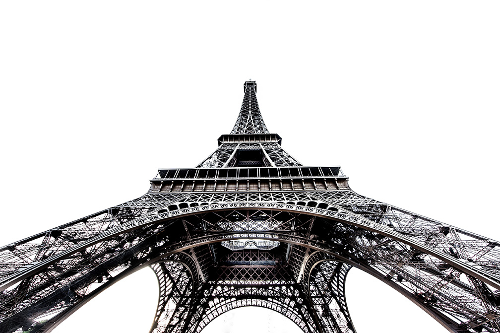
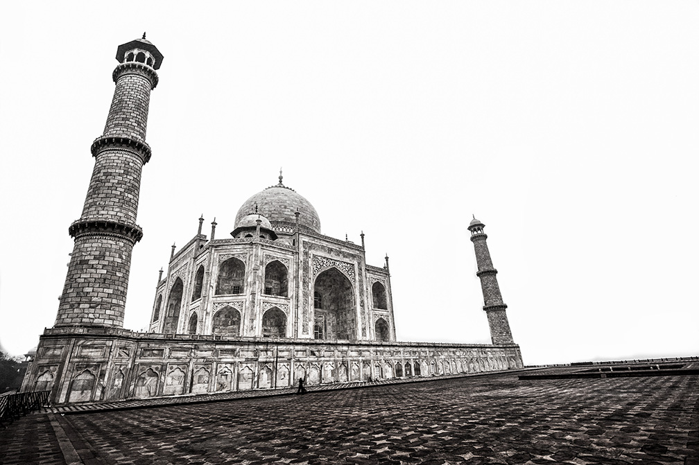
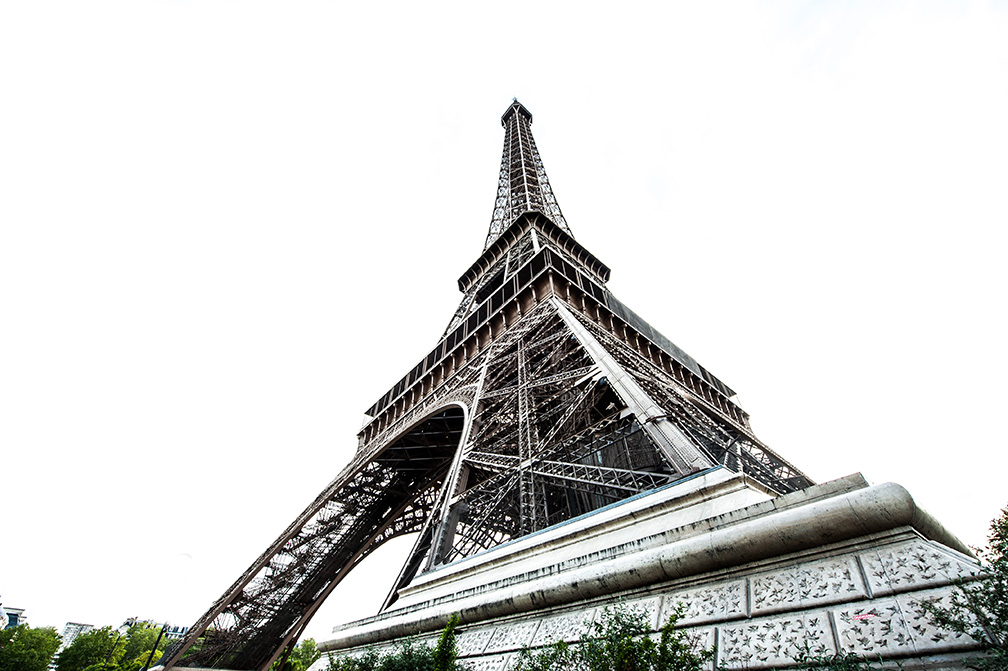
When I was going through my images, I saw that sometimes the third frame (the one over-exposed by two stops) would make part of the sky solid white, and when I saw the 3rd frame of my bracketed shot the Eiffel tower, it reminded me of the London Eye shot I had done with the solid white background, so I took it into Lightroom and pushed the Highlights and Whites until the sky went solid white, then I brought in lots of Clarity and Blacks to make the blacks pop, and it looks pretty cool. Then, I went back and started over from scratch by first doing the full HDR treatment (using Photoshop CS6’s updated HDR feature, and the built-in “Scott5” preset) and then I mixed in the sky technique from Lightroom, and it just came together.
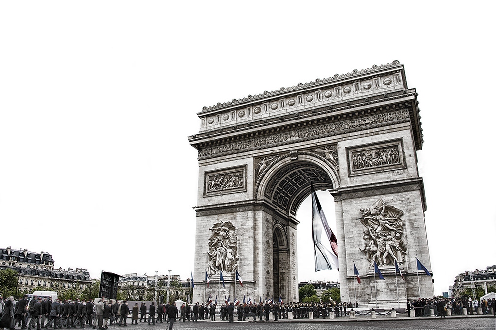
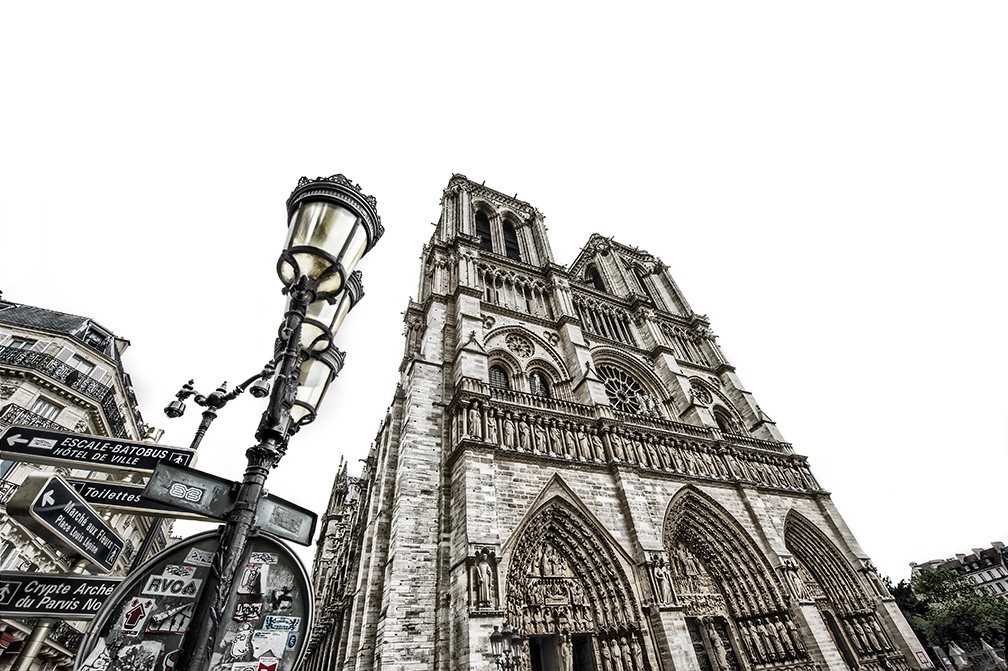
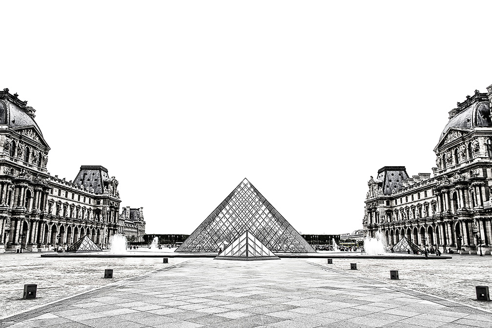
If you look closely, I leave just a little bit of color in all the shots, so they’re not fully black and white. When I showed a few to Jay Maisel on my phone, he really liked them, and said “They kind of look like metal etchings” and I kind of agree. So, after the Eiffel Tower shot, I set out to shoot a few more iconic Parisian places, like Notre Dame, the Arc de Triomphe and The Louvre (below) and did the same thing.
Expanding the idea
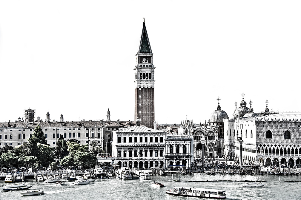
Once I showed these to my wife Kalebra (who was along with me on the trip, and really made the trip a blast for me), she said, “Don’t you have other iconic places you could use this technique on?” I realized I had a lot of bracketed shots from previous trips, so I dug up a few and I’m sharing some of those below.
The reality is….
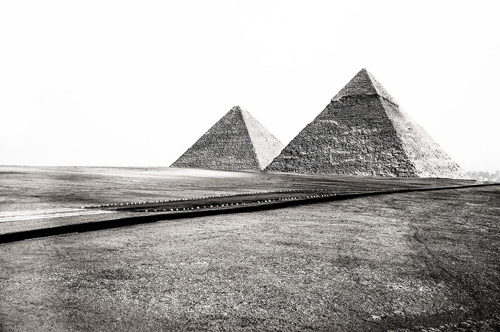
The reality is…. even if you have the properly bracketed shot, not all iconic monuments or buildings work with this look. I like ones where I shot it really wide with my 14mm or so, but even at that, some of them just didn’t look right, but I’m posted the ones I’m OK with so far (but I have more to try out from my archives).
Not for everybody
I know, like HDR in general, this look won’t appeal to everyone, because the only look that appeals to nearly everybody is no “look” at all, so I just think these are for me. In fact, I like it enough that I’m thinking of places I’d like to head back to, and go into them with shooting for this style in mind (which is what I did with the bottom two shots from Venice — taken after I processed the one from the Eiffel Tower).
One for the road…
I figured I’d bring it back around with a final shot from Paris below — this one a side-angle view of the Eiffel Tower with the 14mm (I only took two lenses — my 28-300mm, which was my main lens, and then the 14mm which I used in churches for a super-wide angle look or for this series).
Tomorrow, the Paris back story
I have a lot more to share about Paris, and our experiences there (both good and bad), but I wanted to share these first, so tomorrow I hope you’ll stop in as the story continues. Have a great Monday everybody. :)

Now that’s a good way to have fun while working. Â Kalebra kept us apprised on Google+ about the various coffee, chocolate and champagne encounters. Â Welcome home.
I normally like most of what you do Scott but I can’t help feeling you have spoiled some othereise nice shots. HDR just doesn’t do it for me.
Have to agree with Marc, Â Your talent can create nice photos without HDR.
Great shots, and a great way to apply the HDR technique both from the purely artistic approach and from the design point of view. This pics for example can make great book spreads or ads with copy. Nicely done Scott. Thanks, Javier.
My dear Scott, Hi
Very useful and great shots. Waiting for Online classes.
Best Wishes
-Ali
Fantastic shot i also like your post very much. Every images are very attractive and eye caching. Thanks a lot for sharing this great post with us. Waiting for another shot…
I absolutely love the effect Scott! Great perspectives too! Your work is really inspiring.
Cheers!
Well, I like the look too, and I agree with Jay’s comment: they look like metal etchings. And I REALLY like the first shot of the Eiffel Tower. Nice composition and a great subject for the metal etching look.
And just FYI…Â I am able to get the D800 to take all the bracketed shots with the self timer. Of course, it won’t do it in two shot increments like the D4; one stop is the max.
Great Photos! You can do self-timer, multiple shots (1-9) and exposure bracketing on the D90 too! Just given it a try to check it works :-)
Cool photos Scott. I too think the effect works well on some photos, not so much on others. Really love the effect in the pyramids picture! It’s a pity Nikon didn’t include the two stop increments in the D800 though…
Really liking the look of these shots…the completely white sky works a treat.
Might have to try some of this whilst down here in Devon.
Cheers Scott,
Glyn :)
Love them, i did etching back in the day and its so reminds me of it ,I’m inspired and so keen to give it a go.Thanks for sharing
I like the shots! :-)
BTW, if you’re walking around with Jay Maisel, you MUST bracket, even if not for HDR post-processing hehehehehe
I absolutely love the look of these photos. I bet a series of these would look spectacular matted, framed and hanging on a wall. Wish you would do a KT class on the process.
Well Scott, I like the etching look of your HDR! Very Cool. I need to get further into your classes on Kelby Training. I know these new classes take some time to get published, I’ll wait. I just got your #4 Digital Photo Book. Loved the section on Travel Photography. Have you got any idea when your CS6 for Digital Photographers will be released?
Thanks for all you do for us,
Mike
Seems like you all had a great time.
3 new classes sorted, new hdr technique and probably enough information to fill the blog for at least a week!
Regarding the hdr technique, really like it, but I think it is one of those “looks” that would get quite boring if overused.
These look amazing. I love how you took something that’s been shot a gazillion times and pushed for a new look. These remind me of some shots I did at our local fair a couple of years ago in an effort to capture motion in daylight, except I went in the opposite direction of over-saturation instead of de-saturation. http://www.flickr.com/photos/8×7/5127390741/in/photostream/
Like these photos! The places haven been shot a tousand times, but this hdr look is great and brings up a new way to look at.
Thanks for showing them,
Elisabeth
Sorry Scott I guess I’m the minority here but I said to myself ‘what is Scott thinking? Those pictures are horrible’. They should be post on The Grid and be put down!
Again sorry.
Harold, if you watched the Grid, then you already know what I’m about to say. I didn’t ask for your critique.Â
Well Scott In case you didn’t realize it’s a Blog so a critique you have to expect? I don’t have to like everything you do, even though I do like alot of stuff that you do, this is not one of them. Oh I didn’t see last weeks The Grid as I was on vacation in Hawaii.
Hi Harold. Just because I wanted to share a Photoshop technique, and something I’m working on, does not mean I submitted it to unsolicited critiques. When I post a photo, I’m sharing, not asking for a public critique unless I say, “What do you guy’s think?” It’s as simple as that.Â
Ok fair enough, I’ll keep my comments to myself in the future.
Harold, I think if you watch the Grid then you would realize the photos being “put down”, although that’s not really what they are doing, are the ones that are lacking in the technical area, such as bad focus, bad lighting, bad composition. Scott’s photos are manipulated artistically. As he said, he doesn’t expect everyone to like them, because everyone has different tastes. You should not critique based on personal taste.
Gm658 you maybe right I’ll do just that I take a look at the Grid. I do keep an open mind but these photos are dull and lack something. I can’ find the words right now.
Scott, I like the “etching” style shots. I would like to see a couple that is shot “normal”. I’m glad to see you like the 28-300 as much, I use mine a lot, I think if I were going to Paris I would have to bring the 24-70 too, just for indoor shots for the 2.8. Can’t wait to see the classes!
Then check back tomorrow for “normal” shots. LOL! :)
Dont get me wrong Scott, I actually like them, just want to see some of the color from over there. You comments and everyone else’s should spark good Grid debate this week! :)
Scott, these are just fantastic, and I really like the “etching look”! Thanks for sharing your photos and technique! Can’t wait for your Travel Courses!
Interesting technique, Scott. It’s also interesting the different reactions here! For me, the Eiffel Tower seems to fit the technique really well. I like the Arc de Triumphe, too. The subjects with more texture and which take more of the frame look really great. New ideas and new ways of seeing are always welcome. Thanks for sharing.Â
I absolutely love that look. Very cool. Yes, setting the self timer to take your bracketed shots is sooo handy!Â
Hi Scott, Â Pretty cool effect! Â On auto-bracketing with Nikons – Â With my D7000 I can auto-bracket with the self timer the same way as you describe using your D4 (-2, 0, +2 with a two second release.) Â Curious that the D800 can’t do this.
My D800E can do that under [Custom Setting Menu], [C3]. Â I added it under [My Menu] for easy access and changing the number of sequential shots it will take & timing. Â Easy.
when I read all this…I realize how amateur I really am lol. Love the photos btw, even though I have no idea what HDR is.
Just to be clear, all the way back to at least the D90 we could set the self timer to take up to nine shots in a row. If you have bracketing turned on it does those three shots then stops. Now on the d800 we can not only do it that way, but we can also use the interval timer to do it, set for nine frames and utilize the full nine frame bracketing (same on D700) or we can make a time lapse movie movie right on the spot…though I don’t know how the bracketing feature might intact with th e time lapse movie mode…
Thanks for sharing a cool technique, and thanks to adobe for sharing a cool preset!
Great idea and a new look. But where do you get all the energy? You’re better than the Energizer Bunny. You’re batteries never run down. Very impressive stamina. And I look forward to taking advantage of all your hard work for learning. Thanks for doing this!
Steven
I am also curious where you get all these energy, Scott… I need your kind of battery. :)
Man, love the style. A great new look to the same old iconic places.
Scott, these are some really great shots with a fresh take on places that have been photographed millions of times. While traveling it’s difficult to always be where you want to when you want to. And if you get stuck somewhere in mid day with an overcast sky this is a great technique to come away with photos that can still be interesting. I hope you will add this technique to the post production part of your travel photography class.
Hi Scott,
To my eye, this technique works best for minimalist graphic compositions like the top Eiffel photo, the pyramids and the Taj Mahal. I find it much less effective for the other photos. As somebody else said, I think it’s probably a look that is best taken in small doses. Of course, that’s my personal opinion.
Cheers,
TrevJ
I was going to say that the technique worked very well with the pyramid shot.
What the technique make me think of are the very old shots from the 1800’s-early 1900’s that were higher contrast or had aged a bit and gone more contrasty.
Last week, my wife and I were at Harbor Village, San Diego, and walked into a store selling expensive art. A young lady walked up to us and asked what kind of art we liked. I said, “All sorts of good art. Particularly photos like Scott Kelby shoots”. Without saying a word, she just walked away from us. Whatever could that mean?????
I think they call it snobbery. Scott’s popular, so they turn their noses up even though he shoots great stuff.
You’re probably right, James. I noticed they only had paintings and sculptures, no photography (those galleries are at Solana Beach). So they were probably kicking themselves for their limited offering. Scott seems to think I’ve made up the whole thing! If I were that creative, I’d write the ‘Great American Novel’!
I think she realized that they didn’t have anything that good, so all she could do was walk away. ;-) Â (Nice try, though. Really. The whole “Harbor Village” and wife thing really made it sound believable).Â
What a wonderful collection of captures and just love the cool post technique and different look! Welcome back from your amazing journey and thank you for sharing your adventures with us while there… :-) Â Â
I just cannot decide how I feel about these. I like the style on the last two shots (the pyramids and the extreme wide of the Eiffel Tower) but I don’t love the effect it has on the masonry of the Louvre. I can imagine the clean look of them on a metallic print large in the right space would look spectacular though. They do achieve one thing, they are different shots of incredibly frequently-shot places.
Paris is a jewell in this world that’s for sure :)
You know I am quite open in terms of photo styles, but this feels very amateurish to me. Was it cloudy in Paris that you removed the sky on all of them? also they, IMHO, seem way too over-sharpened…
Hey Mario — I didn’t ask for your opinion.Â
With the greatest of respect Scott, that seems a little harsh. His name is Mariano, not Mario and I think he was trying to give an honest opinion on a public blog post for which you have enabled a comments section. You said yourself this style won’t be to everyone’s taste. I left my comment here because I thought you might want to scope a broader reaction to the style. Mariano, perhaps not even speaking his own language, may have had the same good intention. I doubt he’d read your blog at all if he really thought you, rather than the feel of this style, were amateurish.
Hi James: Thanks for pointing out the typo (I just fixed it). Now, onto my comment. I posted the comment to share my Photoshop technique — I didn’t ask anyone to chime in good or bad about the photo. I didn’t say, “Hey what do you guys think?” Or “Open to critiques.” I don’t go and post unsolicited comments about other people’s photos, because like me they may be just wanting to share them, which is what the Internet is all about — sharing — I don’t suppose they put them their for public critique. So, if someone posts an completely unsolicited critique, especially kind of a harsh one, I don’t take it too kindly, which I didn’t. :)
I agree 100% with Scott. I think it’s rude to give a bad or negative comment unless one asks for it. Maybe some of the negative commenters should bring their work to PSWfor a pro critique.
I agree with Scott, this is not the forum for photo critiques. I actually love the look of these images Scott- I want to try the technique on some of my archives (wish they were archives of Paris!)
mariano go check bernd and hilla becher´s portfolio on the net. they actually insisted on subduing the sky  as they didn´t want it to distract the viewers attention from the architectural form they wanted to show. lets assume kelby went after this look and expanded the idea behind it.  Â
I think it would be interesting to print this style on artists paper, and use a watercolor wash to add color—like a hand colored print.
Wow!  I love this effect.  I think the style really adds a lot of character to what might otherwise be just another boring shot of (fill in the blank) landmark.  It’s almost a lithograph, but retains more detail and a hint of color, and definitely gives an old world kind of feel.  I am definitely going to try this for myself.
Any stories about traveling with a camera and equipment in Paris? You can save the Maisel stories for the Kelby Training episode. Were there any Maisel version 1 photos from back then and version 2 photos?
These photos kind of remind me of the photos taken during WW2 as well as having a metal look. Very cool. It is funny how an idea will come to you out of nowhere. Can’t wait to see more Au Revoir
Scott,Â
I have been following you on social media for many years, bought half of your books and totally respect your energy and talent.  I totally agree with you in regard to not asking for peoples opinion when posting photos but when you share some great photos and there is a comment section then you just have to expect it.  You don’t seem to tell the people that have given you the good comments “I didn’t ask for your opinion.  It’s a tough one as we enjoy your travels and talent and love seeing your photos but once a comment section is there for your followers to enjoy then these things just happen.
I know….and that’s precisely why I contemplate turning off comments altogether sometimes.Â
Scott,
It’s obviously entirely up to you whether or not you allow comments, but my feeling is that differing opinions, whether “good,” “bad” or indifferent make for a much more interesting, diverse and informative photographic community. Sure, some negative comments are VERY poorly phrased, but I think it’s best to just shrug those off with “I’m sorry you feel that way. Perhaps you’ll enjoy some of my other work.”
Have a good day. :-)
Trev
I hope you don’t decide to turn them off. I think the large majority of commenters are commenting with good intentions and breathe life into your blog. There’s always a few people who don’t think before they post and there’s always scope for misunderstanding. I once quoted Oscar Wilde on your comments section and a woman took great offence believing the words to be my own, it was the last thing I intended to do! When I read it back I could see why she might have been offended.
When a post is entirely about a new technique with a striking look to it, it’s hard to see what else people will comment on other than their own feelings about that new look. For the record, it’s definitely growing on me.
I’m glad you enjoyed Paris and I hope negative comments haven’t taken any of the sheen off your week.
I like them. They have an old-time kinda 1800s vibe. Good work!
intervalometer 5 times 1 shot 1 second apart works on my d200 …
I like them a lot. Great look for me. And, you still have your “normal” images for “normal” people that you can do later.
This is awesome style! Thanks for sharing it.
these are amazing. now i want to go back to europe (not that i really need any more motivation to go back) and shoot. have you tried printing these on metallic paper? they may come out looking more like the metallic etchings you mentioned.
I love people shots on a white seamless, that is what this reminds me of. I would never have thought of doing this before seeing the examples.  thanks for sharing
Scott,
Its a real shame you think these are just for you. Â I for one love these images, so much so that they would look awesome in a coffee table book, complimented by other similar images from your collection.
Brilliant. Â Utterly brilliant.