It’s Guest Blog Wednesday featuring John McWade!


My name is John McWade. Because this is my first post, here’s a quick history.
I’m a designer, not a photographer. Early in 1985, I was the first person in the world to lay down my T-square and become a full-time “desktop publisher.” That meant that I was doing my design work entirely on a computer — a 9″-screen Macintosh — with a test version of Aldus PageMaker.
I’d been at it for months when, that summer in New York, Apple rolled out its “Macintosh Office,” a networked suite consisting of the Apple LaserWriter, Adobe PostScript, and Aldus PageMaker. All three were revolutionary. The press, impressed, said, “Yeah, this looks good, but is anyone actually using it?” To which Apple said, “Well, there’s this guy out in California . . .”
And my phone started to ring.
Things have not been the same since.
It took only five years for desktop publishing to democratize design. Its early adopters, with exceptions, were not designers. They were writers, editors, marketers and others who had design to do — newsletters, brochures, business stationery, whatever — but lacked the time, budget, or need for a professional.
Most had an affinity for design, too. But most did not have the skills.
Books and periodicals taught point and click. How to draw a curve, make a shadow, put a glow on something. This was helpful. They called it design, but it wasn’t. It was effects.
No one outside of school was teaching design. Typography. Page layout. The art of making a visual message beautifully and simply and clearly.
So we jumped in. We launched a small magazine titled Before & After, How to design cool stuff in January, 1990, to help the novice — the non-design professional — with graphic design. It was an immediate hit.
I’ve been at it ever since. In print, in books, online, in video (just starting this), and in the occasional live class. I love my work. The surprise has been that our little five-year project would turn into a career that continues to this day.
Brad asked if I’d do a post for photographers.
From a designer’s standpoint, the great thing about being a photographer is that you have great images to work with. So how about how to get a photo and type to coexist in the same small space, like on a business card? There’s a universal way to do it, which I’ll show you here, and once you have it down, you can elaborate pretty easily if you want.
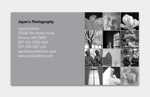
Before:


(Above) Jayne Kettner’s business card had a clip-arty logo, a slogan, a swashy, calligraphic signature, and her business information, all scattered into various corners and places. This is common, and there are several problems with it. One is the scattering, which puts similar kinds of information in different places, with nothing to connect it. Two is the visual complexity; that is, the unnecessary tangle of lines. Three is that we can’t see her photos; her biggest asset is absent.
Here’s how to fix it.
Size
(Below) The standard U.S. business card is 3.5″ x 2.” Set up an extra 1/16 inch all around. This is your “bleed” area, which will prevent white from showing around the edges of the card when it’s trimmed to final size.

Start with the words
Set your words—business name, your name, address and contact information—in a block of ordinary type (here, Benton Sans Book, 7.5 pt on 9.5 pt line spacing). Align left, and place the block in the upper-left corner.

Make the business name bold.

Add a half space—a whole space works as well—below it . . .

. . . then tint the type 60% (or so) gray; leave the business name black.

The result is a minimal, intentionally designed look that leaves the white space as the dominant element. You’ll be tempted to fill the space, but don’t.
Add the photo
Place and crop your photo to the edges of the bleed area . . .

. . . and bring your words to the front (below). On a dark image like this one, finish by coloring the business name white and the body light gray.

And that’s all there is to it. No disorganization, no distractions. It quietly places your photography and your name into the client’s hand, simply, clearly, beautifully.
Use both sides
If that just-right photo has no room for words, use the back. The minimal type treatment presents a gallery-style look. By that I mean it’s an object alone on a white wall, which gives it the viewer’s full attention.
Front:

Back:
Add background
(Below) If the photo doesn’t fit the space, add an artificial background. On a solid field like this, eyedropper the color nearest the edge . . .


. . . and fill the card behind the image. While you’re at it, you might eyedropper some pink from the flower . . .

and add it to the business name . . .

. . . which makes a beautifully soft connection.

Fade to black
A too-narrow image with a multicolor edge requires fading . . .


A gradient on a layer mask is an easy way to do this . . .

A change of typeface
Below, a small change of typeface from Benton Sans to Didot—on only the business name—softens the name while retaining the look. Classy.


Get vertical
Vertical-format cards are less common but can be dramatic.
It’s tempting to move the words around, but don’t do it. The upper-left corner makes a clear, designed statement, especially if it’s consistent on all pieces. If an image won’t work with that position, use a different image.


(Above) Her asymmetrical position activates the layout.
(Below) You don’t want to lose a photo because it doesn’t fit the space. If you crop, we recommend making the image square, which looks intentional, not ambiguous.


(Above) The photo on white is classic. If it’s too stark . . .
(Below) Soften with color . . .

Her lips . . . Her hair . . .

Her dress . . . The background . . .

Use an object
An alternative to a portfolio photo is to picture an object from your studio. Shoot it against white and place it on the page. Include its shadow.


(Above) White space is the controlling element on these cards—note how your eye immediately registers the images, despite their small sizes. Small is important; if you make them big, the objects, not you, become the point of attention. Note, too, that although they’re predominantly black, the objects are in color, just like you’d see them in real life.
(Below) White space is not empty but has real force. Note (below, left) how it pushes your eye to the left, and (below, right) it creates a strong sense of depth behind the studio umbrella.

Create a gallery
Instead of one photo, create a tiny gallery. Make a matching Web gallery, and you’ll have a direct, card-to-Web connection, useful for branding.
Make a grid . . .

. . . and add your photos. Square images are harder to crop but look designed, and they correspond to Web thumbnails and avatars, too. (Below) On white, gray and black.


That’s it. Simple, flexible, universal. It’s a clean look that’s easy to repeat on other documents — brochures, Web sites, etc. — so you’re consistent everywhere. Remember: 1) keep the type basic, and 2) keep it in one place.
Since I already have your attention, I’d like to ask for your advice on something…
Imagine standing before a dozen high-school yearbook students embarking on their school year with the goal of creating a great yearbook. Amateur shooters, consumer equipment, some phone cameras.
If you can give them only one tip for making great pictures, what is it?
What if you can give them six tips?
Leave a comment and let me know what tips you would give.
For more, visit us at . . .
Web site: bamagazine.com
DesignTalk: mcwade.com/DesignTalk
YouTube: youtube.com/bamagazine
Facebook: facebook.com/beforeandaftermagazine