Thanks to everyone who “Beta tested” my new portfolio yesterday, and shared their ideas on how to improve the experience. I didn’t mention that it was a beta test because…well…I didn’t know it was a beta test, but it clearly had a number of issues I hadn’t caught (mostly caused by me), and poor RC Concepcion wound up spending the day (and night) yesterday going into Flash and making all the edits and fixes.
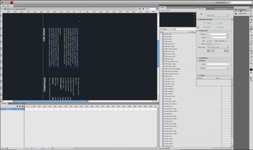
To give you a peek into RC’s World, take a took at the screen capture above. That’s the template in Flash. Notice that the text is actually backwards and turned on its side (click on it for a larger view)—that is how RC has had to edit this site. He truly is a Flash hero! (and a great friend for putting up with all this on my behalf).
Anyway, posting the portfolio created so many comments, suggestions and questions, that I thought I’d follow-up with this quick Q&A. Here we go:
Q. Where did the original Web gallery template come from?
A. I bought it from a site named “FlashLoaded.com” for around $79. What you saw yesterday was their template simply updated with my images. The effects, the transitions, the music, the sound fx—-those were the defaults built into the template.
Q. But we hate all those effects, and sounds!
A. I know. I read your comments. RC was able to edit the template so at least the background music doesn’t play automatically when you come to the site. However, the musical note icon makes it look like the music is playing when it’s actually not. Then if you click the musical note, nothing happens (it’s still off). If you click it once again—the music then comes on (so, to hear the background music, click the note twice). Also, thankfully he was able to kill the little sound effect that played when you changed photos.
Q. What about the Next and Prev buttons that appeared over the photos? They’re incredibly distracting.
A. I hear ya, and I’m very fortunate that RC was able to find a way to remove them, and still keep some of the functionality. Now, once the photo is open at the larger size, if you click anywhere on the photo itself, it brings up the next photo. There is no “Prev” button at this point, but I’m OK with that—at least those two button are gone.
Q. What about those transitions?
A. Well, they’re less obtrusive than they used to be, and so far we haven’t gotten rid of them completely, but RC is working on it. They don’t stand out nearly as much as they did, but I agree—they should probably go (if we can just figure out how!).
Q. What was with all the “Lorem Ipsum” text?
A. That was the placeholder text in the template. We didn’t realize that when you got to the end of a category, that Lorem Ipsum text started to appear. That’s fixed now (thanks RC!).
Q. Hey, ya know Tiger was actually hitting a 4-iron—not a 7-iron!
A. I know. It was just about the #1 most-mentioned comment from yesterday. I wrote the captions very late at night. I’m surprised I didn’t call it a putter.
Q. What about all the other typos? Like the wrong copyright date, and the missing quotation mark, and all that stuff?”
A. RC got those taken care of yesterday, too. Those were all totally 100% my fault. From now on I should write all captions during broad daylight.
Q. Can you set it up so when you click on your logo, it returns the reader to your blog?
A. Yup—RC got that taken care of last night, too.
Q. Was the template easy to update and maintain?
A. It was like squeezing toothpaste back into the tube. I don’t know what they could have done to make it more complex (see the screen capture up top). Unless you have an “RC” that can help you, make sure you buy a gallery template with an XML back-end (where you can update and maintain the gallery from a regular Web page, rather than having to be a Flash expert who can read backwards and sideways). This turned out to be the most expensive $79 I’ve ever spent.
Q. I saw a couple of people who said they thought the photos looked jaggy. What’s with that?
A. If you’re viewing the portfolio on a standard Web browser, they should look sharp and crisp. If you followed the link to the .swf file that a reader posted yesterday, then it expands to fill the screen, which artificially enlarges the images, which makes them look pixelated. At regular size and view, they look fine.
Q. A lot of people said they just didn’t like the design of the portfolio. Did you take their advice?
A. We fixed as many things as we possibly could, taking every suggestion and idea into account, and I think it’s much improved today (here’s the link in case you want to compare the updated and edit version to what you saw yesterday).
Q. Did anyone like the new portfolio?
A. I took the day off yesterday, and took my family to Busch Gardens Adventure Park in Tampa. Right after lunch I got a text message on my phone from a photographer who didn’t point out typos, or complain about the transitions, or complain about anything. He just wrote, “Love the new portfolio you put up. It’s terrific!” It was from Joe McNally.
Q. So, how do you feel about the new look?
A. Obviously, I chose it to replace my old one, so I must have liked it, but I like it much better now that your suggestions and ideas have been put in place. I could have saved myself a lot of grief if I had thought to send the portfolio to Terry White first, before releasing it publicly. He’s brilliant at testing sites for usability, and he would have caught a bunch of those things right off the bat (and as it turned out, he came up with some great ideas last night, too!). The things I do like about the new look are:
(a) I like the thumbnail layout, and that you can see full thumbnails of all the images in each particular gallery.
(b) I like that some of the thumbnails can be larger “feature” thumbnails to highlight your favorites
(c) I like that you can write a caption for each photo
(d) I like that you can view individual images, or click-thru a slideshow
(e) I like the little bit of motion that’s there now. Things don’t feel so static that way (but that’s just me).
(f) I like that you can see a black and white version of any photo by placing your cursor over the thumbnail.
(g) I think it has a pleasing over-all look, but again—that’s just me.
Q. How likely are you to try another new portfolio look anytime soon?
A. Not bloody likely!
Seriously though—thanks to everyone who helped me improve the online gallery. I don’t expect everyone to like any gallery I put up there (after all; not everyone liked the old gallery—especially me).
I think ideally you want a gallery that doesn’t distract the viewer from the images, that doesn’t have a bunch of sound fx, but at the same time, personally I want a gallery that has a nice layout and is fun to use. I think this newly modified template hits some of those things, but the search for the perfect portfolio gallery still continues, which is probably the last thing my buddy RC wants to hear. :)


