

If I could design/redesign Photoshop’s dialogs and palettes
Hi everyone. I’d like to first thank Scott for having me as a guest today and I’d like to thank you for giving some of the most valuable asset you have – time. To that end, let’s get right to it. There’s two aspects to this post. The first is very passive – you sit and read and look at my ideas. But the second part is very much active. See, I’ve created a PSD file with all the makings of a skeleton dialog box in Photoshop. You can try your hand at making your own and share them with everyone. More on that later though.
If you’ve ever read Scott’s Photoshop Channels Book you’d have seen that he totally redesigned the Calculations adjustment dialog to one that is a little easier to understand. I remember seeing it and thinking what a neat idea it was. Since then, every once in a while we’ll kick around ideas at the office about how we’d design or layout a dialog or palette or even ideas for new dialogs we have. Well, I’ve decided to put my money where my mouth is and actually design them as well as share them with thousands of people. It could be a smashing success or a huge failure but I have to say I had a total blast doing it. Let’s take a look:
1. Layer Style Dialog – Set as Default button
I’m kicking it off with an oldie but a goodie. One simple button added to one dialog would make such a huge difference. Yep, the Layer Style dialog. Lots of people poke fun at it – especially the default red color for the Stroke setting. But there’s lots of other little things in there that don’t look right either. Like the Drop Shadow. It’s default settings are too fake for most applications and if you don’t change them then you can spot your fake Photoshop drop shadow a mile away. But here’s the thing. I don’t think it’s Adobe’s responsibility to predict the settings we like best. They’ve got enough on their plate. We all like something different and there is absolutely no way that they’ll please everyone. You can bet that as soon as they change the default red stroke, the community of “Red Stroke Lovers” will cry out like you wouldn’t believe. So I propose this. Add one simple button to the dialog that always stays in the same place – Set As Default. That way, when I’m messing around and I come up with a combination I like I just click “Set As Default”. Next time I go in there, those are the settings that I see first. If I need to change ’em I can, or I can set new defaults if I prefer. Either way, we all win. Adobe doesn’t have to worry about pleasing everyone with their choices and we are freed of the dreaded red stroke and fake drop shadows.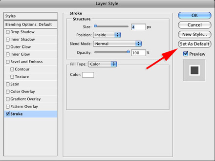
2. File > Automate > The Watermarker
This is one of my favorites. Seriously, think of the hoops you have to jump through right now to watermark a folder of images. First you need to create an action. One that watermarks regardless of width and height. Oh yeah, throw resolution into there as well and good luck coming up with ONE action that does it all. Then, you need to know how to use the Batch dialog which really isn’t that hard but when you couple it with the fact that you need to make an action it’s just too much for a task that photographers and designers on the web absolutely need these days. So my dialog is affectionately known as The Watermarker (you have to say it in a deep radio announcer voice though – with reverb preferably). I know, the name is kind of lame but it makes sense. It’s very similar to the Image Processor. You choose which images you want to watermark and then where you want to save them. Next you pick what formats you want to save in and whether or not you need to resize (which for web you would). Finally, you choose your watermark style. The default is just a big copyright symbol. However, you can choose text or even select your own logo. Then you can control the size of the watermark as well as where you want it placed. It even has a nice big preview.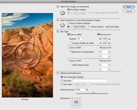
3. Camera Raw Palette
This one is simple in nature but very likely extremely difficult in implementation. Doesn’t mean I can’t dream though. See, if I work on a raw photo, I’d like to not go back out to another dialog to adjust something in the raw settings. I’d love to have a little palette or dialog right there in Photoshop that I can adjust and have my image update. I realize this is totally crazy and defies the laws of everything raw but you never know what those Adobe engineers can pull off. They’re some of the best in the world and if anyone can do it I bet they can. Think about this… 5 years ago, did you ever think you’d be able to do non-destructive retouching and selective edits on a raw file? Probably not, but if you take a look at Lightroom 2 beta you’ll see it’s happening today. 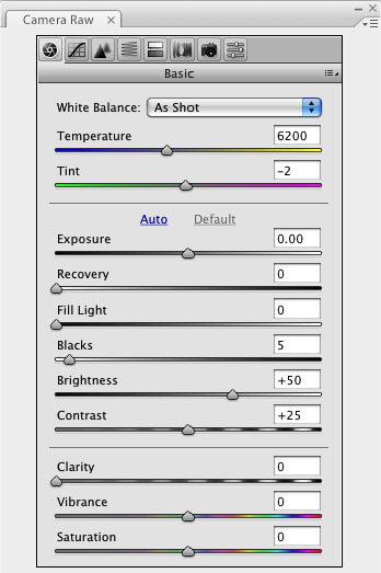
4. Blend Mode Dialog/Palette
This is probably one of the oddest dialogs I’ve designed. Mainly because I can’t exactly tell why I want it but I really think i do. I’ve always thought it was a pain to have to cycle through all the blend modes in the Layers palette. Then, what happens if you find 2 that you like and want to compare them. You really have no way of seeing them next to each other. So I thought up a little icon that you could click on the layer in the layers palette. This would pop open the Blend Mode Viewer window or dialog. Then you could see all of them in one place. I’ve also reordered them to put the most useful at the top and even left a few out. And you’d be able to see a larger view of the current selection at the top of the dialog. It’s a big dialog I know but I’d love some type of blend mode helper. 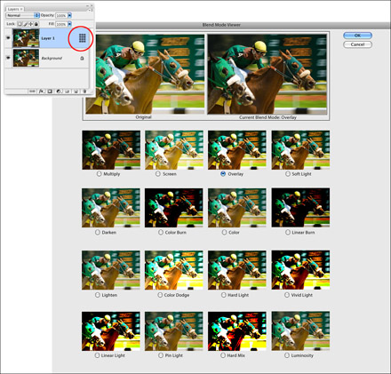
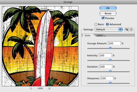
5. Grunge Filter
Let’s face it. Grunge has been around since the 90’s (made popular by rock bands that didn’t shower and wore flannel shirts that could practically walk around themselves they hadn’t been washed in so long), and it doesn’t look like it’s going anywhere. Especially when it comes to Photoshop. For years we’ve had to come up with these convoluted ways to create this effect so I’ve decided to create my own Grunge Filter. Complete with a Basic option which lets you set your Amount of grunge and an Advanced option that let’s you really drill down into the texture and settings. But it goes beyond Grunge. I think the concept of adding some trendy filters could really be cool here. If there’s a new, hip, stylish trend out there then go ahead and add it as a filter (or whatever). It’s a way to keep Photoshop a little edgier and remove the need for folks to apply 7 filters at a time to achieve a popular effect. 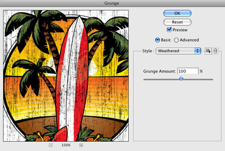
6. Resize Handle for Filters
Here’s a really quick one. While I’m on the topic of Filters, I had another thought – adding a resize handle to the filter dialog box that resizes the whole thing. That way, if you want a large preview and you have the screen real estate for it then go for it. If not, then you can keep it sized down. Again, it’s one of those things that puts the control in our hands so some one else doesn’t have to decide what screen size we have or how large we like our dialogs. 
7. Semi-transparent and get-out-of-the-way dialogs
This one applies to everything. I’d really like for my dialogs to be semi-transparent like iPhoto’s are. That way I can see what I’m working on if one gets in the way. I’d also like them to scoot, or disappear or just plain get out of the way as my selection tool or brush comes close to it so I can continue working without having to stop and move the dialog. That’s more of a functional thing then it is a redesign thing and it’s really hard to show in a static graphic but I thought I’d see if I could sneak one past ya :) 
7b. A Dark Interface and Dialogs
Keeping with the same theme of making the interface look cooler, I’d love to see a gray or black Lightroom-like interface. I know that’s really pushing it but think of how cool Photoshop would look if it were black! 8. White Balance adjustment layerI’d also like to see a White Balance adjustment layer. Personally, I use Camera Raw and Lightroom but so many folks out there don’t. I think the White Balance selector tool as well as the presets and sliders in Camera Raw work really well for color correction. Plus, the addition of having this as an adjustment layer would give us a mask which means we can selectively edit parts of the photo instead of everything. And I really like Lightroom’s implementation of the White Balance selector. When you hover over a part of the photo, the preview shows you what it would look like if you selected that point as the neutral gray point. It takes a lot of the trial and error away from color correction. We could simply use the image preview in the dialog for just that purpose. It would constantly update as I dragged the eyedropper around the photo.
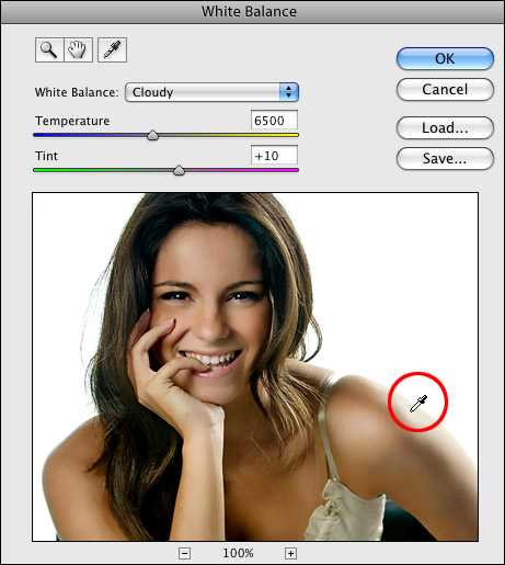
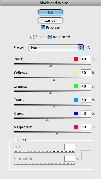
9. Black and White Dialog (Like variations but with an Advanced tab)
I really like the way the Smart Sharpen filter is laid out and I especially like the Basic/Advanced tabs. I think it would be great to see this concept carried over to other dialogs. Not necessarily to dumb them down though. I like the fact that those who don’t know or need all of the advanced settings can just move a slider or click a thumbnail (knowing full well, they won’t have control over the effects). But then those that really know the details can drill into the Advanced tab. I also like the idea behind the Variations adjustment a lot. Basically you just click the one that looks better. So I propose marrying the two in the Black and White adjustment dialog and maybe even in some other dialogs as well. In the Basic tab, you just click the one you like. In the Advanced tab (which looks like the B&W adjustment does now), you have full access to all the sliders to mix the B&W any way you want. 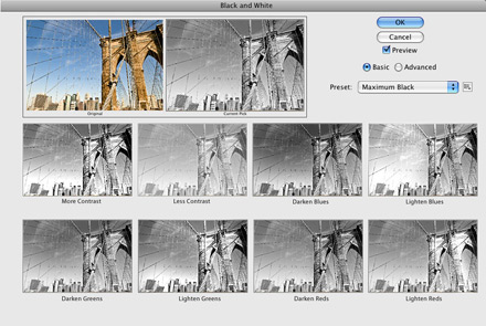
10. Before/After View
This one is a bit more of an interface change then a palette or dialog. However, I think we’re in dire need of it so I wanted to include a quick design on how to get it in there. Right now, there’s really no easy way to see a before/after view of your image. I’d like to see the Before view be the image as it was when I first opened it in Photoshop and the After be the point where I’m at now. You could toggle between seeing the before/after view side by side, side by side split, or top to bottom. Even if it were just a button I could press to momentarily show me the before image that would be great. Anything is better then having to go to the History palette to see it now. 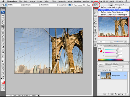
Homework:
Yep, you’re not getting away that easy. You have a little homework here and you get to pick on what level you want to contribute. 1) Just leave a comment here on the site as to which one(s) are your favorites (if any). 2) I’ve included a PSD file for you to download. It has all the makings of a skeleton dialog box. Download it and make your own. I’ve even got instructions on what font to use in it to make yours look like Adobe’s do. Then a) Upload it to the flickr site I created for these dialogs (or your own website if you’d like) and. b) Leave a comment here telling us about the dialog you created and a link to the flickr/web page where it’s at. I know it involves some work but I (and I’m sure everyone else out there) would love to see some of the things you guys come up with.
– Here’s the PSD file.
– Here’s a link to the Flickr website group for these dialogs (http://www.flickr.com/groups/photoshopdialogs/)
Well folks, that ends my guest blogger day here on Scott’s blog. Thanks again to Scott and everyone who reads and comments here at the blog. Take care! – Matt Kloskowski
Nice post. Appreciable also, Learned a lot from it. carry on bro…
I working with photoshop for last 5 yrs. The homework is so interesting ….!!
This is an extremely helpful tool, indeed!
Great work and thanks for sharing.
clipping path
Really looking for this type of help. Thank you very much for you detail instruction and of course for the psd files.