

That’s A Photoshopped Photo, No?
When I started photography in 2005 and was proudly starting to share my work with the world – that was a common reaction to my photos.
Most of the people enjoyed my work, but I would get this comment:
“This must have been Photoshopped.”
Indeed it was, for example:
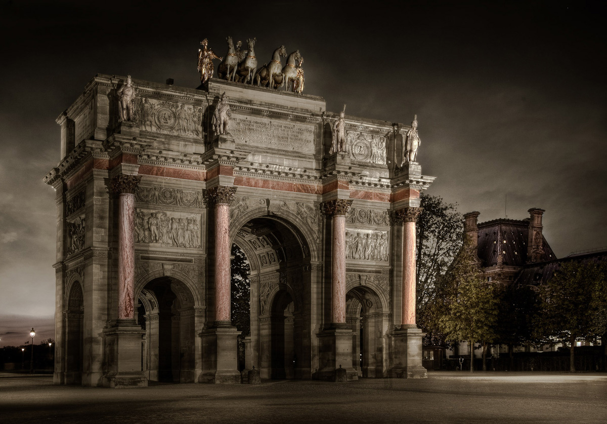
This is a photo of the Carrousel at the Louvre. I added some clouds and a sepia look, but kept some of reds as natural colors.
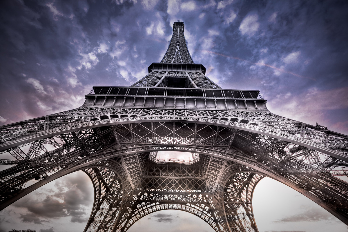
This is an HDR shot of the Eiffel Tower where I added some magenta in the sky to make it more dramatic.
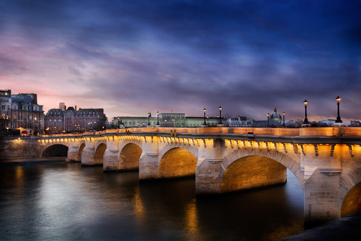
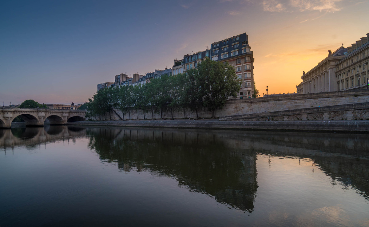
Here is a photo of the Pont Neuf in Paris. I changed the sky and did a lot of dodge and burn on it, love the photo. I’m selling this photo to one of the biggest network galleries in the world – it has 85 physical galleries. The gallery really liked it despite the “Photoshop effect.”
I always felt a little guilty changing skies, or adding too much dodge and burn. I felt like I violated some kind of sacred oath that photographers had signed to not use any of these tricks on their photos.
When somebody tells me, “You used Photoshop!” I hear, “You are just good with software, but you are not actually a real photographer.”
Then one day I started using an ND filter and doing long exposure which lead to this kind of photo:
The magenta came mostly from the use of the filter. The stretchy clouds and the silky water came from the long exposure. So this time the drama did not come from software but from a dark piece of glass that you screw onto the camera.
I wondered, “Is using an accessory to create an effect more legitimate than using software?
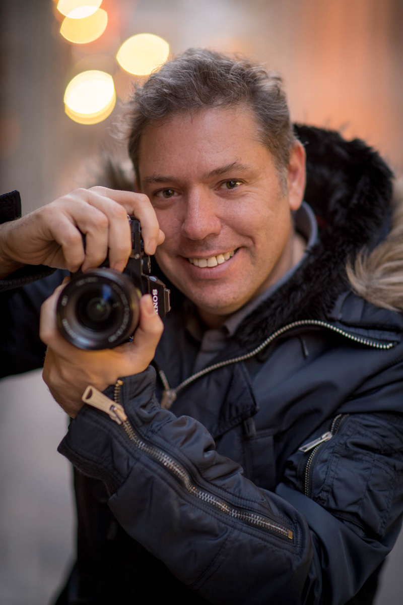
Then I started using an 85mm f/1.4 lens that gave a very shallow depth of field and a superb bokeh to my photos.
This is a portrait of me taken by a friend. Do you notice how the bokeh in the background is a special effect which was created by a lens? This is not something natural that you can observe with your eyes.
I came to the conclusion then, that no matter what you use to create your image, whether it is in-camera, in-software, or with the use of a filter or a lens, what matters is the emotional impact that the photo creates. Do my photos tell a story? Do people like it? Would they like to have it in their homes or offices?
In the end, for me, these are the questions that matter.
I also realize that sometimes people react to saturation, like some people used to react in the early 80’s when color television came out. I remember at home the brand new color TV seemed fake to me, I was only used to black and white.
Sometimes nature gives you very strong sunsets with amazing colors. When you manage to match them using Lightroom or Photoshop to the feeling you experienced at the time, they might feel fake, but to me they are a representation of what I was seeing.
For example:
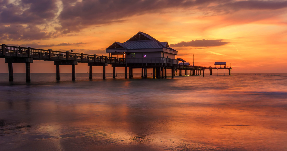
This is a beautiful sunset in Clearwater, Florida. I spent quite some time in Lightroom tweaking this photo until I felt like it was as saturated as my eyes remembered.
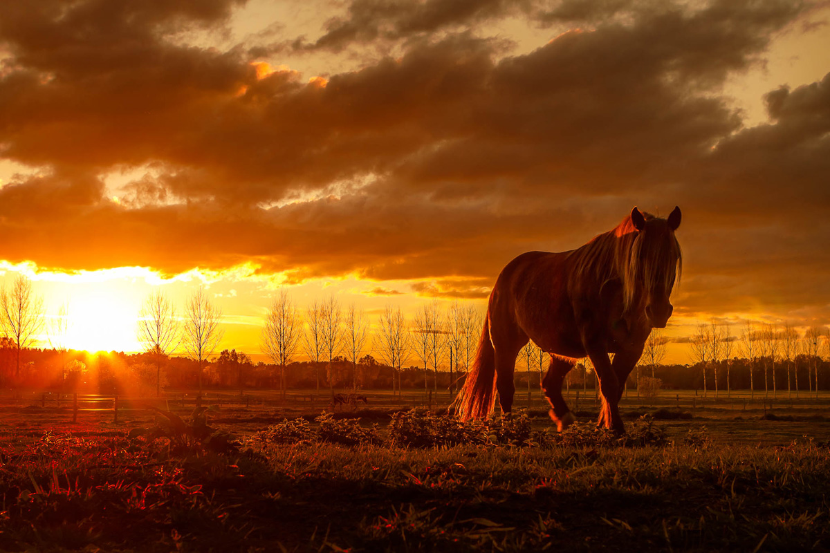
A horse close to Chantilly France, looking straight into the sun, my eyes were almost blind, I corrected the color until I got the same impression.
What confused me even more – is black and white photography. I remember talking to the owners of Yellow Korner and they seemed to have a lot of admiration for black and white as being a noble photographic art.
So I started studying Ansel Adams’ workflow from his book, the camera, the negatives and the prints and realize how much he really controlled and retouched his photos using the zone system with a very complex printing process. I also saw some old black and whites from famous photographers who spent dozens of hours retouching them, much more then what we do today. This was mainly due to tools that were hard to use at the time. Try taking out a negative and skin spot with a needle!
Here are a few photos I took recently in Yosemite as homage to the work of Ansel Adams. I’m a big fan of his work.
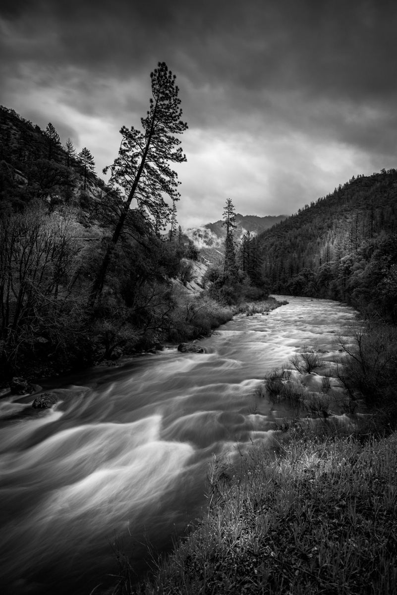
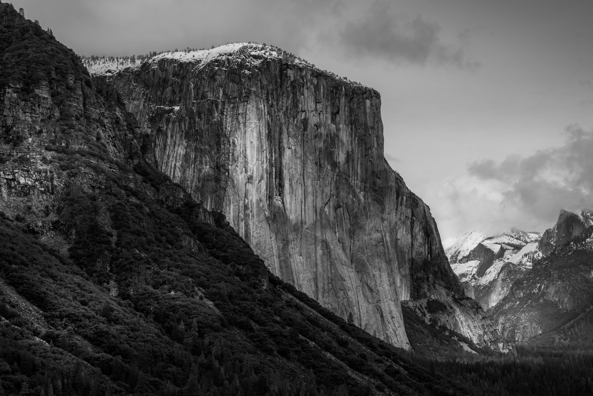
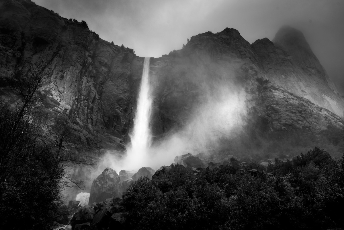
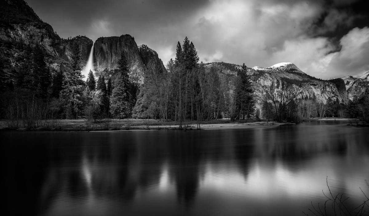
Then one day it hit me: When you do black and white, you are participating in an art form that has been here for decades and has been established as a form of fine art.
Even though I felt satisfied that the emotional impact was all I cared about, and that I would be creative with my photos, whether or not people enjoyed them, I still felt guilty when someone asked me if I used Photoshop or not.
One photographer fascinates me for his image and his success and that is Peter Lik.
He does beautiful photos that are very saturated, beautifully printed and, per what I have read, he is the biggest seller of fine art on the planet in recent years. I know some people love him and some people hate him (they are probably jealous.☺)
I get a lot of inspiration looking at his photos and I like to listen to what people say when they see his photos at his galleries. He has galleries all over the place New York, Vegas and I have spent quite some time there for inspiration and eavesdropping.
The public at his galleries usually don’t say “These are Photoshopped!” but more like “What a beautiful tree, or island or beach.” etc…
I’m sure Peter’s work takes a lot of Photoshop work, but that is not the response that he is getting.
I realized then, that as long as you retouch your photos to what people are used to seeing, you can get away with a lot. But when your skies start having a blue that the public is not used to seeing or too much magenta in my case, they react as if your photos are computer generated. But, if you managed to make fabulous color correction, within what the general public is capable of believing, you have created a whole different impact.
So that’s my game these days, to retouch my photos in such a way that they look dramatic (and hopefully nice), but the color has to remain within the realm of experience of the human race ☺
This photo has quite a bit of dodge and burn, but I tried to keep it to an “acceptable to the human experience” range.
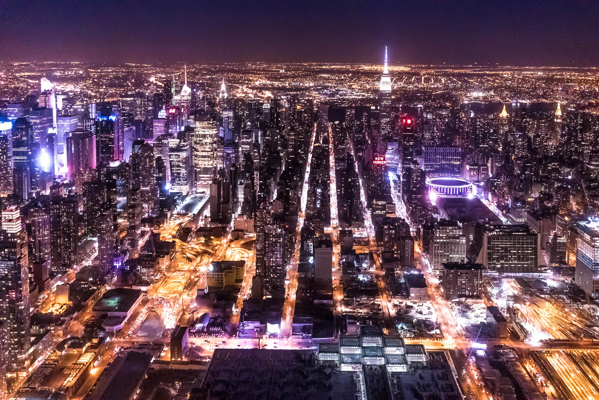
I shot this from a helicopter at 8000 ISO.
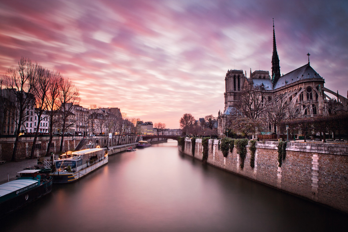
A sunrise in Paris just a few days ago.
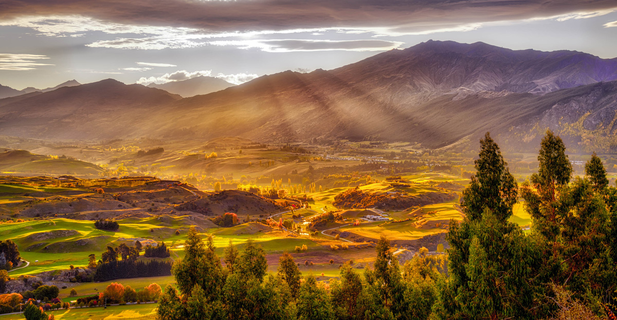
All of this being said, next month I might go back to some super HDR like this:
I just completed a full course on Landscape Photography that you can find right here.
I’m giving a super discount, for a limited time, to all of Scott’s readers by using the code: KelbySR at check out.
This is by far the training course I’m the proudest of, 48 videos with lots of live and examples from start to finish.
How do you like to retouch your photos? Leave a comment below!
Thanks for reading!
– Serge
You can see more of Serge’s work at SergeRamelliPhotos.com, learn from him at PhotoSerge.com, and follow him on Instagram, 500px, YouTube, Facebook, Twitter. You can also see Serge live in person at Photoshop World in Las Vegas July 19-21!
Excellent post !
Loved your point of view. Well said!
I love saturation and contrast. I find myself over doing it sometimes when I’m retouching the images that go in the magazine I build. Gorgeous work! Love, Love, Love the colors!
The site http://www.kelbytraining.com/books/cs6 does not exist? Where I can’t get nothing from it?Help!
Really good post! Serge Ramelli is a huge inspiration for me and I have learned a lot from his tutorials on Youtube.
serge’s pictures almost make me throw up lol
just bc you’re used to doing HDR on almost EVERYTHING doesn’t mean you should. Jesus christ. Let shadows be shadows and let highlights be highlights. Trying to make every single value look like a mid-tone doesn’t automatically improve a picture. I’m physically cringeing right now