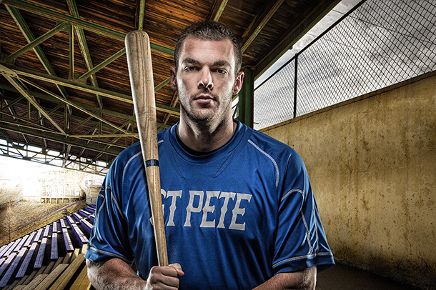
On Friday I did a series of promo shots for Performance Compound, a training facility where a lot of pro athletes train, everyone from NFL players to Major League Baseball, and did about 14 portraits that day assisted by Brad Moore and crew (that’s Third Baseman Sean Buckley above) and I thought I’d share a couple of finals here, along with the behind-the-scenes photos and the post-processed and unprocessed images.
This entire process is the same as what I showed on my Light it, Shoot it, Retouch it tour, with the addition of one extra back light on the subject (as you’ll see in a moment). Here goes:
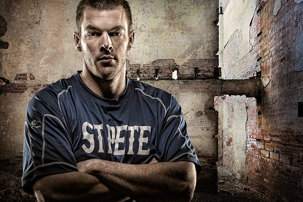
1. Above: here’s the shot as it came out of the camera. I used a Grid on the beauty dish above his head to get a quick fall-off on the light. My main concern here is the side lighting from the back, and that part looks good. His face is supposed to be darker.
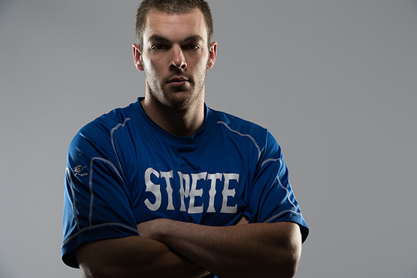
2. Above: Here’s the shot with some simple, quick adjustments in Lightroom’s Basic Panel (if you don’t have Lightroom, it would be exactly the same settings in Photoshop’s Camera Raw). The settings are below.
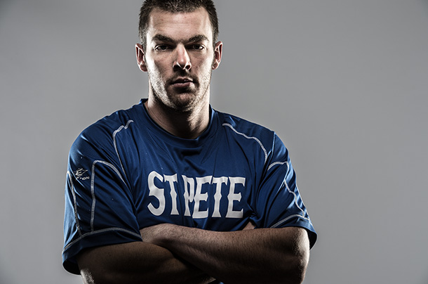
3. Above: I wasn’t kidding about simple adjustments: Just increased the Whites a bit, plus lots of Clarity and I lowered the Vibrance a bit to desaturate his skin. I also took the Adjustment Brush, increased the Exposure slider a little bit (dragging to the right) and painted over his face to brighten it (It’s supposed to be a lot darker than the sides, but I thought it was a bit too dark). The white balance was set to Auto in my camera and look fine in this case.
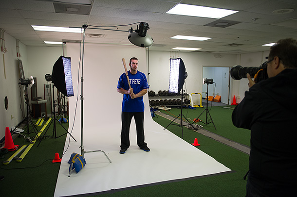
4. Above: Here’s a behind-the-scenes shot of the lighting set-up: 17″ beauty dish with a grid: two strip banks in back on the sides with fabric grids. We have a tiny bit of light on the white background to make it a very light gray (if we turned the power up, it would turn solid white). Production photo by Brad Moore.
5. Above: Here’s a composite from the exact shot you see in #4. The two backgrounds (here and at the top) are from an awesome company called “Photo Art Streetscapes” (link). Their stuff costs a bit more, but it’s totally worth it.
As for matching him to his surroundings: I showed the techniques of how to match the overall color and tone of the composited image on my live “Light it, Shoot it, Retouch It” tour, and in my “Light it, Shoot it, Retouch it “ book as well (Amazon or Barnes & Noble), and Matt covers all of this in his Compositing Secrets book, too! (Amazon or Barnes & Noble).
Well, there ya have it —- short and sweet. Hope you all have a fantastic Tuesday! :-)




Very cool!
Thanks Darren. :-)
Wow! Amazing edit! Love it
Thanks for sharing
cool, thanks scott
I see I missed guessing the light on the white backdrop. That one surprised me just a little bit, but I’m guessing the background was a bit too dark without it.
Thanks for sharing the setup. I always enjoy these lessons.
Hey William. Yeah, the background fell to a very dark gray so we had to light it a bit. Brad put diffusers in front of the background lights and then I had him pull them way back to lower the amount of light even more so it didn’t go white. Only took a minute or two of tweaking, but I really wanted that light gray — make the selecting job a cinch.
Scott, What changes would you make to the background lights if the background was say a Savage Thunder Gray, which is a darker shade of gray?
Thanks for the great blog post.
Great work, love to see it. Very, very Joel Grimes-esque. Totally see his inspiration all over this. He would be proud.
Awesome post as always, Scott. I think you met to say when you grabbed the Adjustment Brush, you “decreased” the exposure by dragging to the “left” to make his face darker. Of course it’s early and I haven’t had my coffee. Thank you for all you do.
The instructions are right, but it’s supposed to read “I thought it was too dark.” Written before my coffee. I’ll go fix it now. Thanks. :)
Did you light the background so you could select him better for the composite? I wouldn’t have lit it at all if I was going to blend him into a scene later. However, if that trick works then I’ll use it. Great shots. I refer to the LSR book frequently for tips, great reference.
Extracting him is easier on a light gray background (that seems to be the best all-around color) and without the lights on the background, it was a very dark gray. Hope that helps.
Any recollection of what the (even approx) ratio of BD to skims was?
The beauty dish was powered all the way down as low as it could go.
Cool, thanks!
Love it when you make posts like this, Scott. Thanks! :)
Balliolman,
England.
Great post, Scott. Short and sweet, but it shows how simple these kinds of shoots can be. It’s been awhile since you did one of these posts…Brad’s behind-the-scenes shots are particularly helpful! Will these shots be used for an local ad campaign for Performance Compound?
–John
Hey John — absolutely. :)
Great post Scott!
I love it when you show us how you do your shoots.
Hope to see you back in Boston again soon!
Scott, I love what you do. But in this picture, your subject looks a little bored or dead in the face. For me, your subject needs an expression on his face to sell the shot. I’m sorry, he is just a guy holding a bat.
Great post work as always.
-Marlon
Actually, I rather liked his expression.
For crying out loud, you are joking Marion, right?
Do you think you could accomplish the same results, or close to, with three or four speedlights? As a journalist I must travel light. Great work!
Absolutely! You can buy strip banks and a beauty dish designed especially for use with speedlights that are lightweight and very portable. Check out FJWestcott.com
Pretty cool setup :]
Great post
پکیج
The picture are not showing up?
amazing tnx
erewrwerwe
Hello
The content was very useful, thank you
??????