It’s #TravelTuesday and I, Dave Williams, am back! Today, I want to touch on some colour science. Yes, “colour,” because I’m British – get over it!
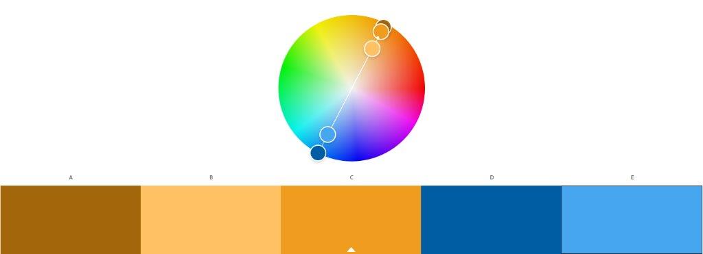
Let’s start with the importance of colour. We all know that as photographers we are creating art with light, but from the outset, and then when we get into our post-processing, it’s important that we give due consideration to colour, as well. There are colours that naturally work together that create our epic sunset and sunrise images, which I’ve talked about many times before, and those are blue and orange. The reason we’re so attracted to these images deep within our subconscious mind is because of this complementary play of colours. On the colour wheel, we find that orange and blue are opposite one another. This is what essentially defines them as complimentary colours.

This colour psychology extends beyond merely being something that pleases our minds, though. There’s something physical going on when these colours are working together with our eyes.

I’m no ophthalmologist, but hear me out. In our eyes, we have rods and cones which are responsible for detecting colour and shade. These sit on our retina, which is at the back of our eye, and specifically, it’s the cones that deal with colours. Here’s a fun fact: – The rods work well in low light, and there are 20 times more rods than cones, which is why we find it hard to see in low light.
We have three types of cones: – those that see red, those that see green, and those that see blue. When these cones are activated in different combinations, we see the world in glorious technicolour. Interestingly, these are the colours that add up to being the primary colours RGB. Here’s another fun fact: – around 12% of women actually have four different kinds of cones, so they can see more colours than most people! That explains all the colours some people come up with!
Anyway, we can provoke our cones to demonstrate which ones are working and which aren’t in this simple little piece of science. Take a look at the heart below. Stare at it for 30 seconds straight with no movement whatsoever. When 30 seconds is up, immediately turn your eye to a white surface, like a wall or a piece of paper.

What should have happened is that you should have, for a couple of seconds, seen a red or pink heart on the white surface. This is because the other cones have been stimulated but the red has not, so the red receptive cones created the image in the absence of the other colours. It’s a pretty cool demonstration of the way our eyes work and of the balancing of colours.
Anyway, when we shoot, we should consider complementary colours, as well as other colour harmonies, and, luckily for us, Adobe has given us a helping hand in the form of this colour wheel. We can see various colour principles at play and create a colour palette that we can take into our Creative Cloud account and use in tandem with our creations across Photoshop, InDesign, and the entire range of Adobe apps that feature the Adobe Color Theme panel.
And with that, I wish you a good Tuesday!
Much love
Dave


