Here’s a really popular, super simple, technique for creating ad backgrounds (you see this look a lot in print ads and online banners. The one we’re going to recreate is a print ad I saw for the Modern Shoe Hospital), but there’s an added super-handy trick inside of this, and it’s how to keep the original drop shadow from a placed product shot on a white background. It’s cooler than it sounds. Here goes:
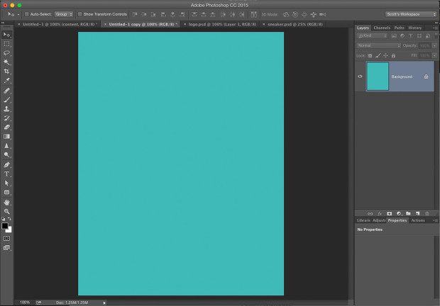
STEP ONE: Open a new document and fill the background with a solid color. This doc is around 8″x10″ at 72 ppi resolution.
STEP TWO: Create a new blank layer, then get the Elliptical Marque tool and create a large oval-shaped section (like the one you see here). Now set your Foreground color to white, then press Option-Delete (PC: Alt-Backspace) to fill your oval with White (as seen here). Now you can Deselect by pressing Command-D (PC: Ctrl-D on PC).
STEP THREE: Now you’re going to blur the living daylights out of it. Go under the Filter menu, under Blur and choose Gaussian Blur. Enter 80 pixels and click OK (you can use a lot higher amount on a high-res image. This is just 72 ppi). The goal is just to make it look really blurry like what you see here.
STEP FOUR: now that our background is done, open the product shot you want on this background and copy and paste it into your background document and position it in the center (as seen here).
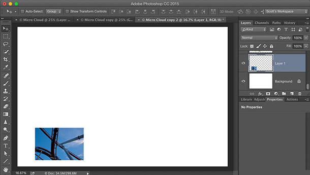
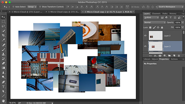
STEP FIVE: Our goal here is to remove the white background yet keep the original drop shadow. This is easier than it sounds. First, duplicate the product shot layer (the sneaker layer) and hide that layer from view by clicking on the eye icon to the left of the layer. Now click on the original sneaker layer. Hold the Shift key then start pressing the “+” key on your keyboard. Each time you press Shift-+ it toggles you through the different Layer Blend Modes. At this point, don’t worry at all about what the sneaker looks like — we’re only concerned about the drop shadow at this point, so keep toggling through the blend modes until you find one where the shadow looks natural (in this case, it was the blend mode Linear Burn). The shadow looks pretty good, but the front and back of the sneaker are white, so they’re letting the teal background show through quite a bit, but that’s why we created that 2nd sneaker layer.
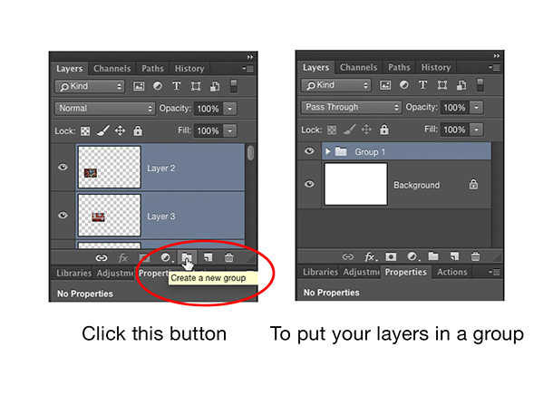
STEP SIX: Now make the top layer (the duplicate sneaker layer) visible again. Hold the Option key (PC: Alt-key) and at the bottom of the Layers panel click on the Layer Mask button (it’s the third icon from the left). This adds a black Layer Mask over your original sneaker image (so, the layer is still there, you just can’t see it because it’s hidden behind that black mask). Now get the Brush took; make sure your foreground color is set to white; choose a small soft-edged brush tip (from the Brush Picker up in the Options Bar), and paint over the front and back of the sneaker to reveal the original sneaker in those areas (as seen here where I’m painting over the front of the sneaker. You can see the original sneaker being painted in).
STEP SEVEN: To finish things off, just add your text headline, your logo (with a slight drop shadow from the fx menu at the bottom of the Layers panel in this case, since it’s really hard to see that white text over that white glowing oval), and you’re done.
It’s Down. It’s Dirty. It’s Done!
Hope you all have an awesome weekend, and we’ll see ya back here on Monday when we’re all not so cheery. ;-)
Best,
-Scott
P.S. Let me know how you feel about this Photoshop Down & Dirty tricks. This is the third one I’ve done in the past two weeks, and I want to make sure you’re digging this type of stuff. If it’s too far away from what I normally do here, let me know.



Scott, these are great – please keep it up. Seeing how to produce finished pieces like this is awesome.
I love it. Please keep them coming
Awesome – these are well worth it. Please keep ’em coming.
Like This one ;-)
This is great! Keep it up
great tip
Great tip thank you bunches
Love all your tips! Thanks so much!
Thank you, i like Photoshop Down & Dirty Trick
THANKS! Keep these coming!
Scott, I love these Down & Dirty tricks. Your straightforward manner of “showing us how it’s done” is classic Kelby, and why I became a fan in the first place many years ago. Thank you, and please keep them coming!
On a totally separate note, I’m a drop less enthusiastic about the latest blog redesign. It loads very slowly in IE11 and causes other random errors. Maybe your coders could look into this? In any event, I love coming here every day to see what you have to share with us. I appreciate all of your hard work.
-Mark R.
These are great. Keep them coming!
Well. Like a lot of people I was just going to look. But since you asked for comments, I will give mine. There are so many things that can be done with photo editing software and I at times find it daunting to discover how to do something. This down and dirty trick sounds very good and I know where I will be using it. I have a facebook post I want to make tomorrow and this will fit in perfectly. I like learning from videos but sometimes it is hard to understand the details. It looks like you have included everything here. Thank you Scott Kelby P.S. Please keep these coming. Randy K
So dirty, I am going to go wash now…and use that in the future to get even dirtier.
Love these tips!!! Please keep them coming!
Scott, I love your tips. That is one of the reasons why I subscribe to Kelby one, watch The Grid, go to your seminars and buy your books. I like your blog to see what you are currently up to and what you are excited about. Even though you don’t know me from Adam, it helps me feel a wee bit connected to the leader of the Kelby enterprise. A few tips are great, I’d like you to keep Scott, family, friends and crew in the picture also.
Keep up the Great work!
YES, I am digging this type of stuff!! Keep them coming Scott :)
this is the stuff that made me join NAPP all those years ago :) Lovin’ it !!
I’ll join the masses and say that you should keep these tips coming. Maybe make Friday your Tip Day, and keep Monday and Tuesday for other news or opinions?
I have only two gripes about the new blog design….. 1) I miss your portfolio pictures at the top. I suppose if I want to see them, I can click on the link to your portfolio, but… :-) Also, it always seemed that when I opened your web page, I got the shot of Tom Brady passing as the first photo. I miss that! 2) I HATE the placement of the link to the comment section. After I read the entire post, I have to scroll to the top to find the miniscule link to comment. The site used to have a secondary link at the bottom of the post. Time saving! I will say that Discus loads better with the redesign. It always hung when loading in IE and I had to try multiple browsers to get it to load. Ok, whine over.
Have a great weekend shooting football!
–John
I dig it. Thank you for sharing, fine sir.
Really love this stuff Scott!! Thanks.
This is very appreciated. Thanks for sharing especially with such Excellent instructions!
Love the quick hitters!
Scott, I’ve always considered your idea to blog about what you are doing to be a mistake. What you are doing may be of some interest, but is overall not too useful. So, I truly hope you continue with tips, tricks, and equipment reviews. You have a special gift of being able to to teach with conciseness and clarity. Keep up the great work.
I have some photos with same problem, but original background is green and not white. Is it possible to do the same trick? :D
Nice and simple, looks great too :)
Love your tips, thanks for the inspiration!
Hi Scott
I agree with everyone here. You have a special talent for teaching and as a subscriber to your lessons website for many years I generally like to view the ones you teach. Not everyone (even though they may be an accomplished photographer/re-toucher/ect.) can teach and make it enjoyable. You CAN!
You are an incredibility successful individual who lives (on appearance) a story book life. I enjoy and appreciate your talent and work. It is because of your Digital Photography book series (and some hard work on my own) that I have vastly improved my own photography.
So please keep doing what you do. I enjoy hearing about your fabulous adventures, although they are beyond my reach, your greatest contribution (in my humble opinion) is your sharing of your talent and teaching.
I also understand the need for change and refresh but I do not enjoy the new blog look as much as the old one. Sorry for the negativity.
Yeah, it’s temporary. A much better, cleaner, and just improved all-around blog design is coming next week. Didn’t like this one very much as it turned out.
???? Amazing! Thanks for sharing, as always!
Love the Down & Dirty Tricks! Keep them coming. For me — its one of the best ways to learn. It also helps with my own inspiration. I learn how to apply what you teach to my own projects. Thanks
Love the tips! Especially when they are not CC specific. Thanks for sharing!
Awesome tips!
Excellent! Reminds me of the superb, short videos we used to find on NAPP. They were brilliant.
Scott,
I love your down and dirty tricks! Keep them coming!
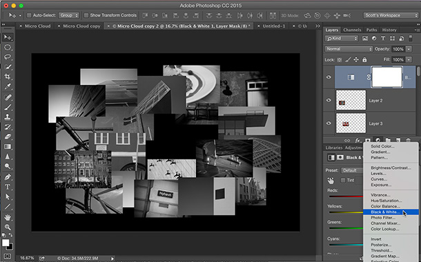
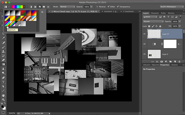
I love them… I did the rainbow colored one for an auto restoration shop using a few dozen photos from around their shop. It was awesome. Keep these coming. Looking forward to seeing you in Austin.
I’m liking the tips Scott. The new blog is a little wonky to navigate, preferred the old format. But we’ll get used to it. I thought my screen was really dirty at first, but as I scroll down the grey smudges on the left and right side move as well :) (You fooled me!)
I have really been enjoying them so it would be great to keep it up if you don’t mind :)
Please keep it up!
72 ppi is meaningless. Only pixel dimensions matter.
Hi-I was trying this tutorial out with a product shot not on a perfectly white background. I’m not getting how I can get rid of the border around the product while doing this. Anyone?