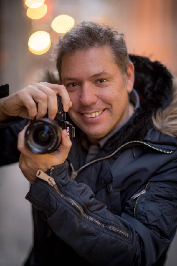
Editor’s Note: With the Travel Photography Conference coming up soon, I wanted to re-share this 2020 post from instructor Serge Ramelli! You can get more info about the conference and register at KelbyOneLive.com.
15 Years Of Retouching and My “Over Retouching” Story
When I started photography 15 years ago, what attracted me to it at first was the post-processing process. I remember seeing some super strong HDR photos that I was in complete admiration of, hoping that one day I would be able to pull that off.
So I started photography using Photomatix and doing lots of HDR. I felt like a kid that was given a toy. And like any kid, I played with the latest toys until I got bored with it
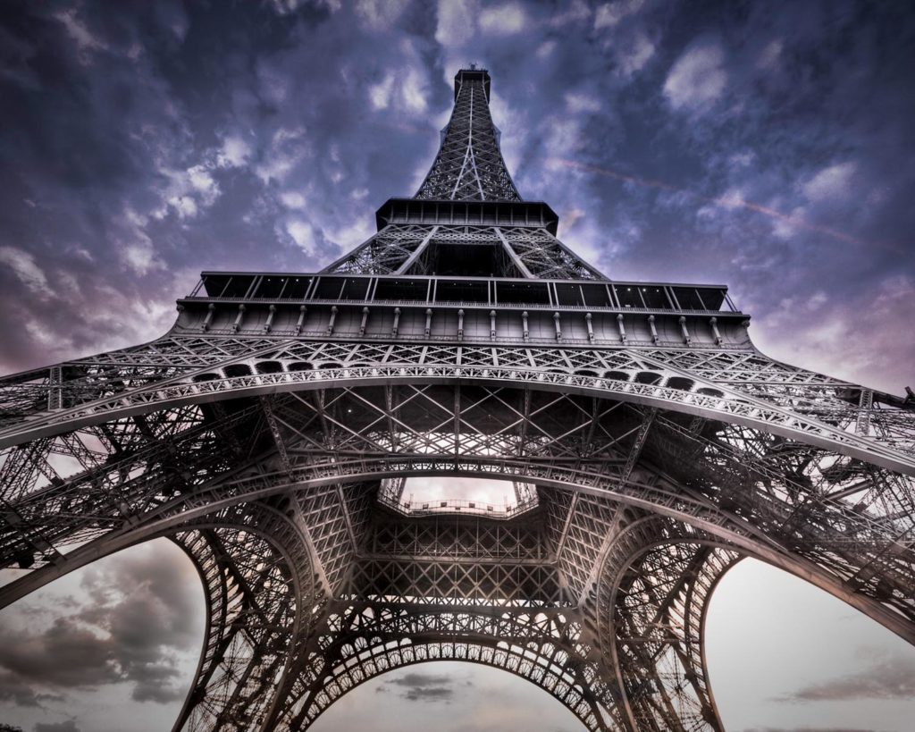
I loved doing this kind of photography. But there was just one thing that bothered me. The first reaction I was always got was, “Did you use Photoshop?” All because I used a post processing software. It sort of meant to me that I was not any more a legit photographer, but more like a graphic designer.
At first this did not bother me. But after years and years of getting this reaction, I started getting a little tired of it.
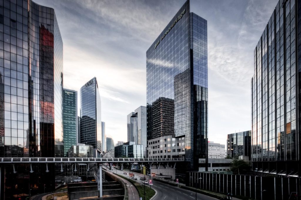
In 2010 I went to Photoshop World for the first time in Las Vegas and discovered the work of Peter Lik. I was absolutely in admiration of his photography and the size of the gallery in the Mandalay Bay Hotel. I did some research on him and discovered that he had several galleries on his own. Since then, I visited the one in Soho New York and Rodeo Drive in Los Angeles (which is now closed). I spent hour observing the reactions of the public in the gallery.
What surprised me the most is that the public usually reacted with, “Wow! What a beautiful beach, what a great city,” etc… there was no mention of Photoshop.
It was clear to me that there was some serious post processing done on his photos. But it was good processing. Processing that made the photos very dramatic but with a natural flair.
I then realized that there were several issues in my photos.
Too Much Clarity
Too much clarity makes a photo look like a drawing. For example, see this photo below taken of the same scene. One has a lot of clarity and the other one has a more natural look:
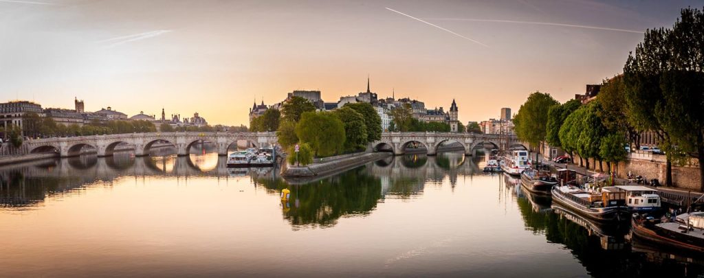
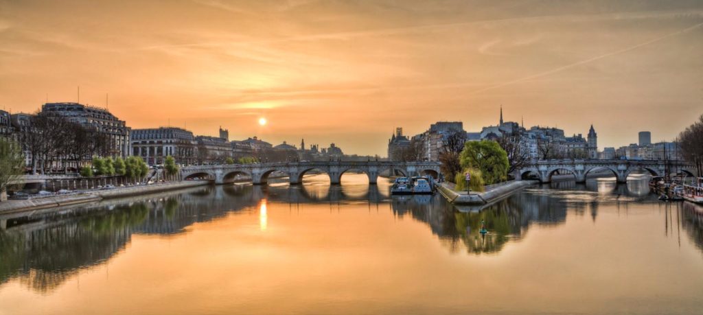
There is nothing wrong with the HDR look. I think that as an artist we should be able to create the effect that we want. I just found out, after 15 years, that when you can nail the super dramatic, while staying natural, it creates more emotional impact as it takes away the idea that that some quick and easy filter was used.
Color/Hue/Saturation
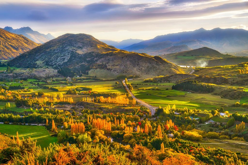
I always thought that the problem with my photos was too much saturation. If you get ever a chance to go to Clearwater Beach in Florida and witness one of their crazy red sunsets, you will see that mother nature can get REALLY super saturated red.
For example this Golden Hour I did in New Zealand looks too saturated to me now:
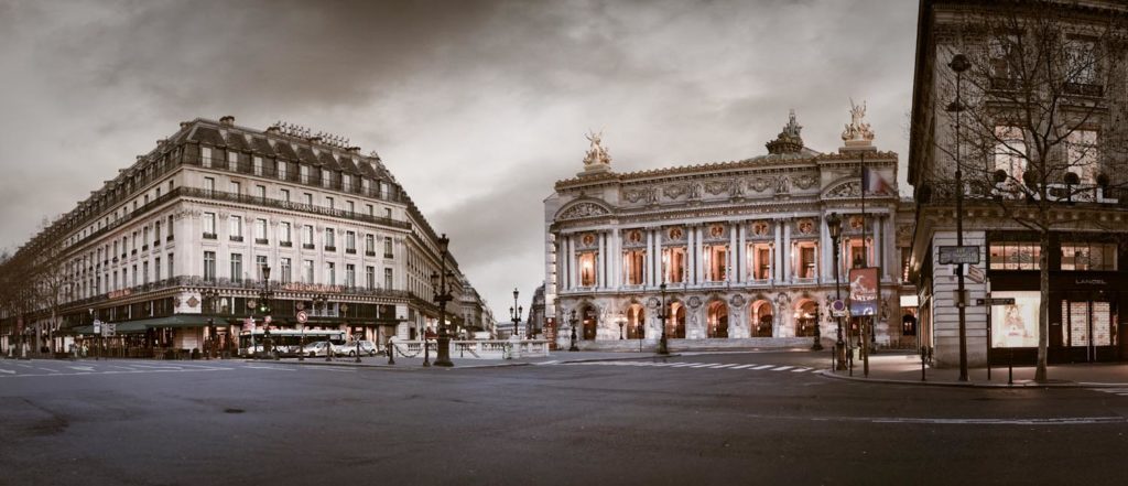
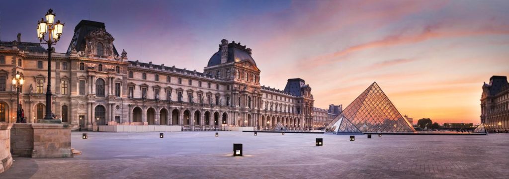
I think that this kind of photo of Paris look more natural in terms of colors:
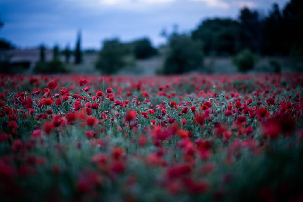
But as a note, when you take a photo with a very strong bokeh, that is not a natural effect you have used a lens to create this look, unless you have some serious eye issues.
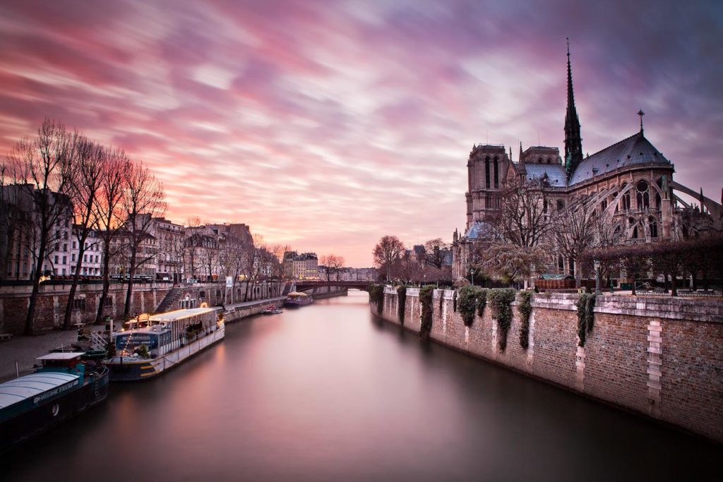
Or if you are using a ND filter, you may get a heavy magenta cast and stretchy clouds and flat water. That is not natural either.
In any case I think you should create the style that you like and you feel communicates to your public.
I just thought that this story might be useful for some.
My quest now is now MAXIMUM drama, but still natural. Here are some recent examples:
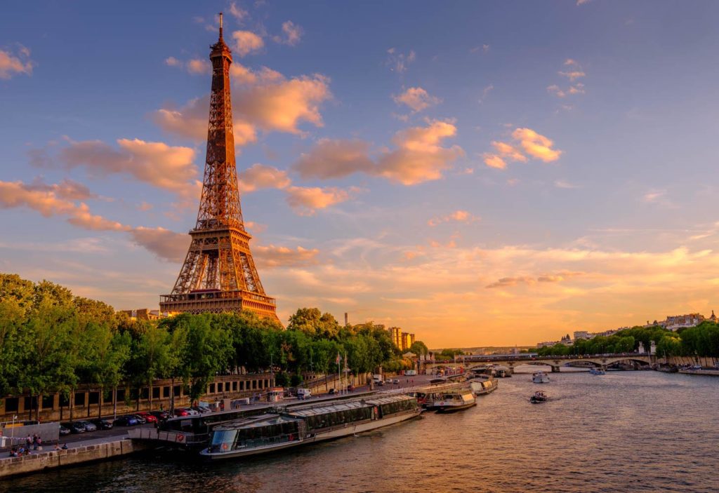
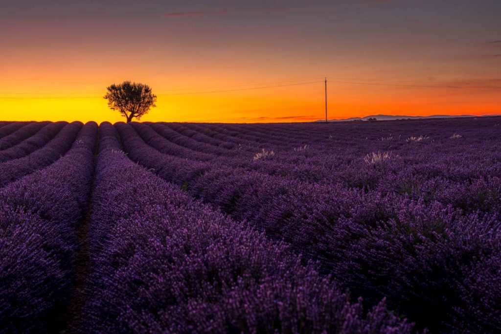
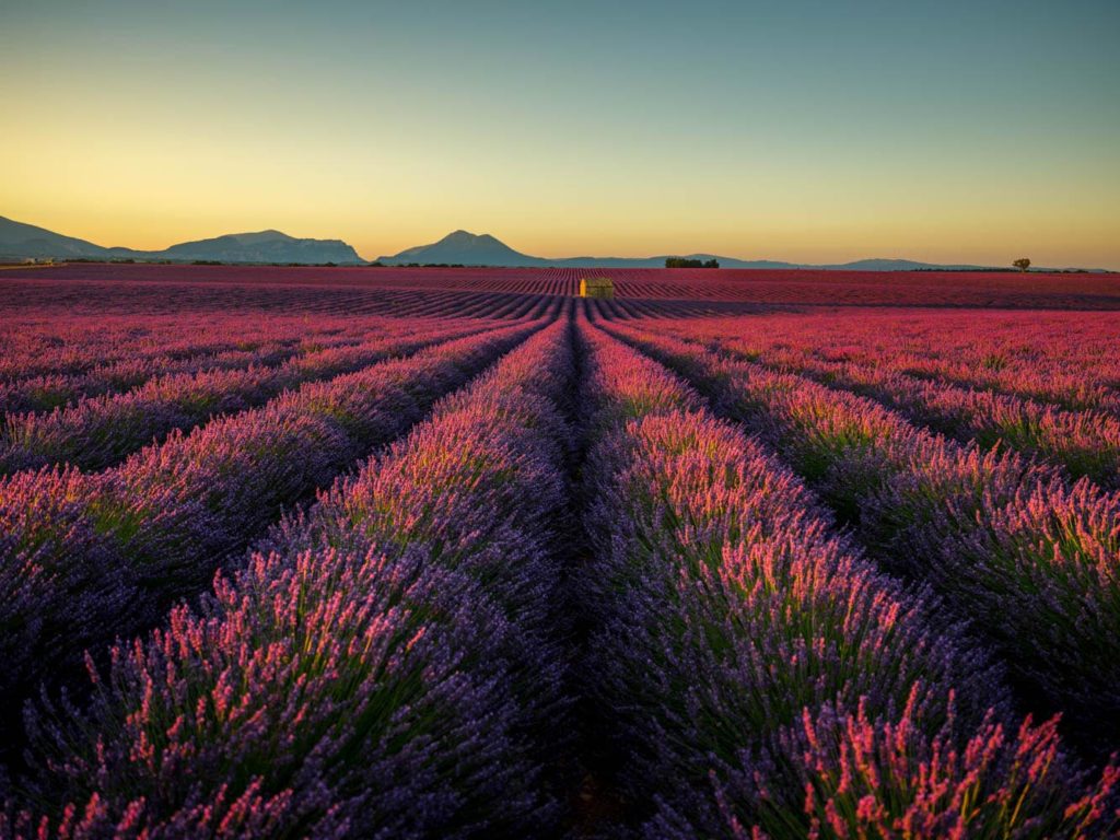
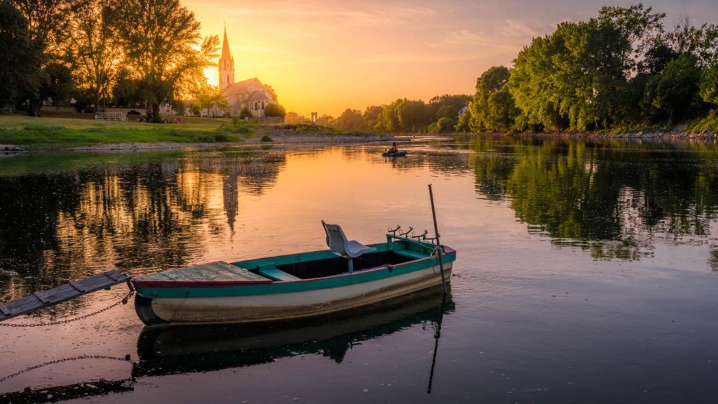
What style do you prefer? Dramatic with a strong illustrative kind of look, or dramatic but with a very natural look to it?
You can see more of Serge’s work at PhotoSerge.com, and keep up with him on Instagram, Twitter, and YouTube. Be sure to check out Serge’s classes on KelbyOne as well!

