

OK, it’s official – I’m making every Friday here on my blog, “Photoshop Down & Dirty Tricks Friday” where I’ll share a simple, hopefully helpful, and certainly fun Photoshop special effect — the type of effects you see in ads, on the Web, in banners, etc.
This one I’m showing you today I especially like because I’m showing how I created a perspective text effect for the Facebook promos I did for my last seminar tour (my “Shoot like a Pro Tour”), but I’m using the date of the next stop in my “all new” tour (my “Reloaded!” seminar), so it’s both a Photoshop trick, and a subtle plug of my upcoming Phoenix live seminar stop on Tuesday, September 22nd (like the way I worked that in there?).
Anyway, here’s how it goes (and it uses a filter a lot of folks haven’t tried, the Vanishing Point filter, which is designed to do the math for you on creating perspective effects).
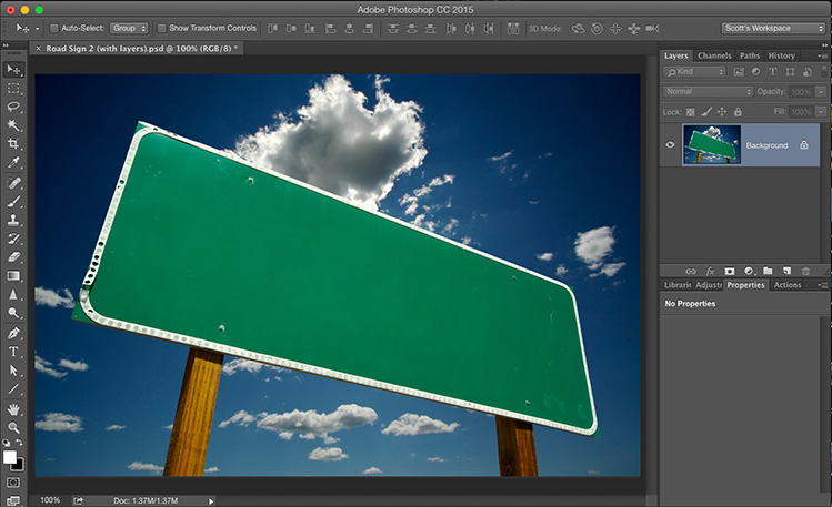
STEP ONE: Open the image you want to add a perspective text effect to in Photoshop, like the road sign shown here (it’s a stock image – you can get one like this to practice on for a buck at dollarphotoclub.com).
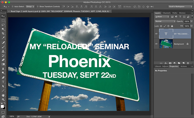
STEP TWO: Get the Type tool and create your type. In this case, I’m trying to make it look like a road sign so I used Helvetica Bold, and I left lots of leading between the lines like they do in real road signs.

STEP THREE: Go to the Layers panel; hold the Command key on Mac (the Ctrl key on Windows), and click directly on the “T” thumbnail icon to put a selection around your type (as seen above). Now press Command-C (Windows: Ctrl-C) to copy that selected text into memory. Now you can delete that Type layer by dragging it into the Trash can at the bottom of the Layers panel. You’ll want your perspective text to appear on its own layer, so add a new black layer above your sign layer, and then press Command-D (Windows: Ctrl-D) to Deselect your text.
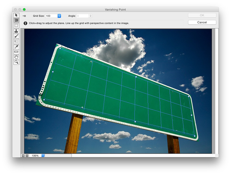
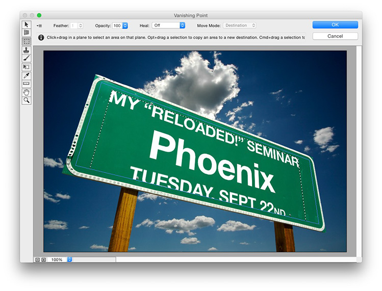
STEP FOUR: Go under the Filter menu and choose Vanishing Point to bring up the Vanishing Point window, seen above. Click on the 2nd tool from the top (it’s called the “Create Plane” tool). You’re going to click it once just inside each corner of the sign (it works kinda like the Polygonal Lasso does, but with a rubber-band effect, dragging out a straight line as you move your cursor. It just takes four-clicks — one in each corner until you create the full four-cornered shape, and it applies a blue grid like you see here, to let you know the shape you created worked. NOTE: If you see a yellow grid instead, that’s a warning that’s it’s probably not exactly right, so you might want to futz with it a bit, moving your cursor slightly one way or the other until it turns blue. It the grid turns red, and the grid disappears, so you just see the outside border, that’s letting you know that you’re way off, and it’s not going to work. But never fear, this filter helps you out pretty well and chances are you won’t have a problem.
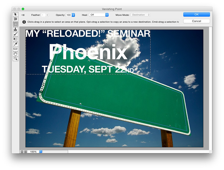
STEP FIVE: Press Command-V (Windows: Ctrl-V) to Paste your copied text into Vanishing Point. It’ll appear just floating there doing nothing special, up in the left corner, as seen here.
STEP SIX: Click your cursor inside your text and drag it down over your grid and all of a sudden it just snaps into the grid with the proper perspective automatically applied, (as seen here). The text here is a little too big for the sign (it’s cutting off the bottom of the letters in the bottom row), but we can fix that easy enough in the next step.
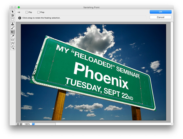
STEP SEVEN: Switch to the sixth tool down in the toolbar on the right — that’s the Transform tool (shown selected here). It kind of works like Free Transform, so hold the Shift key (to keep things proportional); grab a corner point and drag inward until the text fits on the size without any problem, as seen here. You can reposition your text anywhere within that grid (moving it up/down/left/right) using that same tool. When it looks good to you, click the OK button in the top right corner, and it applies the perspective effect to your text, and renders it on that blank layer you created right before you open the Vanishing Point window.
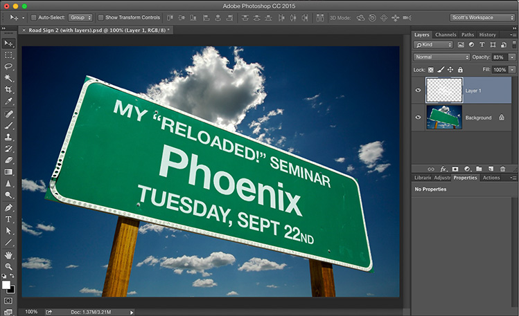
STEP EIGHT: Now you can see the text added to the sign with the proper perspective effect (the letters are larger on the left and get smaller as they move to the right side of the sign proportionally, like they would in real life). Lastly, we want the letter to not look so “Added after the fact” and a great, simple trick for that is simply to lower this layer’s opacity a bit so the letters look more like they’re on the sign (in real life, those letters wouldn’t be 100% solid white — the ink would have bled into the sign, and been washed out a bit by the sun), so I always lowered the Opacity for these signs to 83% (as seen here).
Now that you know this technique, on some level doesn’t it make you subconsciously want to come spend the day with me in just about three weeks learning some really cool, really intriguing, and really inspirational photography stuff? It does? Great! Then just follow this link to sign up and we’ll spend the whole day together on that Tuesday (I wish all my effects worked this well as a seminar promo). ;-)
Hope you all have a great weekend. I’m shooting the Bucs/Browns game tomorrow night (sad to hear Johnny Manziel probably won’t be taking any snaps due to soreness in his arm — I was hoping to get some “Johnny Football” shots). It’ll still be a blast, even shooting in the Florida heat (and it’s crazy hot here right now), but it’s still football, so I’ll be there with a big smile and a long lens or two). :)
Best,
-Scott
P.S. We just released my “Retouching Brides” online training class. If you shoot weddings, I think you’ll really find it helpful. You can watch it right now, online for just $19.95 – here’s the link – and after you’re done, you can watch all my other classes too, because that $19.95 gets you a full month of unlimited access to the entire library of all our online photography, Photoshop, and Lightroom classes (not just my classes – all of ’em!). Just sayin’- that’s a pretty awesome deal. :)
Scott, great idea to make Friday your tip day! Wonder who mentioned it first? :-)
Hope to see some football shots on Monday or Tuesday (or on Facebook). We’re all going through a bit of withdrawal here from your sports photos.
Have fun at the game, and remember to hydrate! :-)
–John
I just worked through the tutorial and found two things that need correcting/mentioning: In step 3, “black” layer should be “blank” layer; in step 5, you should add that prior to pasting copied text into Vanishing Point you need to first click on the Marquee Tool located below the Create Plane Tool and then paste the copied text. Great tutorial!
Scott, this is the perfect example for the Vanishing Point. Thanks for the Great Idea and tutorial!
You Rock Buddy!!!
Thanks Scott – Will look forward to Fridays even more now with your Down & Dirty Tricks!
That’s super cool!! Just learning PS, using as much of your tutorials as I can. Thanks Scott.. You Rock!!