

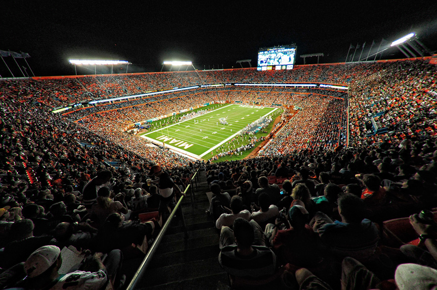
I forgot to post this fisheye shot from the game in Miami last week, but when I was getting ready to post it, I thought, “I wonder if I should correct the fisheye distortion?” So, I gave it a shot.
In Photoshop CS5, it’s an automated process—just open the image in Camera Raw, go to the Lens Correction panel, and turn on the Profile correction and it does the rest in all of two-seconds flat. Here are the results:

(Above: Here’s the original uncorrected photo, taken with a Nikon 10.5mm fisheye—a DX cropped lens on a FX full-frame body. I love how this DX lens looks on the Full frame body—it’s not too over the top).
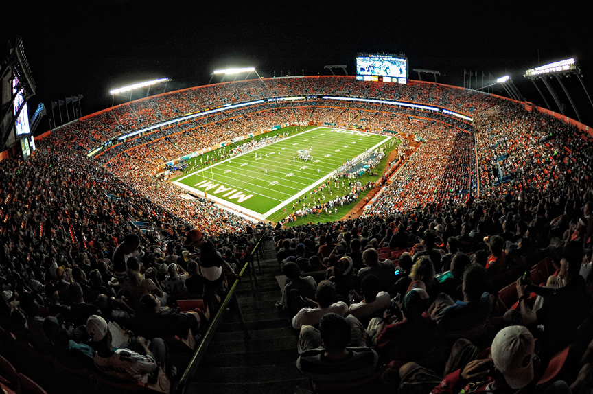
(Above: Here’s the fisheye effect corrected, removing all the roundness that comes with shooting a fisheye lens, using the Photoshop technique I mentioned above).
The top one looks more “classic fisheye” but then when I look at the bottom one, I think, “Well, this looks a lot more like what it really looked like in the stadium that night” but I’m not really sure I like it better.
What do you guys think? Uncorrected (and round) or Corrected and flat? I’m really curious to see what you guys think.
I’ve got one more for you, but this one was taken by my buddy Mike McCaskey (who was shooting along side me that night). He sent me a bunch of his images from the game, and I just fell in love with this one, of Chicago Bears Linebacker Lance Briggs, and I asked Mike if it was OK if I shared it with you guys. That’s the kind of smile that says “We’re winning this one!” And, of course, they did. And the next one, too! Go Bears! (8-3).

In looking at the two fisheye images now posted on the blog (I looked at a preview before the final post went live), I think I need to darken the handrail going down the stairs. I think it’s kind of distracting. A 15-second fix in Photoshop:
#1. Add a Levels Adjustment Layer and drag the center Midtone slider to the right to darken the midtones
#2 Drag the far right Output slider to the Left to darken the overall image (as shown below);

Then press Command-I (PC: Ctrl-I) to invert the Adjustment Layer Mask. Get the Brush tool. Make your brush size very small. Set your Foreground color to white, and paint right along the railing to darken it. The final result is shown below.
(Above: The final image with the rail darkened. Why didn’t I try that on the corrected version? Just bein’ lazy.). ;-)
What’s good Scott?
I don’t think you should fix it. The guy’s hat in the correct version bothers me a ton. It looks better in the one right out of the camera. This is one of those tricky ones though. It amazes me still how CS5 corrects like that. It’s just with a POW! haha
I hope everything is good, great shots from the game in the last post as well. Could remember if I left a comment or what, I’m pretty sure I would have read it on my phone last week.
—
DT.
Miami, Florida | Nassau, Bahamas
Definitely the uncorrected one. Weirdly enough it looks more organic to me. Seeing the comparison of the two yields a very jagged feel to to corrected one. Plus after a more detailed look. I don’t think I like weird blur effect the audience gets specially at the top right and even in the near foreground. Great image.
I am going to have go with uncorrected, i love it. The corrected one looks good except, now it’s prominent that the guy on the lower right is being chopped off and the guy of left is getting super warped with the correction.
Cool portrait of the linebacker!
Not even close ….. Uncorrected.
Uncorrected if going for the artsy fartsy look.
Corrected has its merits as well.
I’d wager that most folks into art and photography would choose the artsy fartsy version.
Guess which group most readers of this blog fall into. *wink wink*
First – great shot. Second – I prefer the corrected one. The straight line of the rim around the stadium just looks better IMO. Thanks again for sharing your thought process with us.
I keep changing my mind on which one I like better but I will settle on the uncorrected first photo as the foreground becomes too distorted in the “fixed” one.
I love the uncorrected shot as it has a really nice organic line. I think the corrected shot would work better if the stadium rim was straighened a bit more. The horizon looks off to me, thats coming from a graphic designer who needs somewhere to align his text.\
I love your work though, awesome stuff.
If I were going to frame it I would go with the corrected version, to me it makes the stadium look bigger. It’s really just a matter of taste.
KT
Ken:
I hadn’t thought of it, but you’re right—the corrected one makes the stadium look much bigger.
S.
I prefer the corrected version. As mentioned earlier, the white hat is distracting like the handrail was but that’s a problem with the hat and not a case of corrected vs uncorrected. For this specific framing, the corrected photo has me feeling part of the crowd and experience while the uncorrected image has me feeling like I could be in a helicopter. I want to feel like I was actually there.
Hi Scott,
Some comments from the other side of the ocean ;-)
If you ask me, i like both photos. My taste will vote for the corrected one because i like the symmetry and the stadium is the main subject. But real world photo is the uncorrected one. Tough choice hmmm… i think my 51% will vote for the corrected one IMHO ;-)
Greetz,
JdK
Corrected every time. But then I have rectilinear wide-eye lenses (EOS 14mm) and TS lenses, so I guess I’m serious about things looking real.
excellent post! thanks a lot for sharing..
Well, both image convey something that I like. It all depends on what you’re want the picture to say really.
The corrected one give the feeling of a big stadium with a mile long field while the uncorrected one give the impression of a arena closed upon itself with the crowd just about capable of touching the guys on the field.
I’m fond of uncorrected fish-eye pictures, they give a “we live on a small planet” feeling to pictures that I think is important.
Hey Scott
I think I prefer the uncorrected shot as it is. The original hand rail slowly draws your attention to the center of the pitch which is always a good thing, as you’ve got more things to look at. However, in the corrected photo we’re looking straight at the pitch being the focal point. Also in the corrected photo the guys caps (sat on the left and right bottom corner) look really stretched, doesn’t look quite right. Although a positive side to the corrected photo makes the stadium look a lot more bigger.
Tough choice Scott, I like them both for different reasons. There’s something really exciting and dynamic about the uncorrected version that really works well for this scene, the roundness keeps pulling me right back in.
On the other hand the realness of the corrected one makes the scene feel grander somehow, maybe just wider and more open, and it gets rid of some of the distracting side elements.
I vote both. It feels like two different photos.
The corrected, it just gives a wider feel to it (as mentioned above). Also, fwiw, your sports photography shots have really ratcheted up a notch. I can tell this is becoming a passion for you and is not just “reporting”…the quality of composition and your treatment would rival any magazine photos I see these days! Great work!
not 2 correct buddy ;)
Usually I don’t like the fish look in most scenarios when it ‘just distorts’, but this time it emphasizes the already ’round’ stadium, that’s why I think it looks quite natural and it’s harder to choose between the shots. So I seem to prefer the fish look.
Also I’d try 16:9 crop for the corrected one.
Corrected and with the rail not darkened down (Not that you showed the corrected/darkened option). I sort of like the idea that the rail is almost like an arrow pointing toward the field. I hardly noticed the fans in the stands on either side of the rail. I’m sure you show one shot out of the 1,000s you take at an event like this, but it’s always a humdinger. Great post as always.
I like the uncorrected one myself. I’m always asking the same question when I use that lens also. As always, another great image.
I like the uncorrected one. Straight lines and realism are good, but sometimes it’s nice to distort perspective a little. The first one looks like you are up higher, slightly above the stands and has a nice feel to it.
I like the uncorrected one better. The corrected one distorts the light rays.
Uncorrected. In this photo the composition is much more interesting. The lines of the stadium help move your eye from the field through the stadium and back to the field again. For me, in the corrected photo, my eye tends to hit the field and stay there. It is much more static. Plus, it is a little easier to read miami in the uncorrected photo giving it a slight editorial edge over the other photo.
I vote uncorrected. When I look at the corrected version my eyes jump right to the scoreboard because of it’s odd shape. In the uncorrected version I sort of see the whole scene and then focus on the field and what’s going on there.
I like it uncorrected. Leave the roundness.
I think an in between version. The uncorrected is really fisheyed but the corrected is to “flat” I think. And the big screen in the back is looking unnatural with a strange shape. And the roundness of the original is great….
Uncorrected definitely!
I think the choice depends on what you want to emphasize. Uncorrected emphasizes the playing field, corrected emphasizes the fans. Both work for me depending on how you want to use them in the end.
The uncorrected one for sure! Don’t know what it is but it looks funny. Can’t explain though but that the fun part of photography I guess.
I definitely prefer the uncorrected one as well.
I think the reason everyone is preferring the uncorrected one is because the uncorrected one is Symmetrical. Meanwhile, the corrected one has a lopsided horizon line.
So one makes you feel like you’re looking at a well composed photograph – and the other makes you feel drunk.
It’s not really a fair comparison. That being said, I, too, prefer the uncorrected one
Corrected, leave the rail alone.
I like to see things in photos as I see them with my naked eye. Never have been a fan of fisheyes for that reason.
As with the others who took this stand, I’d leave the rail alone. I like the rail acting as a leading line onto the photo, forcing the eye to the field.
You might take it all a step further, and correct the perspective. Straightening out the scoreboard so it doesn’t look like it’s about to fall over would also put some skew into the crowd in front — that may be a way to give people like me what we want, and still get some of the feel of the fisheye for those who like that look.
But who am I to tell you how to correct (or not correct) your photos?!
Corrected, but leave the rail alone.
I like to see things in photos as I see them with my naked eye. Never have been a fan of fisheyes for that reason.
As with the others who took this stand, I’d leave the rail alone. I like the rail acting as a leading line onto the photo, forcing the eye to the field.
You might take it all a step further, and correct the perspective. Straightening out the scoreboard so it doesn’t look like it’s about to fall over would also put some skew into the crowd in front — that may be a way to give people like me what we want, and still get some of the feel of the fisheye for those who like that look.
But who am I to tell you how to correct (or not correct) your photos?!
Hi Scott, great work, great post as usual. I’ve been quiet for the past while … difficult times.
Nevertheless, I prefer the corrected version, but with a few small changes; the horizon line straighten, the railing leading to the field toned down, not as much as in your version but fading gradually to darkness towards the edge of the photo (I believe this line is an important add to leading the eye into the field) . I also would darken the hat or person on the bottom left hand corner. The hat on the bottom right of the image will disappear as a consequence of straightening the horizon. If it doesn’t I would remove it.
It is a GREAt image and as mentioned by Ken, it will make the stadium look much bigger if the lines are corrected. :)
I prefer the original. It’s not too extreme. Actually, when I first saw I thought it was already corrected! The adjusted version loses the energy of the original.
I like the corrected one because I feel more like I am there, part of the crowd. The uncorrected on makes feel like I am floating above the crowd. :)
I prefer the uncorrected one!
Scott! Its not what we think that matters. Both photos are great! What matters is what the client wants! If I was the client would want the uncorrected version. Why? I like the rounded edge that the fisheye lens makes. Its a perspective that I can’t see with my naked eye.
Thanks for sharing your photos.
Hey Scott,
I think I prefer the first, but I think the second would be better for certain applications such as an advertisement or billboard. However the only thing that bothers me in the corrected one is that the line created by the top of the stadium is just slightly leaning to the left. It’s almost like a horizon line and I wonder if it would look better to straighten it? Just my two cents, great shots!
-Mike
Scott,
My vote is for the corrected version. the fisheye effect is not that severe at the top of the stadium. It is all a matter of taste, but either version works well. I agree that the toning down of the handrail makes a big difference. A nice leading line to the field at the center but it was a tad bright. Thanks for the useful tip on how to correct that issue. The candid portrait is excellent.
5 of one, a half dozen of the other. I like them about the same, but different.
I’d definitely straighten the horizon on the corrected one though.
Uncorrected….I know the corrected version is more ‘real to life’… but
there is something about the stadium lights that bugs me a little in the
corrected version…either way though… awesome shot!!!
Hi Scott,
I really like the Uncorrected photo. I like the roundness as apposed to the stark rectangle appearance of the corrected photo. I guess what I’m trying to say it the Uncorrected one has Character to it. Almost looks like you took it from an airplane. Oh, and thanks for the procedure to correct the bright rail. It did catch my eye right from the start. Personally, I think you could frame the Uncorrected photo.
Thanks for sharing!
Dennis
I am with the majority on this one. The uncorrected is far more natural looking. If that makes any sense. I like the perspective. Looks like you are in the nose bleed seats for that shot.
It depends, sometime it’s better to have the “curved” image sometime not.
Uncorrected, and thanks for the mini tip on fixing the railing.
By the way, when the subject of a press photo really likes a picture of him/her-self, is it common for the photographer or publication (if ownership/rights changed) to supply it?
Many of the shots you provide here are ones that really showcase an athlete in action and I’d be surprised if many of them aren’t the athletes’ favorites (assuming they get to see them)
I think the uncorrected one. It looks cooler and the football field looks bigger.
Uncorrected. In the corrected version a) the red rim of the stadium makes the photo look crooked, and b) the field looks smaller and more distant.
Hi Scott,
I like the uncorrected one best. The corrected version distorts the light rays and the foreground is distorted (in my eye at least).
Really cool shot and always enjoy the game shots!
Scott,
Print both. They are both good. Although I agree with others about correcting the horizon on the corrected version. I lean slightly to the corrected version, but onle slightly.
Great shot either way.
The uncorrected one works best for me. It’s a good example of where a full-frame fisheye works well. I also like the rail as is, since it acts as a leading line to the field.
I prefer the uncorrected one, it give a nice feel to the scale as you feel closer to the action. In the corrected one the field is smaller, especially down the far end. The uncorrected one keeps the field as the main focal point and nicely in the middle without losing any detail round the edge.
Plus fish-eye is cool.
At first for me it was the corrected one. After looking at them for a few seconds I feel it is the uncorrected one. This is a perfect example of the perfect one depends on who is looking at it.
After looking at them for several minutes I’d say I like the uncorrected version better.
corrected
I like the uncorrected pic better, esp. how the field looks. The handrail leads my eye down to the field like a pointer. I wouldn’t change that either.
For a different perspective, use the Dodge tool up and down the stairway right down to the field. 10-15% exposure on highlights and midtones; no more than 5% on shadows. Will have to do some noise correction as well but I liked the effect bringing me down to the field.
Uncorrected. I like them both and probably wouldn’t have thought anything about either if posted alone without the query, but I like the distortion in the uncorrected. I think many of us have gotten used to the look of wide angle shots and our brains simply accommodate for the warping. That being said, I (slightly) prefer the uncorrected version.
I really like the uncorrected version the best. However, I’m a little bias to the fish-eye lens. I think if you are going to use that lens- you are purposely wanting the round feeling to the photo. As far as the handrail (even though you didn’t ask) I like it either way; darker or lighter. What’s great about it being there is that it is a great leading line right down the field.
Like both images but — if I HAD to choose — prefer the corrected one because it eliminates the distracting bright scoreboard at extreme left. Correcting this image doesn’t diminish the desirable effects you were going for with the fish.
Corrected, corrected, corrected (lens, horizon, railing). The railing does lead your eye to the field. But to me it’s still a dominant foreground distraction. An utlra wide view like this is so you can appreciate and take it ALL in. The image’s focus, the field, is already lit in such a way it already draws you to the center.
Hi Scott,
I really think this one’s too close to call. Interestingly, although the lens correction does fix the distortion of the stadium, it ends up distorting the heads of those closest to the camera. So, it’s kind of a heads you lose, tails I win situation. I’d be proud of either shot.
FYI (like you didn’t already know this), you can also do batch — or single image — profiled lens corrections in Photoshop CS5 by going to FILE > AUTOMATE > LENS CORRECTION.
Oh, helluva shot by Mike McCaskey too!
Cheers,
Trev J.
Whatever photo brings the most “tension” and to me that is the uncorrected image. Tension and drama always create better photographs.
The original one is better; it has the better feeling to it
Uncorrected.
Do you have to crop the image from the DX lens on an FX sensor?
Well, that’s sort of my question, too. Scott, you said:
>>>>
I love how this DX lens looks on the Full frame body—it’s not too over the top
If you’re shooting DX crop on an FX full-frame body, wouldn’t that give you the same framing, and just as much of a fisheye rounding effect, as shooting it on a DX body?
I think the uncorrected version is more interesting. I agree with the dark rail crowd, it was a little too bright. The score board can be cropped, but it in the stadium, so I say leave it or swing the camera to the right before pressing that little button with your right finger.
Interesting question. Both are great pictures, IMO; and I think the “correct” one is the non-distorted (corrected) one. That said, looking at both for a while, I think the *CREATIVELY CORRECT* picture is the traditional fisheye look one (non-corrected); my vote’s for uncorrected version.
I like the uncorrected version, has more impact.
I like the uncorrected version in the original crop. But I’d take the corrected version and crop it into a pano shot. Then decide which one you like better.
After looking at all the pictures for about 4 or 5 minutes, trying to figure out why I like the un-edited version better, but I could not put words to it. There is just something about the un-edited version that seems to be more pleasing to the eye. Like most others are saying, they are all great, but there is just something about the first one. Good job!
I much prefer the uncorrected one. Love the effect of the curve. I really appreciate your going through the steps you used to fix the handrail. Having finally gotten comfortable using Lightroom 3 (using your book), I’m ready to tackle Photoshop CS5 (again using your book). I love it when you explain step by step how you accomplished a certain effect. Thanks, Scott!
I think the corrected version looks much better. Fisheye has its time and place, but the corrected version looks better to my eyes
I like the uncorrected version the best (especially with the darkened rail). I think one of the problems when correcting the fisheye effect is that it makes the football field smaller and the crowds on each side larger. For me, this seems to make the subject become more the people in the foreground and the sides rather than the stadium as a whole. I do agree with some of the other comments that cropping the bright scoreboard off the left of the original photo would improve the photo overall.
I prefer the corrected version. Maybe I’ve seen fish eye too much, but there’s something about the flat version that gives you a sense of scale.
I like the uncorrected version better, mostly because the corrected one further distorts the lights in the background and heads in the foreground. It also seems – more obviously in the corrected version – that the edge of the stadium is slanting down to the left and gives me the impression that the fans are in danger of sliding right off the edge of the image. ;) Nice images though!
I like the uncorrected one better. The corrected distorts the people closest to the front edge of the picture. It also crops a fair amount of the image. That white hat in the lower right is pretty wonky (technical term I heard on PSU TV).
Uncorrected. I have always loved the look of fisheye shots. They have so much more character and interest. It tends to really draw my eye into the picture. For me, the corrected one, while nice, is just less interesting and if I were flipping through a magazine, I would just glance and keep going but the uncorrected image makes you stop and look deeper into the photograph.
Uncorrected. The curvature of the fisheye lens looks pretty natural in a stadium environment. The field doesn’t look distorted.
I personally like the original fisheye image. While the second flatter image is nice too, I think sometimes a little omph makes an image stand out. And honestly, I don’t think the fisheye image is too over the top. Just my opinion.
And yea…that second Bears win doesn’t sit well with Eagles fans. ;-) But, that being said, they didn’t play well enough TO win the game, so I can’t be too mad. LOL!
I have no technical reason for my answer, but I like the top picture better than the bottom. …maybe it’s because I am used to looking at pictures with that fish eye curve and it looks natural to me? perhaps it’s that illusion that you were standing on top of the stadium, as if you were hanging from the light poles or something !?!? the corrected version makes the perspective look like you were just sitting in the upper decks….I like that scary look at me hanging from the lights, way up high perspective better!!!! :)
I like both for different reasons: uncorrected makes me feel like I’m in the nose-bleeds, where the corrected on gives me a better sense (normal sense?) of the crowds. So, choosing one, I’d choose the original uncorrected.
I prefer the uncorrected shot. I think it looks more interesting.
The corrected one also looks great and would be the correct choice if producing a realistic shot was the intent. Although it would need a bit more cropping on the bottom part to remove the highly distorted people in the bottom corners.
BTW love, how the field remains undistorted in both shoots, great framing!
After looking at it a couple more times (and reading all the comments), I like the uncorrected version also. The curve of the stadium is more realistic and the people in the foreground look more normal.
Kenith Tonea?!? LOL!!!!! Hilarious!
Did you run up against a posting limit using your real name, Ken? :-)
I was mocking somebodys comment the other day and forgot to change it. (nobody noticed)
I’m leaning toward the corrected version because of the crowd in the stands. The uncorrected version makes it look like the people several rows beyond you and further are so far away, but the corrected version makes it seem they aren’t quite so distant. And the uncorrected version makes it feel like a NASCAR race environment with the roundness of it. Not a bad thing. But the corrected version in this case suits my taste a little better.
Love the Uncorrected image – it just seems more natural and I like the curve – the heads on the corrected version look like watermelons… no bueno
Uncorrected
I like the uncorrected version much better as well. The curve of the stadium and the horizon line make for a much more dramatic and compelling image.
But I agree with darkening the railing line. I was actually thinking when I first looked at the image that it was just a bit distracting, and it breaks up the mass of the crowd too much, which is really the subject of the photo.
and I have to say, that is one sweet portrait of Lance Briggs. his expression is just awesome.
The uncorrected one is best because the field (focal point of the photo) is more dramatic.
Does it have to be “For us or ag’in us”? In other words, it is possible to do a partial correction, so it looks almost like the corrected version, yet retains some of the feel of the fisheye shot?
To me, a very slight roundness would convey the real impression of being there in an oval stadium.
The uncorrected one fits my taste. It’s a good example of where a full-frame fisheye works well. I also like the rail as a leading line to the field. The toned down version still draws the eye without the screaming look at me effect.
I like the uncorrected best. The ‘MIAMI’ in white on the grass looks bolder and sharper. I also like the hand rail uncorrected and the way the score board shows in the top left of the uncorrected version.
Uncorrected. Definitely.
The flat look of the corrected one doesn’t have the same grandeur, doesn’t show the stadium as nicely, and looks too distorted to my taste. Also, it emphasizes the chromatic aberration in the corners, not a good thing.
And good call on darkening the railing, makes a big difference.
Uncorrected! I love the story it tells.
I like the uncorrected, as most people do. Generally, I find with the 10.5 on my D300 that I want somewhere in-between. I tend to allow Lightroom to correct the image and then I back off it some with manual override. The correction tends to be too flat.
To me, they both are cool because you show both. Meaning that those who don’t know the powers of the CS5 lens correction see what a value it is to have. Like everything else you do, this simply teaches those who follow your blog/work what can be done.
Mike
Uncorrected!
The uncorrected is preferable to me, for many of the reasons listed, but also it gives a bit of a feeling for being above the action, where the corrected is under the lip of the stadium. I also prefer the lighter rail pointing at the field.
The uncorrected – it gives the field more emphasis.
I appreciate the fact that lens correction can work its magic as well as it did in the above example, BUT I’ll vote for the original fisheye distortion. Certain scenes seem to require a fisheye to pull off. The first photo is one of them. My brain expected to see the rounded distortion and, I guess, is more comfortable with it. I think I’d vote for the slightly toned-down rail, too.
j
I have to go with the uncorrected photo on this one, Scott. As much as I like the lens correction tool in CS5 and LR3, I feel it changes the look of the original image too much. If you use a fish-eye lens, you want the uncorrected look!
–John
Scott – I think there’s much more “feeling” and “uniqueness” in the original fisheye shot. The fixed version becomes just another stadium shot. Oh, and I actually like the rail popping, because it kind of draws the eye in through the crowd and breaks up all the darkness.
I like the uncorrected shot better. I think it adds a feeling of significance to the atmosphere. To me, it makes the scale of the event even more impressive.
While I am almost always amazed by what PS can do to correct images, in this case my preference is the original fisheye. The circular feel pulls me in, making me feel more like I was there – even though I know for a fact it looked more like the corrected image in real life. Much better with the rail toned down, too!
I lean toward the Uncorrected. It’s just what my gut tells me…… burp.
I like the way the uncorrected version centers and draws attention to the field more rapidly than the corrected version, and the field seems to “sit” more naturally in the rounded environment of the uncorrected version as well.
Definatley the original. It just feels more like looking around the stadium yourself.
I would have to say the same… Uncorrected :)
I vote for the uncorrected/round version – it just feels more dynamic and pleasing to the ey. And I actually liked the rail before you darkened it – it provides a bit of a break in the pattern and darkness of the bottom half of the photo. :-)
I like the uncorrected version as well as the uncorrected rail as it acts as a leading line to the focus of the image- the game! :)
I like the corrected version.
The corrected image is much more aesthetic pleasing. As you said it is a better representation of what you actually saw.
The corrected shot males the field look must closer then it really is…the uncorrected shot has quite a bit more depth to it
at first glance i preferred the corrected one, but after really looking at them the original is much more appealing, without the handrail correction.
I think the uncorrected photo looks great – has a real visual impact. And I too like the original rail, leads right to the sideline of the field.
Uncorrected as well. Really like the look of it.
Uncorrected…….Just cuz.
I think of the fisheye lens as an effect. You shouldn’t have to correct an effect. Uncorrected! :)
Good point, Jim. ;)
S.
That is a good point, now that you’ve mentioned it Jim.
:)
I’ve never liked fisheye. But, now seeing how easy it is to correct the image, I might use a fisheye lens someday. (Notice they don’t offer an adjustment to quickly add a fisheye effect…..) Thanks!
Uncorrected for me too. It’s not always about how you think something looked. It’s also about how it felt, and the bit of distortion comes much closerfor me.
Scott –
Is that Mike McCaskey as in the McCaskey family that owns the team? That shot of Lance Briggs could adorn the walls of any serious Bears shrine. Fantastic!
I have to go with the corrected since the distortion in the stands focuses the eye on the field (if I try to focus on the people in the stands I start to feel dizzy).
John
Hi John. Yup, that’s Mike. He’s a really great photographer, and one of the nicest, most genuine, and most fun guys you’d ever want to meet. :)
S.
Uncorrected. Perhaps it is specific to this subject but there is a lot of roundness in football. The stadium, the linemen, the beer cans, the fans…myself included! In your image the lines feel realistic–the field lines are straight but the stadium lines slightly curved. The uncorrected version is better…frankly looking at this I am tempted to go buy the lens and start shooting the Giants at home! Gear lust does it ever end?
I too like the uncorrected version. I think it has a more unique “look” to the photo, the other one is just too flat. ;)
-S
Uncorrected, definitely. As others have pointed out, there is just a better feeling that is received with the uncorrected.
Uncorrected.
i like the corrected version. it really captures the vastness of the stadium better.
I’m thinking the uncorrected version is a tad better, but it really boils down to what you like better.
I like the corrected version best, my wife likes the uncorected. So not much help here.
I’d split the difference , and correct it halfway, or better yet, change the spherical projection to a cylindrical projection.
I find the corrected version best..
that’s indeed how the stadium looks like when you’re there.
Guess it depends on the type of picture – do you want to use it for journalism (then corrected) or want to make art and then go more extreme and use a fisheye for everything :-)
I like it uncorrected as well. That’s why you shoot with the wide angle lens, to get a different perspective.
I like the uncorrected version. In the corrected version, things like heads/hats in the foreground look ‘stretched’. Also, I just like the traditional fish eye look for this one.
The original is more compelling- and it seems to have less flare coming from the stadium lights.
Nice shot Scott!
I would think that a fisheye lens should produce a fisheye effect. The PS lens correction I believe would be good for structural images.
Looks the corrected one just uses another type of distortion. I vote uncorrected.
Scott
I have to agree with the majority, I prefer the uncorrected fish eye.
The corrected looses too much of the periphery, in the corners and edges.
After all with the money that the fish eye lenses cost, I’d want my money’s worth out of that lens.
Not to mention that the corrected looks too much like what we all see everyday yet appears exaggerated in the corners, the uncorrected has a nice unique perspective.
It would be interesting to see what non-photographers thought. Photographers are used to fish-eye images and like “artsy” images. What does the common person on the street like? Especially ones who attend that stadium.
I too like the original – but in my minds eye I picture football stadiums in the round (Rose Bowl) so the fish-eye curvature looks fairly normal to me. Not having been to that stadium, I would not know what it looks like in real life. I also feel the uncorrected rail leads the eye to the field. And the field feels larger in the original which I feel is the focal point.
Weighing in a vote for the uncorrected version. :) I’ve used lens correction here and there in Lightroom, but often I find myself happier going uncorrected.
Nice shot by the way Scott! :)
Never having been to a football (USA style) stadium I found the uncorrected version preferable. The ‘corrected’ version has distortion in the foreground and the video screen at the far end, so there’s distortion whichever you chose.
It’s the atmosphere that the image shows that counts in the original.
It’s a cool photo either way, but I prefer the corrected version.
Perhaps if I personally had “fisheyes” the original would suit my ocular inclination.
I didn’t even notice the handrail until you mentioned it. What did distract me was that circle to the right of the football player’s face; it’s the only hard line in a blurry background.
Personally, I like the “unfixed” but I do like the subduing of the railing. Just me, of course, but you asked!
I really like the corrected version. As another poster menioned, I’ve never been a fan of fisheye lens either, but the corrected version really pulls me in and has me thinking there may be a fisheye in my future. Nice photo.
I don’t know why, but the uncorrected one look much better…
I’ve posted the same question before (together with before and after samples) and while everyone seems to think the corrected version looks really cool (well, everyone that is a photographer maybe), they all tend to vote for the uncorrected image. I think you’re seeing the same results here.
Corrected or Uncorrected?… It’s a choice of a word?
A word is just 0.001 of a picture.
Uncorrected, please!! To me, it look so much better. I like the fisheye efect!
What were your camera setting for this shot? just currious…
Definitely uncorrected. No comparison. The shot with correction looks like a boring photograph by some no name amateur. Even though the uncorrected version is that same image shot through a fisheye lens, it looks much more professional and intentional.
Scott
Love the point you bring up. For me why would one try to correct for an effect he has already invested in-the lens. Often we tend to overutilize the latest tool, until gradually, it takes it’s place in our armementarium. From the original, I gain more of a feeling of being enveloped (as a viewer), by the arena. By contrast ‘the correceted’ tends to flatten out the image.
Doug Johnson Whidbey Isl. WA
Scott, You say you read all these posts. I was just wondering if you are going to be photographing the UConn / South Florida game on saturday night at Raymond James Stadium? I’m not able to come down due to other prior commitments. It’s a really big game for our Huskies. If we win we are going to a BCS Bowl. If you are shooting the game, some good shots of the UConn team and its players would be really appreciated. Maybe I could make them into a great poster as well. Take care and to chime in on the discussion. I like the uncorrected version
Scott I probably go with the uncorrected version. I do like that you did soften the light on the handrail. If you did that on the original, that would make the photo pop also. Photographers are going to like the uncorrected version and the everyday person are going to like the corrected. It’s all a matter of opinion. Hey on another note are you shooting the South Florida/ UConn fottball game this saturday night? We are not able to go down.If you are, some photos of the game preferably of the UConn team and its players would be cool. If we win we go to a BCS bowl. I would like to make a poster of this memorable occasion. Thanks and keep on shooting…
Personally I love the corrected version. Don’t get me wrong, they’re both great versions but it’s the corrected one that wins it for me.
Great shooting Scott!
All the best to you,
Glyn
I personally like the uncorrected version. I like the curves added by the fisheye. The uncorrected shot just looks like something you would take if you had bad seats.
I like the uncorrected version.