

Hello there! It’s Tuesday, so I’m back to gatecrash the blog again! This week, it’s all about Auto Tone!
So, I’ve been asked this question twice, which therefore automatically merits a blog post about it. Trust me, that’s how that works. ;)
‘What is Auto Tone?’
Well! First of all, what does it do? Photoshop’s Auto Tone (along with Auto Contrast and Auto Color; all found under the Image menu) can instantly fix colour and contrast problems in your images. The click of a button sends the Photoshop algorithms into action, the whole image is assessed, and from that assessment, Photoshop applies what it has determined is “right” for the image. What’s happening, in reality, is that all that work you did with the Exposure, Contrast, Shadows, Highlights, Whites, and Blacks sliders, along with the White Balance you decided upon, are all being looked at and adjusted again right after you adjusted them. That image you worked hard on and made pinpoint adjustments on is being changed and what you thought was best, Photoshop perhaps didn’t! It’s essentially a fight between what is popular and what is right, so here’s what it’s actually doing: –
Auto Tone samples the entire image and assesses the colour values individually. It goes into the Red layer, sets the darkest pixel as black, sets the lightest pixel as white, and redistributes all the other values in between the two. It then does the same for the Green layer, then finally for the Blue layer. Each colour has been dealt with alone, and the result is a combination of the three. Each now has its contrast adjusted, essentially, and the result when you’ve changed each of these layers and combined them can often be quite dramatic because we now have a totally different combination of colours.
For the sake of perspective, and for not leaving them out, here’s how Auto Contrast and Auto Color work, too: –
Auto Contrast samples the three colour values combined rather than splitting them apart, still adjusting the darkest pixel and lightest pixel, and still redistributing a bit in between. The result should, hopefully, be that any colours that needed a little extra punch now have it.
Auto Color starts off the same as Auto Tone in that it splits up the colours and sets the darkest pixel to black and the lightest pixel to white, but rather than redistributing that remainder, it makes an attempt at getting the colours right rather than just spreading it all out. What it does, instead of redistributing the colours, is it neutralises the midtones a little to correct any unwanted colour cast and emphasises that boost in contrast.
So now that we know that, we can further understand why I said, “it’s a fight between what is popular and what is right.” Take a look at what’s popular. It often has crushed tones, blacks that aren’t black, or a range of contrast so slim that in terms of “picture perfection,” it won’t be winning any contests. However, in terms of popularity, it’s scored #1. Here’s an example: –
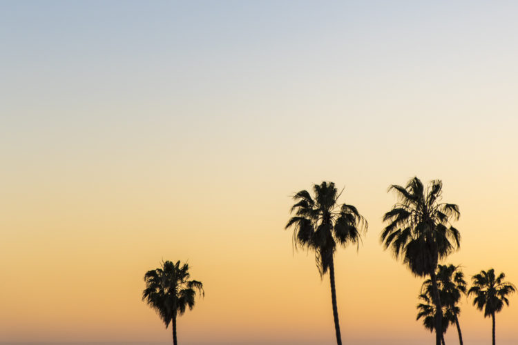
This is a shot of mine taken practically from the hip. I was in Santa Monica with Peter Treadway and Stephanie Richer, just as the sun was dipping down, when I quickly snapped the palm trees (a rarity for me) in silhouette. The first shot is how I set the sliders, setting the image for myself at what I deemed to be pleasing and the more “popular” edit.
This second one is what happened to the image when I hit Auto Tone (Mac: CMD+SHIFT+L; Windows: CTRL+SHIFT+L, if you’re interested).
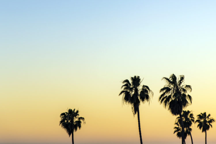
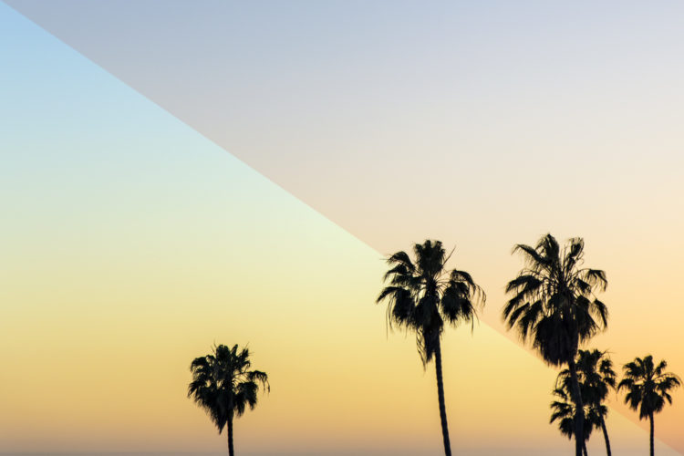
Now, I like my edit, obviously. But, what has happened with Auto Tone isn’t wrong, it’s actually a far better representation of what should be going on there in terms of the colours and tones present at that time on that day. Here are the two intermingled for a good comparison: –
So, the conclusion is this: I’ve explained Auto Tone, Auto Contrast, and Auto Color, so hopefully you understand them if you didn’t before. It’s often seen as a bit of a cop-out button, purely because it has the word “Auto” in it, suggesting that the creative flow is taken away from the creative, but it’s actually a metric ton of useful because of this: –
Set everything up the way you want it, then hit Auto Tone, Auto Contrast, Auto Color, or all three, and check out the result. What you actually end up with should be a considered version taking all you’ve seen into account, knowing what’s popular and what’s right! That’s my tip, you can have that for your back pocket, and I hope you all have a great week!
Much love
Dave

Well explained important information.
Thank You.
I have some color issues with my eyes – not quite a classic color-blindness. I’ve been setting my tone using 3 channels and bp/wp for years. I didn’t notice the auto version was there… hmmm so much for staying in the groove…