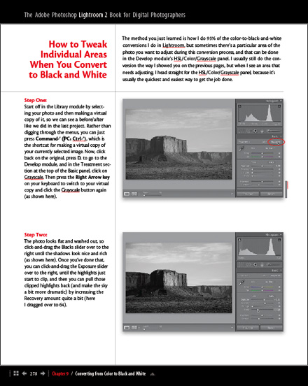
This is going to sound far from revolutionary, but I tried something a little different in my new Lightroom 2 book; we “bolded” all the keyboard shortcuts to make it easier for them to stand out if you’re searching for them later on.
I got the idea from an attendee to my previous Lightroom Live Tour; in their evaluation form they noted that if they have to go back to their workbook to find a particular shortcut, it would make it easier if they were bolded, so in their search they could skip over paragraphs (or entire pages) without bolded shortcuts. Plus, they thought it would just be helpful, and more eye-catching in general.
So, the reason why I’m bringing this up now is; I haven’t heard any feedback one way or another on this particular aspect of the book. Maybe nobody noticed; maybe everybody thought they were always bold. Is it distracting, or helpful?
Anyway, if you have the book, take a quick look and let you know if this is a step in the right direction or not. I made a screen capture of a page (above), and you can see a larger version by clicking on it, but honestly, it’s kinda hard to see here, so it’s really better if you look in your copy of the book. I’m really interested to hear your feedback for future books, and workbooks (which is what I’ve been working on for days, preparing for my Lightroom 2 Tour, kicking off in just a few weeks. Yikes!). Thanks in advance for your help.
Note: I’ve been getting emails from people who led PhotoWalks around the world who have received their copy of the book. I heard from Glasgow and Paris in just the past few days. I’m lovin’ it! :)


