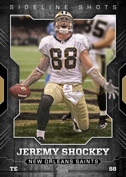
My buddy Matt Lange came up with a really cool way to showcase the images he’s taken on assignment for Southcreek Global Media—he puts them into a layout that looks like a football trading card (as seen above).
You can check out his other layouts right here. Also, I love his new layout for his portfolio (here’s that link). I guess it helps if you’re a great photographer who’s also a great designer, eh?


Nice work by Matt! I’m sure that something similar could be done with baseball players (but you would have to provide bubble gum!).
Thanks for sharing,
–John
Lol. Really stale gum!!! I would also have to be approved to shoot a baseball game which has yet to happen outside of one LSU game. It does look like I’ll be shooting the Rangers in April though. Fingers crossed!
Well what a pleasant surprise. This was inspired by your post when you made the Notre Dame print for your friend. Just wanted something unique. And being the nerd that I am I do still collect cards. So I figured, why not make my own? I like the way they turned if I must say so myself ;-). Thanks again for spreadin the word about a freelance designer for hire.
Good work Matt
Thank you sir.
Well, all photographers should do that! It’s not that hard, specially for photoshop experts like you guys.
Being an amazing designer helps a lot, of course, but anyone can improve the traditional white (kind of boring) frame!
I’m not sure it should always be done. There is something to be said for the traditional white frame. In the case where Scott made the Notre Dame print for his friend, I LOVED that. And I’d never thought of doing that. So I stole a page from his book and did a B&W of Adrian Peterson that I shot. It gives it sort of a timeless feel. In 50 years I’ll be able to go to that print and outside of it having the date typed on it and the player featured, nothing about it will be dated. So there is a time and a place for each thing. This one is just more ‘fun’ I guess.
What I meant was that any photographer could do that if they wanted to, and sometimes the white frame just don’t cut it.
I agree.
Hey Matt
Cool work. Liking the other layouts for your other shots too.
Thanks for sharing. :)
Thanks! You can thank Scott for the sharing part ;-). That wasn’t my doing but a very pleasant surprise!
Great work Matt and a great way to show off your images; nice one!
Thanks Glyn. Now I wish that I’d only designed them bigger and scaled down. They will forever be limited to card size lol.
Very cool! Even better that it’s a photo of my home team!
Who Dat!
Next we just need a tutorial from Scott on how to make similar frames yourself! (it had to be asked :”)
Very nice Matt!
Thanks Mathieu. Appreciate it.
Cool design around the photo, but I’m surprised no one else has brought this up – why is the player in the background (#85) completely out of focus in the top part of the shot, but his shoe is in focus at the bottom? Seems like it would have been easier to clone the guy out rather than go the route of blurring him…
Unlike the other ones on the site when you click the link, this is the one shot that the full player would be shown in the frame. When I clipped him out and placed him on a solid blurred background, you can imagine how that looked. So instead, I kept the bottom portion in focus and faded the blur, as a work around. And the goal of it was to not clone out the background, it was to use the actual photo, in it’s environment. So that’s why the other player remains.
Good job Hurricane Matt.
A Bay Bay!
Matt, awesome shot! Hope you had lots of publishes this year with SC.
Ken
Awesome Matt! Maybe Tuesday’s not so bad after all.
Great creative approach to your excellent photography. What were they edited in… NIk?
I assume Nik means Nikon. I shoot Canon. Unlike most sports photogs, I shoot with a 5DMKII. Gasp, I know.
The graphics were made in a combination of photoshop and illustrator.
Wonder how long it will be before a fellow Southcreeker to apear as a guest blogger…;)
Great way to take a great shot and make it something extra special. Great gift idea for the little athletes in your life too. How excited would your son/daughter or niece/nephew be to see themselves on a kick butt trading card.