

THINKING ABOUT POST PROCESSING BEFORE YOU SHOOT
Hey everyone, my name is Emily McGonigle, and I’m super stoked and honored to have the opportunity to be a guest blogger today. I’m a portrait photographer and retoucher from Nashville, TN. Being self-taught in both subjects, I’ve always tried to get my hands on every resource I could possibly find. This includes books and online content published by Scott Kelby, so getting to post to his blog today is pretty frickin’ cool.
Today I want to talk about keeping the post processing of your images in mind when planning and shooting a session.
I’m a weird, rare brand of photographer. I actually *like* editing and retouching. So much so that I eventually launched a separate retouching brand earlier this year. I was always told early on by my peers that I spent too much time in Photoshop; that I should spend more time shooting and less time learning about retouching. But being the stubborn individual that I am, I kept on the path that I was on and eventually got to the point where my photographic work started to become more recognizable as mine, partly because I was putting my signature on my images through my retouching and color grading.
As a result, post processing is something that I’m constantly thinking about, from the beginning of a session, to the last stroke of my Wacom pen.
Post Processing Starts When You Plan Your Session
This may sound like a weird concept, but it’s really not.
Color is magical. I love color. I have SUCH a hard time remembering that black and white imagery exists (and that sometimes it can make for a stronger image). But color can sometimes screw you up if you don’t plan for it.
I in no way claim to be an expert color theorist. As a matter of fact, it’s something I’m *still* learning and experimenting with. But what I do know is that the colors you start with on your set will greatly affect your coloring and mood in post processing.
If you’re planning on ending up with a moody shot, using a bright background with pastel color clothing on your subject isn’t going to jive well with the hyper contrasted, muted color grading that you had in mind. Making sure that all the elements you’re using in your image compliment your end processing can make or break an image.
The light that you plan on using is also equally important to consider in conjunction with your editing goals. Again, if you’re aiming for a moody end image, lighting the subject with flat, soft light, is probably not going to yield the results that you want in post, no matter how much you push and pull your curves and color.
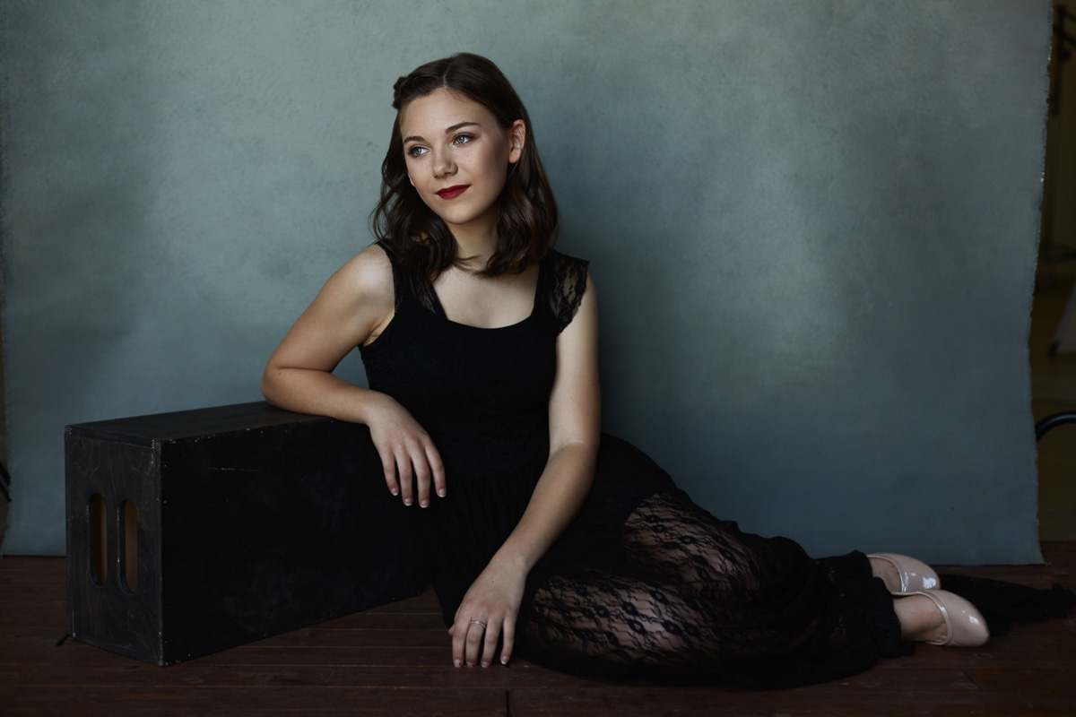
For example, for this shot of my friend Lauren, I was inspired to do a monochromatic color palette with a lavender theme. I knew that I wanted a clean edit on this image, so making sure to light it without a ton of moody shadows was important.

When lighting this image, I paid special attention to the shape of the light on her face. I knew that I wanted a specific highlight on her cheekbone that I would later dodge in to accentuate her already gorgeous bone structure. But if the light wasn’t already placed correctly to create that shape, all the dodging and burning in the world wouldn’t matter. It wouldn’t look natural if the base of the shape wasn’t already created by the lighting used.
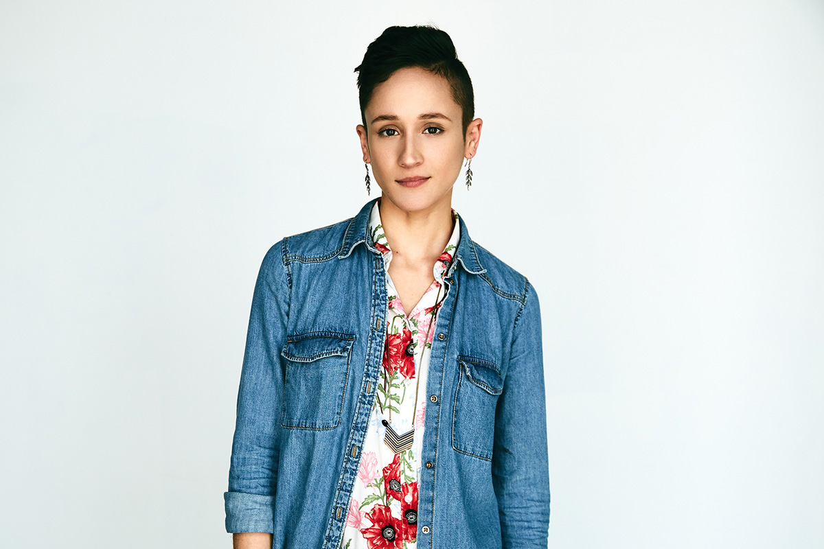
In the image of this model, we actually had her outfit picked out first. After seeing the brown of the dress and her accessories, I knew I was going to want to process the image with warmer tones. As a result, I made sure to use elements in the image that would compliment that idea. A diffused garage door filtering sunlight as backlight and a cream piece of raw canvas both lend themselves to warmer color grading.
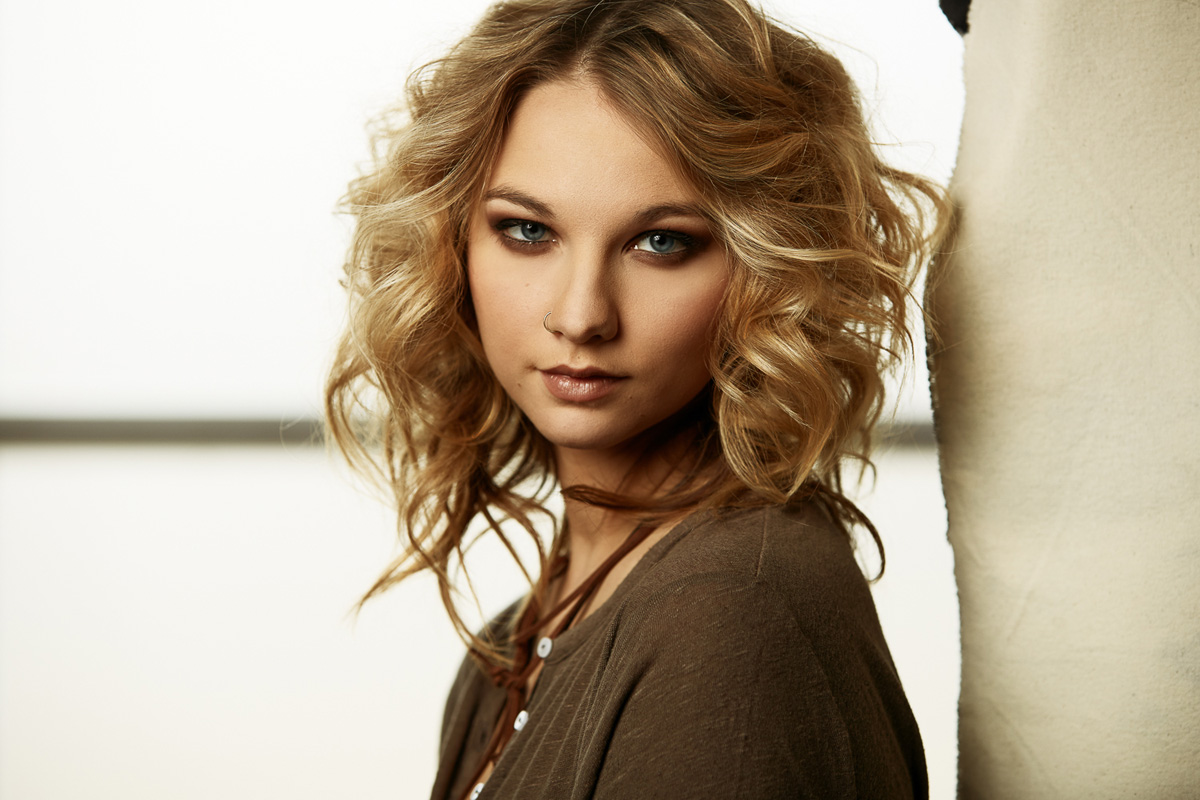
On the opposite end of the spectrum, for this image of Taylor, I knew I wanted a clean, cooler, and moody look. I grabbed a backdrop that already had cool tones in it, and used dark elements around her on set. Then in post, I made sure to use cooler tones in my color grading to finish out the look.
None of these images would have worked quite the same way if I had used different elements on set, or if the subjects were wearing different pieces, but I still tried to process them the same way. I had to keep my end processing goal in mind while building each image.
Shooting for post processing
When I’m in the studio, one of my favorite things to do is tether directly to my computer, using Capture One. The glorious thing about tethering is that not only do I have a bigger screen than the LCD on the back of my camera, but after testing the initial set up, I can take a few moments to apply some preliminary edits. I can play with the color grading and density of an image on the spot, which allows me to do a rough version of the post processing that I’m envisioning for the image. The client will know what to expect, and I can know if what I’m striving for is actually going to work.
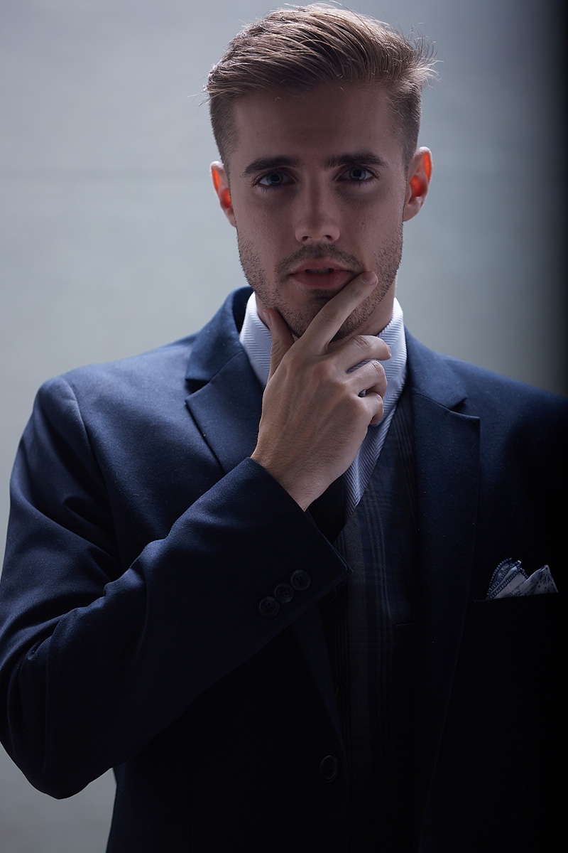
One example of this that was critical to the end result, was this image of my friend Sam.
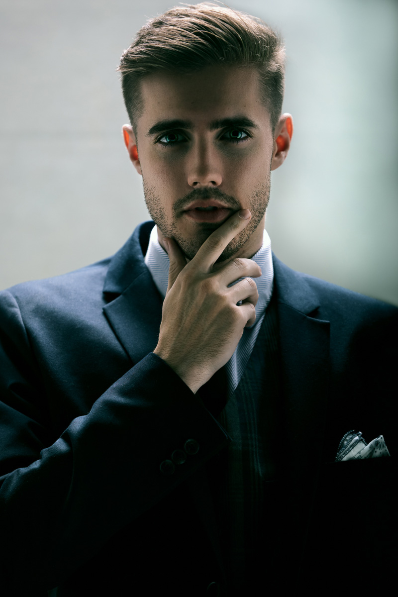
There is no way I would have achieved this final look without intentionally thinking about what I wanted to do with it in post, prior to actually making it.
For this image, I was experimenting with a new way to light my subjects, that I hadn’t tried before. I knew I wanted the image to be dark and contrasty, with pops of highlights.
Straight out of camera, with ZERO work done to it, the image looked like this:
After determining that the shape I wanted was there, I went ahead and applied a rough edit in Capture One, which resulted in this:
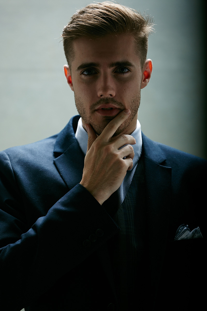
That was close enough to the color grading and contrast that I wanted for the final image, so we shot the rest of the set this way, with Capture One automatically applying my edit to each file as it was created.
After the session, I went home and put the final touches on the image using Photoshop. I applied my color grading, starting with the raw image straight out of camera, applied some skin smoothing techniques, brought out the highlights in his eyes, and accentuated the light on his face with dodge and burn.
It’s important to note that 90% of the time I begin my color grading and retouching in photoshop from the straight out of camera image that was captured, and *not* the image with my rough studio edits applied. The reason for this is that the raw image is less contrasted, and not influenced by added color casts, therefore allowing me more room to create the exact color grading and contrast I’m trying to achieve. If I had used the studio edit as my base image in photoshop, it would have been much harder to make Sam’s eyes sparkle, or bring detail back into his jacket, because the raw data of shadows would already have been pushed by Capture One.
I also prefer to light in such a way that I achieve the correct shape on the subject, and the correct shadow to highlight ratio that I’m trying to achieve, without the image being too contrasted. The reason for this is the same: it allows me more wiggle room to play with my tones and density in post.
“I can fix that in post”
GET IT RIGHT IN CAMERA.
I know I’ve been preaching keeping your post processing in mind when shooting, but I’m NOT talking about things like moving things out of your frame that shouldn’t be there, fixing fly away hairs on set, smoothing wardrobe, and anything else that you’re tempted to “photoshop out”. If you can fix it in camera… do that. It’ll save you so much headache.
That being said… there *are* instances where that will be necessary, either due to limited resources, space, or your model giving you that KILLER look, but they moved a little too far off center, exposing your set in the background.
For example, there’s a shoot that I assisted my friend on that required him to build a set. I was also going to be the one to retouch the images when they were finished, so I was very conscious of what could and couldn’t be tackled in post, concerning the set build. We had a fairly limited resources to make the set, so we bought a stack of 2x4s, some drywall, some screws, and we fashioned three “walls” of a room that was to be the set for the model. You could see the seams between all of the drywall panels, the fabric that we used between two slats to allow light into the room, and every single screw we used to hold it all together. We didn’t intend to build a clean, nice looking set. We only had enough resources for the bare bones, and it was my responsibility to clean it up and make it look finished in post.
The great thing about it though, was the fact that I knew what would make my life easier and what would make it harder, before I even had to sit down to Photoshop. I knew that pinning the fabric as flat as possible would make smoothing the seam a lot easier in post. I knew that lining up certain slabs of drywall at certain angles would make smoothing the seams easier in post. Even though we were still prepping the set for the model, we did it with the retouching in mind.
If we had unlimited time and money to build the set, we could have just made a complete, solid, painted room, but since we didn’t have that luxury, I did what I know to do, and kept my post processing in mind while we put everything together.
Another time, I was photographing the band Zobrodome for their promotional materials.
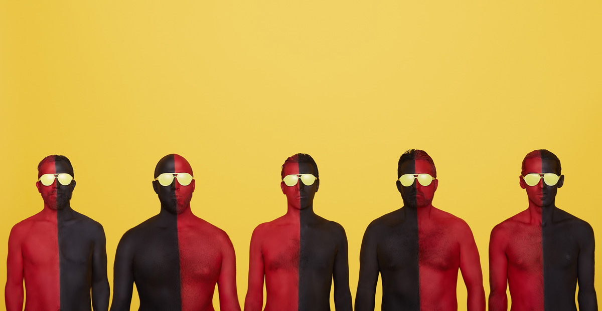
Initially we were going to line the guys up on a yellow paper backdrop and shoot everything in camera. However, what I didn’t anticipate was that not all 5 of them fit well together, side by side on the size paper that I had. If we had been doing standard band shots, it would have been fine, but because the guys needed to stand on the same plane, side by side, we ran into some issues.
I had to think fast and decided that compositing would be the way to go. The inspiration for the image came from a graphic the guitar player had made, and we wanted it to look as surreal as possible. Keeping my post in mind, and knowing that I’d need things to be as consistent to make the composite work, we took plates of the background (Plain shots of the background lit, but no one in the frame). Then one by one, I had the guys stand individually in front of the backdrop on a marked spot on the floor.
Because they were painted down the middle, I also had to be particular about getting them to line their chins up with the line going through their necks as close as I possibly could. I knew I could fudge the lines a bit in post later, but to keep things from getting *really* out of whack, I needed them to nail it as best as they could in camera.
It actually turned out to be a really fun shoot, and an interesting composite job, but every step of the way, I had to keep in mind what my end goals would be in photoshop.
The long and short of it
No matter what your style is, the way you process your images is the finishing touch to your work. Whether you do a lot in post, or tend to be very minimal with it, it’s still extremely important to keep in mind what your end goal is.
I hope that I have been able to enlighten some of you with the idea of keeping your post processing in mind from the very beginning of a shoot. I know it’s something I never used to think about, and it would frustrate me when I couldn’t get the desired results I was striving for. But now that I’ve shifted my focus to consider all parts of my image creation, including my post processing, I find that I am much happier with what I am producing.
Emily McGonigle is a photographer and retoucher based out of Nashville, TN. You can see more of her photography work at EmilyMcGonigle.com and her retouching work at EmilyMcGonigleRetouch.com. She can also be found on Instagram under @EmilyMcGoniglePhoto for photography and @EmilyMcGonigleRetouch for retouching.

1 comment