The Longest Exposure: The Artist Is The Camera
Hi everyone! Corey Barker here to share with you a behind the scenes look at my recent illustration and how artists must observe and interpret similar to the way a camera does. I have always been fascinated with photography and how a camera captures an image. The word photography itself means to draw with light. A photographer determines, by way of the settings on the camera, how much light will enter the lens and the glass in the lens will bend those light waves into focused beams which will then hit the film at the back of the camera for a specified amount of time burning the image into the film. Of course, that was in the old days of film photography. Today the process is very much the same however instead of the light hitting the film directly it hits a light sensor which then goes through a computer processor to generate the image you see on the screen.
As an illustrator I look at creating images in Photoshop the same way. It is quite literally painting with light and as much as I enjoy shooting images, I enjoy creating them much more. Now that certainly doesn't mean I don't combine photos with illustrated elements but there is something to be marveled about the way the mind perceives light that makes creating the image that much more intriguing to me. Observing both in reality and in photographs the way light behaves on various surfaces and reacts as it bounces and reflects off objects affecting the way they are perceived. All we see in the world is merely reflected light at varying wavelengths. The funny thing is that color is purely a mental construct. It does not exist in the physical world. The green grass, the blue sky, the red fire truck all appear that way because our brains process those wavelengths of light that are reflected off of them and generate what we see as color. It was when I learned this very concept in art school that I realized how gullible our visual system could be and how artists can exploit this to recreate reality.
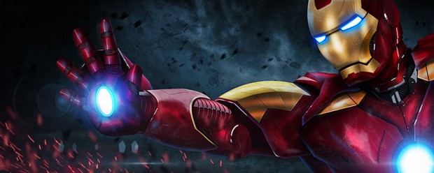
The finished Iron Man piece that I’ll be showing the making of here
Throughout the history of visual art there have been numerous tools for the artist to convincingly recreate reality such as paint, charcoal, and ink among others but none have given artists the power to recreate what we see more than what we have now in this digital age. It is a remarkably exciting time to be artist. While many still endure with creating convincing pieces with paint and other traditional media programs like Photoshop have allowed artist to bend and manipulate light itself to create convincing representations. The difference is that digital art is transmitted light whereas traditional methods use reflected light. Reflected light, however, has its drawbacks as it limits the spectrum of light visible to humans. This is why a vibrant image on your computer screen does not look he same when you print it. Though print technology has dramatically improved over the years it still not quite as vibrant. I know several artists that will still draw there pieces traditionally like a pencil sketch and then scan it into a computer and render it digitally using Photoshop or Painter. It gives them more options, more vibrant color, and digital is much more forgiving.
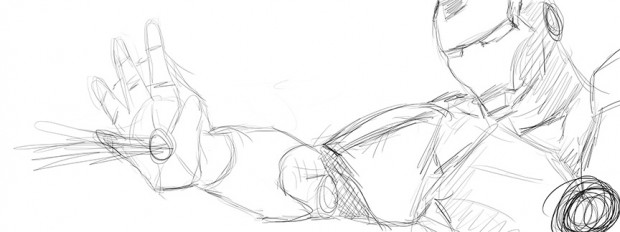
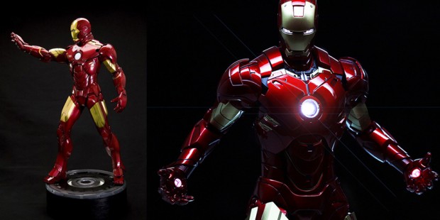
These are the things I think about when I create a new piece. I want to manipulate light to create the illusion of something recognizable. Photoshop gives me the means to do that. Which brings me to my latest piece. Everyone who knows my work knows how much of a movie fan I am. With the wave of great superhero movies I have been taken in with the character of Iron Man and I wanted to create a version that I had never seen before. I looked around on the web and saw some really impressive fan art but all were created from referencing a photo or scene from the film. That to me is just mimicking reality and there is certainly nothing wrong with that. I wanted to create something unique. So I had to come up with a concept first. I wanted to portray Iron Man in a very aggressive way and I knew I wanted it to be in a cinematic widescreen format. So jumped into Photoshop and started sketching away. Since I use a Wacom tablet I just sketched it directly in Photoshop. Once I had the idea in place I needed to seek out reference images. I needed to know how the component parts looked from different angle and I needed to know how light effected the various surfaces. So I did a Google image search and found several images that were very helpful. Some were close to the positioning I wanted but not quite so I knew was going to have to get creative. Funny enough I also found images an Iron Man action figure toys that proved to be quite helpful with positioning.
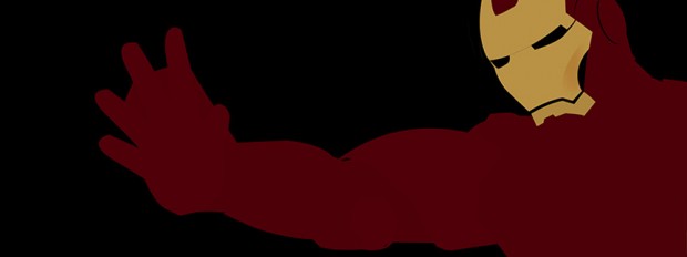
So now I had my basic sketch and reference images and was ready to dig in. I started by using the pen tool to create basic shapes of each of the elements that made up the overall Iron Man suit in the pose I wanted and giving them a basic color fill keeping each element on its own layer. Then this is where the fun really starts. Where you have start shading and applying light effects to cross that line from flat 2D to realistic 3D. I made a conscious choice not to use Photoshop 3D in this image as I wanted to really see how real I could get the image to look. First thing to consider is proportion, when you creating something based on reality the proportions have to be as close as possible. Even an untrained eye can look at an image and feel like something is off without knowing what it is. Creating the paths and getting the proportions sorted took the better part of a couple hours. Did I mention that patience is a big part of the process? Anyway once that is done then I turned each shape into a layer element filled with the flat base color.
Next I referred to the images I had for lighting reference as I used the dodge and burn tools to add basic shading to each shape. Bearing in mind the overall light source I wanted in relation to the subject as each object will reflect that light and cast shadows on each other. Not to mention the light that would be emanating from the eyes, chest plate, and the palm of the hand. All these elements seemed to fall into place quite nicely and after about 5 hours of shading, I had a pretty solid three-dimensional object starting to emerge. I still had a long way to go. The video below shows a quick example of the shading process in action and how I was able to get a polished look on the metal surface. This gave me a good idea of the result I was seeking and knew this was going to work so I was more confident about proceeding forward.
After seeing the shading would work well I proceeded to render more areas. My process, however, tends to have me jump around so I eventually moved on to another part of the subject and would get back to render more later. I wanted to see how the eyes were going to work out. So in the next video here you can see how I utilized layer styles to achieve the glow from the eyes and how I added reflected light elements on the metal surrounding the eyes. This is when I start to see the realism start to take shape.
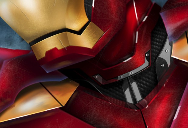
Now one of my most favorite parts of the image is the area around the neckline. I took some license and added a carbon fiber base and then built metal parts on top to help shape the neckpiece and other support parts under the chest plate. This was an afterthought because I had the neck drawn out as simple overlapping pieces but I saw another Iron Man image online that showed this look and knew I just had to add that. Took some time as I had to basically redraw that area but the result was worth it as you can see here.
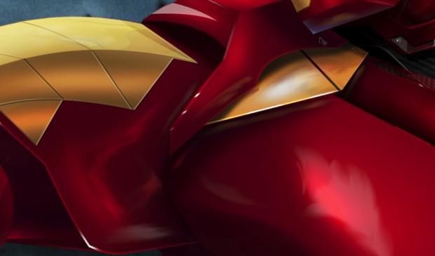
After finishing the shading and other elements the suit looked really good. However it still looked like a nicely rendered toy. It was too clean! I really wanted this to have some scratches and battle damage to really add the extra bit of realism, not to mention adding other physical elements and atmospheric lighting effects. I also noticed that with the proximity of certain elements and being metal it stands to reason that these would reflect each other in a rather subtle way. So I came up with a quick and clever solution. Using the Smudge tool I sampled the color of an element and then, on a new blank layer, I dabbed the color and then smeared it with the Smudge tool giving the illusion that it was a soft reflection on the surface. I proceeded to do this all over in areas where there might be a reflection. This proved to be quick and easy with a very convincing result.
Now finally there is the issue of the scratches and battle damage. For that I have made an exclusive video on how I did those finishing touches over at my site CoreySBarker.com. You can see how I created the effect using custom brush effects and how I put the background and flare effects in to finish off the image.
Clearly there is more going on then what I can explain in one blog post and a few videos but just wanted to give you a good overview of how something like this comes together. In the end the final image ended up being comprised of about 200 layers and weighing in at about 1.17GB file size. Cumulated time of completion was about 12 hours. As I mentioned, no 3D was used at all and the photo used in the image are the clouds in the background and even those were greatly modified.
So there is a little peek behind the curtain inside the mind of a Photoshop freak! I am always driven by the idea of can something be done or not. Make no mistake, I have ventured into pieces that have turned out to be miserable failures but always leave with something I can use. It all depends on how you look at it. Not everything is going to go the way you want it too. The same could be said for photographers. Not every idea or shot is going to come out the way you plan but you move on and make it work the next time. I have found that sometimes if I am well into a piece and I am just not feelin it, I will save the file and archive it away and not look at it for days or even weeks. Then I will go back in with a fresh pair of eyes and a different mindset and I will be inspired once again with something new or it will be a dead end. I have many projects that are at various stages of completion and they may be completed later down the road or they won't. I just know that I have to have the right head to make it happen. This is the blessing and curse of being an artist. Like a camera, the digital artist is painting with light. It's just a slower processâ¦it is the longest exposure.
You can see more of Corey’s work at CoreySBarker.com, and keep up with him on Facebook and Google+




Corey, you and Bert Monroy really intrigue me! I would love to learn to create from scratch like this. Now I’ll watch the videos. :)
It’s incredible your dedication and hard work! congrats to Corey and thanks Scott for sharing
Corey Barker: There. Is. No. Substitute. If Photoshop is a Kramer strat, Corey is the Eddie Van Halen.
Corey, your PS skills never fail to impress! And a 12 hour project? That’s dedication!
What Corey … no 3D! :-) This is just fantastic stuff Corey! Like the rest of the folks here … you never cease to amaze us! You constantly inspire me and I use a lot of your tips and tricks! Wow, Excellent work!
Scott, Brad thanks for letting Corey spend some time with us here!
Dennis
respect,respect and just respect to you corey from senegal !!!!
I’m always impressed with the things you do, Corey, but this time you went way beyond that. I’m awed! Your videos really helped me to see what Illustrators and Designers have to do from scratch. Thank you.
Awesome as always! Great Job!!!
Hi, Corey. Great article. I find PS affords me the opportunity to pursue my oil painting in digital mode. With the camera I can capture scenes and using my Bamboo tablet, I can draw and paint much as I did in the traditional way. When I print my work I add a canvas texture to complete the final painting. Also, as you mentioned, reference material can be used for ideas on color schemes and settings. Planning and assembling the idea for a painting is made easier with PS and its artist friendly tools.
Is there a specific reason why talented illustrators like Corey, Pete, and Aaron Blaise use Photoshop for their illustrations instead of Illustrator, or is it just that they are the Photoshop Guys? Amazing, amazing work as always.
I can’t answer for Corey or Aaron, but Photoshop is more organic… I can draw and sketch just like a pad of paper… albeit with multiple undos and layers. Illustrator is a phenomenal vector program, so when I want to create clean sharp edged images and juggle multiple paths and layers that is where I would prefer to work. comes down to which one handles what more naturally. Photoshop loves pixel based work and handles vectors well… Illustrator loves vector based work and handles pixels. Hope that makes sense.
It does make sense. I’ve never heard it put that way before. Recently I’ve been using Illustrator and thankfully Adobe has a lot of continuity with their products to make transitions between Illustrator and Photoshop manageable. I still prefer Photoshop, but I’ve just spent more time using it. Thanks for the clarification.
Chad, there’s nothing wrong with using Illustrator for creative work. However, in the end, when you have to print your image, most inkjet printers are pixel oriented and therefore, better suited for PS output. I know there are printers for vector based output but haven’t heard much info about them. I may be mistaken but think that you can convert pixel based work to vector and conversely, vector to pixel but how well that conversion looks, is my concern. I use PS simply because of the ordinary inkjet printer’s pixel based configuration. That was the deciding factor for me.
Mr. Kelby, albeit a talent for all of us to learn from, is a smart cookie. He has taken the best of the best, with people such as Matt, RC, Pete and Corey and surrounded himself with some of the most talented people working today. It’s one thing to do the work…it’s another to be able to convey that lesson and methods to the masses in a way that we can all benefit. There is rarely a time when I see these posts on here, or NAPP that one isn’t in complete awe in what we’re seeing.
Just from an inspirational standpoint alone…. But to get actual working methods you can carry away. Very grateful to all the people at Kelby for such a great place to be inspired and learn.
always amazed by the creative talent that is out there.
Freakin’ amaazing!! Thank you Corey!!