My name is John McWade. Because this is my first post, here’s a quick history.
I’m a designer, not a photographer. Early in 1985, I was the first person in the world to lay down my T-square and become a full-time “desktop publisher.” That meant that I was doing my design work entirely on a computer — a 9″-screen Macintosh — with a test version of Aldus PageMaker.
I’d been at it for months when, that summer in New York, Apple rolled out its “Macintosh Office,” a networked suite consisting of the Apple LaserWriter, Adobe PostScript, and Aldus PageMaker. All three were revolutionary. The press, impressed, said, “Yeah, this looks good, but is anyone actually using it?” To which Apple said, “Well, there’s this guy out in California . . .”
And my phone started to ring.
Things have not been the same since.
It took only five years for desktop publishing to democratize design. Its early adopters, with exceptions, were not designers. They were writers, editors, marketers and others who had design to do — newsletters, brochures, business stationery, whatever — but lacked the time, budget, or need for a professional.
Most had an affinity for design, too. But most did not have the skills.
Books and periodicals taught point and click. How to draw a curve, make a shadow, put a glow on something. This was helpful. They called it design, but it wasn’t. It was effects.
No one outside of school was teaching design. Typography. Page layout. The art of making a visual message beautifully and simply and clearly.
So we jumped in. We launched a small magazine titled Before & After, How to design cool stuff in January, 1990, to help the novice — the non-design professional — with graphic design. It was an immediate hit.
I’ve been at it ever since. In print, in books, online, in video (just starting this), and in the occasional live class. I love my work. The surprise has been that our little five-year project would turn into a career that continues to this day.
Brad asked if I’d do a post for photographers.
From a designer’s standpoint, the great thing about being a photographer is that you have great images to work with. So how about how to get a photo and type to coexist in the same small space, like on a business card? There’s a universal way to do it, which I’ll show you here, and once you have it down, you can elaborate pretty easily if you want.
Before:
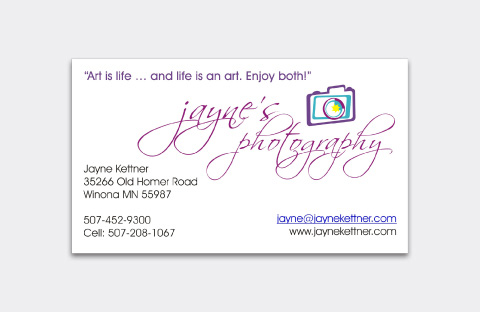
(Above) Jayne Kettner’s business card had a clip-arty logo, a slogan, a swashy, calligraphic signature, and her business information, all scattered into various corners and places. This is common, and there are several problems with it. One is the scattering, which puts similar kinds of information in different places, with nothing to connect it. Two is the visual complexity; that is, the unnecessary tangle of lines. Three is that we can’t see her photos; her biggest asset is absent.
Here’s how to fix it.
Size
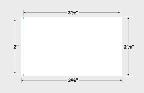
(Below) The standard U.S. business card is 3.5″ x 2.” Set up an extra 1/16 inch all around. This is your “bleed” area, which will prevent white from showing around the edges of the card when it’s trimmed to final size.
Start with the words
Set your words—business name, your name, address and contact information—in a block of ordinary type (here, Benton Sans Book, 7.5 pt on 9.5 pt line spacing). Align left, and place the block in the upper-left corner.
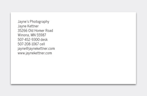
Make the business name bold.
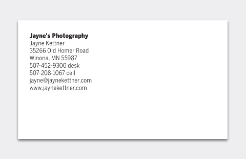
Add a half space—a whole space works as well—below it . . .
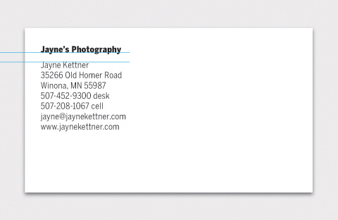
. . . then tint the type 60% (or so) gray; leave the business name black.
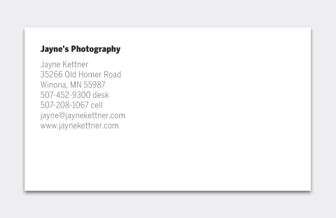
The result is a minimal, intentionally designed look that leaves the white space as the dominant element. You’ll be tempted to fill the space, but don’t.
Add the photo
Place and crop your photo to the edges of the bleed area . . .
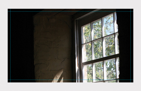
. . . and bring your words to the front (below). On a dark image like this one, finish by coloring the business name white and the body light gray.
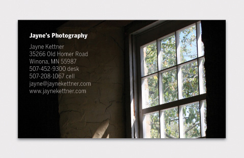
And that’s all there is to it. No disorganization, no distractions. It quietly places your photography and your name into the client’s hand, simply, clearly, beautifully.
Use both sides
If that just-right photo has no room for words, use the back. The minimal type treatment presents a gallery-style look. By that I mean it’s an object alone on a white wall, which gives it the viewer’s full attention.
Front:
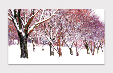
Back:

Add background
(Below) If the photo doesn’t fit the space, add an artificial background. On a solid field like this, eyedropper the color nearest the edge . . .
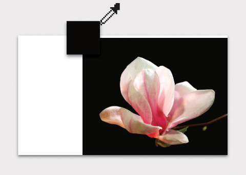
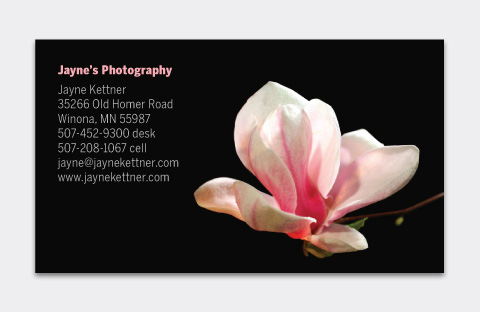
. . . and fill the card behind the image. While you’re at it, you might eyedropper some pink from the flower . . .
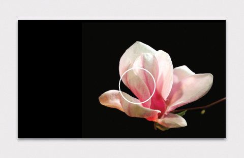
and add it to the business name . . .
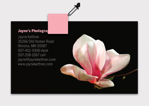
. . . which makes a beautifully soft connection.
Fade to black
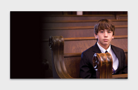
A too-narrow image with a multicolor edge requires fading . . .
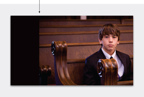
A gradient on a layer mask is an easy way to do this . . .
A change of typeface
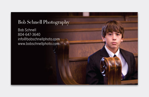
Below, a small change of typeface from Benton Sans to Didot—on only the business name—softens the name while retaining the look. Classy.

Get vertical
Vertical-format cards are less common but can be dramatic.
It’s tempting to move the words around, but don’t do it. The upper-left corner makes a clear, designed statement, especially if it’s consistent on all pieces. If an image won’t work with that position, use a different image.
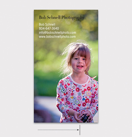
(Above) Her asymmetrical position activates the layout.
(Below) You don’t want to lose a photo because it doesn’t fit the space. If you crop, we recommend making the image square, which looks intentional, not ambiguous.
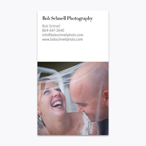
(Above) The photo on white is classic. If it’s too stark . . .
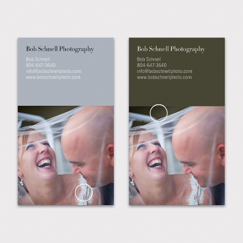
(Below) Soften with color . . .
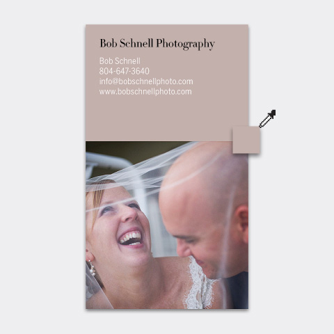
Her lips . . . Her hair . . .
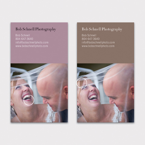
Her dress . . . The background . . .
Use an object
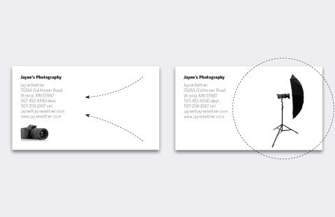
An alternative to a portfolio photo is to picture an object from your studio. Shoot it against white and place it on the page. Include its shadow.
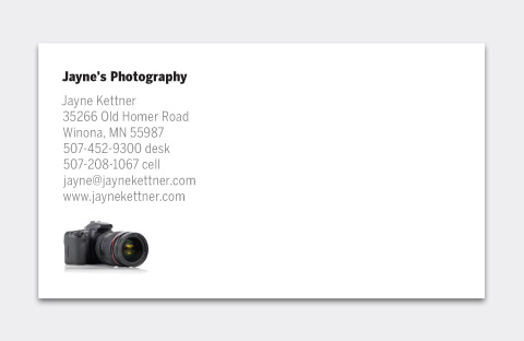
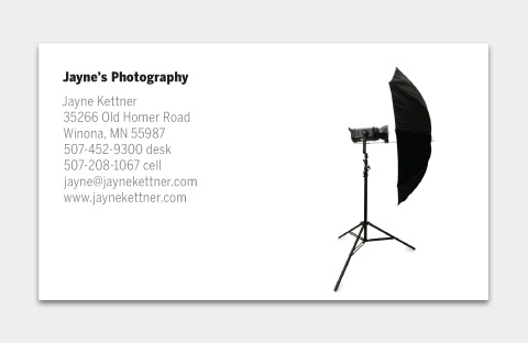
(Above) White space is the controlling element on these cards—note how your eye immediately registers the images, despite their small sizes. Small is important; if you make them big, the objects, not you, become the point of attention. Note, too, that although they’re predominantly black, the objects are in color, just like you’d see them in real life.
(Below) White space is not empty but has real force. Note (below, left) how it pushes your eye to the left, and (below, right) it creates a strong sense of depth behind the studio umbrella.
Create a gallery
Instead of one photo, create a tiny gallery. Make a matching Web gallery, and you’ll have a direct, card-to-Web connection, useful for branding.
Make a grid . . .
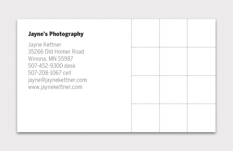
. . . and add your photos. Square images are harder to crop but look designed, and they correspond to Web thumbnails and avatars, too. (Below) On white, gray and black.
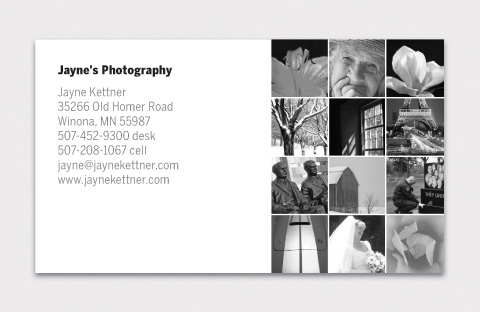
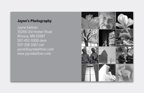
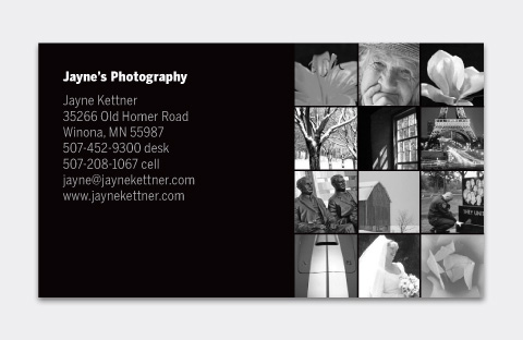
That’s it. Simple, flexible, universal. It’s a clean look that’s easy to repeat on other documents — brochures, Web sites, etc. — so you’re consistent everywhere. Remember: 1) keep the type basic, and 2) keep it in one place.
Since I already have your attention, I’d like to ask for your advice on something…
Imagine standing before a dozen high-school yearbook students embarking on their school year with the goal of creating a great yearbook. Amateur shooters, consumer equipment, some phone cameras.
If you can give them only one tip for making great pictures, what is it?
What if you can give them six tips?
Leave a comment and let me know what tips you would give.
For more, visit us at . . .
Web site: bamagazine.com
DesignTalk: mcwade.com/DesignTalk
YouTube: youtube.com/bamagazine
Facebook: facebook.com/beforeandaftermagazine



I learned more in this great post about design than in any one single place. You are truly a great teacher. So simple and elegant…thanks for a wonderful post.
Thanks for an informative post, John! This info will help anyone that wants to promote their business in a simple, yet impactful way, using business cards. I’m sure this would translate very well into any kind of material that is used to drum up clients.
Tips for high schoolers shooting yearbook photos? I would say:
1) Keep it simple. No crazy backgrounds, foregrounds, etc.
2) Solid color clothes. No plaids, stripes or odd clothes. People will look at these photos 30 years from now! Limit any future embarrassment!
3) Props are great, but don’t make them the center of attention.
4) No full-length shots. Pictures get shrunk and cropped for yearbooks. Will the person still be recognizable?
5) No pets in the picture. The picture is about the graduate.
6) Smiles always look better than a serious pose. Graduation is a HAPPY time!
I shot my son’s yearbook pictures last month. Of course, he insisted on picking the pose with his guitar and the serious expression! You can’t win them all…..
–John
1 tip – Tell a story, can be fun, funny, dramatic, or just a moment in time.
6 tips
1) Tell a story, it’s always my number one tip a good story is something that people always enjoy
2) Composition, As a rule never place your main subject in the middle of the frame 1/3 from a side, top of bottom of the frame
3) Don’t get hung up on technology its about the image not the equipment or the software
4) light is everything in photography after all the root of Photography from the Greek is Photo = light and Graphy or Graphic = writing. You can create beautiful light by being aware of how the light falls on your subject/model.
5) Move, yourself and/or your subject/model if you can for better light and composition. Don’t get stuck in one place and use a zoom lens sparingly better to move your position if possible than to use the zoom
6) Have fun, photograph what excites you, what you find compelling and before you press the shutter release ask yourself if there’s anything distracting or missing from the frame that would make it a better photograph
Go easy on the drop shadows!
Great Post!
1. Practice. Shoot all the time…
2. Learn to shoot in Manual…this insures that you can shoot in all modes
3. Look at other shooters images
4. See Light
5. Build a library of favorite images for inspiration
6. Practice.
Love the post! I am part photographer and part design person as I’ve worked for the last 17+ years at weekly newspapers. For the last 10 years, in addition to the newspaper, we are also a full printing company so I’m always having to design business cards or brochures for people. I totally agree that less is more when designing a card! Thanks for the informative stuff and various layout options. I’ll pass the info around my office!
As to the photos for the yearbook … our high school yearbook is horrible! Too many bright, distracting background colors on the pages and then tiny photos turned at all kinds of angles splashed all over the page. It drives me crazy to even look at it!
If it were me I’d tell them …
1 – Pick a color theme and stick to it throughout the book with tiny (tiny) exceptions when needed.
2 – Photos of people should be cropped in close to the “people.” Don’t run a 5 inch wide photo with only 2 inches width of people and the rest blank walls. Crop in closer to the people and make sure that faces are identifiable.
3 – This comes with my newspaper background but I’d try to make sure every candid photo was identified. In 20 years, you won’t remember the faces in many of the photos, especially if they were kids from grades other than your own. A tiny cutline will mean so much for the long run!
4 – Don’t use funky shapes for the photos. Squares and rectangles are classics and should be used. A photo cropped into a starburst is SO tacky!
5 – Hold the camera as still as possible and use a flash for the photos. Blurry photos due to camera shake or lack of flash are terrible but so typical of yearbooks.
6 – Have a plan for organization. Keep all of the photos organized by keyword if possible. A year full of digital photos is extremely hard to keep up with, especially when they are submitted by several different people. A good organization method upfront by activity, sporting event, club, etc. will help so much when deciding what makes the page and what gets cut. Remember, you don’t want to leave anyone out or have a club not represented because someone forgot that a photo was turned in.
Just subscribed to the pdf version of the magazine! Can’t wait to get it started. I had no idea that there was a company out there that taught this kind of design stuff but I’m so excited to find you! Thanks!!
Excellent article on design. I have a degree in commercial design and when I was in school I remember one of the teachers telling us that desktop publishing would forever alter the way we prepared artwork for print. At the time I was one of the few who believed him, today I guess he has had the last word.
Thank you so much for for such an inspiring and well written post. Unfortunately, bad timing for me as I just designed some pretty crappy business cards for our bike shop and they arrived today :(
Hi John,
great post! I’m not a photographer nor a designer, but I use desktop publishing and photography for the Company marketing (and I’m not a marketing man!).
I love the way “keep it simple” for two reasons:
1) it’s really simple to do
2) it has always better effect than the complicated one
I have saved your website bookmark, it’s nice to have something to reference to.
For the questions…well, I don’t have any clue of that!
Regards from Italy,
Davide
Hi John, great tips! It’s funny how often “Less is more” is so true.
As for shooting tips, I’d say (in no particular order)
1) Get closer instead of zooming- Especially if they don’t have great lenses or they’re shooting with a phone. This will allow the subject to really be the focus of the shot and will allow them to shoot more places because the background will be less of an issue. There will also be more light coming in so they will be more likely to get a sharp shot.
2)Shoot vertically and horizontally- You never know what space the shot will need to fit into will be like.
3)Keep it casual. Talk to your subjects, show an interest in them and their poses will be more relaxed and their smiles will be much more sincere.
4)Try to fill the frame with your subject(s)- This kind of ties in with number one. People will be more recognizable as will what they are doing. Generally don’t leave huge empty spaces in the shots as in a yearbook space is at a premium.
5)If you have to shoot sports, try to get close and learn a bit about the game. It will be easier to get better shots if you know what the players might do. If it’s indoors, try to get a flash of some sort or ask the person in charge to turn all the lights on (if that’s possible).
6)Don’t just get shots of the star players or the popular people. I’ve found that some of the most interesting, fun people are the ones out of the spotlight: musicians, artists, actors/actresses, science students doing experiments, debaters…try to get a wide range of activities and different people in those activities.
Sorry for the length of the post. :)
love the post thanks just about to redesign my business cards so comes in really handy !!
Advice
Believe in yourself
Be yourself
get some training–online/college/school
work hard
listen
Who You are is more important than what you say
ohh ya take loads of photographs!!!
One of the best Guest Posts here since I started reading Scott’s blog 6 months ago. I loved how simple you put everything and how everything made sense with the illustrations you chose.
I’ll think about your advice when it comes time for me to design my own business cards. Thank you!
My 5 tips are:
1. Go look up rule-of-thirds and learn that.
2. Find a good light source to illuminate your subject (ie, window)
3. Carry their cameras at all time, don’t miss the shot
4. Have fun.
5. Start looking for free learning media like this blog, threes plenty on the Internet.
6. Shoot a lot of B&W, oops oyes, break the rules!
Thanks for this thought provoking blog.
I’m subscribed to the online edition of Before & After. I’ve been with them for a good many years now. I love how they present graphic design problems and provide quick and easy solutions.
Thanks for the great tutorial :) I already subscribe the B&A mag online…
1. Put the subject either left or right of centre.
2. Try and isolate the subject from the background using either distance between subject and background, or by framing for a simpler background (that’s two tips!).
I think that’s enough for point and shoot photographers to remember ;)
Peter
Heya John,
I’m a designer my self, I absolutely love your blog post, brings back memories of my school days. I still use the tools and techniques today in most my design work.
My 6 tips would be:
1. Most importantly HAVE FUN!!
2. Be your self.
3. To take random shots throughout the day (the best and more natural outcomes, brings back great memories too).
4.Keep them simple yet effective… So more of the cropped shots in maybe polariod frames.
5. Use of two colors for the year book.
6. Keep layout the same throughout. Or alternatively have each page layout reflect each individuals personality, which would make it more interesting to look at.
Thank you for a great blog post John.
LOVED your post! Simple, flexible, and universal!
For the dozen high school yearbook group shooting photos with cell phones, my best tip would be to find a tripod and buy or make a tripod mount for use when shooting. Thanks for the great post!
Frekkin great!!! .. I just considered designing my first business card a few days ago, and using some online templating system I created it. But the design lacked that extra touch.
This blogpost is AWESOME, just what I needed to design my business card.
Thank you very much!
John, one word – wow! What a fantastic post, thank you. I particularly liked all the background colour options for the vertical format with the square crop wedding shot.
My couple of tips for your Yearbookers:
1. Keep it simple
2. Work together – critique each others shots, support each other (kit sharing, working as assistant for another shooter etc) as much as possible
Great post and very helpful! Love the examples.
Advice for yearbook photographers?
1) Photograph a story. Who wants to look at groups of people simply standing, smiling, and looking directly at the camera? You’re capturing memories! Get some action/interaction: shoot a verb!
2) Take advantage of natural light when at all possible
3) Carry that camera all the time (during school, on breaks, at school events, etc)
4) Don’t forget to photograph your teachers/principal (you’ll want to remember *most* of them a few years from now.
5) You’re shooting digital, so if you don’t like it, delete it and shoot it again, no big deal.
6) Vary your subject matter: don’t focus on the seniors; underclassmen want memories captured, too (and they buy yearbooks).
7) Have fun!
Ok, I gave 7 tips instead of 6. I was never good with numbers…even in high school.
Design can seem so simple when described by someone with your talent. Thank you for taking the time.
Yearbook assignment: Photography is at its best when it tells a story. I’d tell the students to capture moments and people who symbolize what it is to be a student today at their school. Make the shots candid and real instead of staged.
Thanks again for the wonderful post!
Thanks for a very useful post – love the very straightforward design of the business cards.
Great inspirational article. So simple but clever. I’m from UK and not familiar with year books but here go’s.
1. Fill the frame
2. Put people in the foreground of scene shots
3. Angle people in shots
4. Think of a collage of images, shot all the little objects in a scene
5. Remember the images are going to make up pages allow for crops
6. Disable the digital zoom on the camera
Great article… After leaving school in the mid 80’s, I went back in ’92. I was wondering what happened to the $250K in typesetting equipment (top of the line) when I saw the Apples in their place… they were in a closet.
John,
Firstly, thanks for a really useful and insightful post full of thought and creative ideas.
My suggestions:
1) Something simple done well will look better than something creative done badly.
2) Create a structure and work to it for a consistent look
3) Practice before you leap into doing it for real
4) Learn some simple poses that will flatter most subjects – male, female, skinny or of the fuller figure.
5) See what others have done before you for ideas and potential costs
6) Enjoy the experience and think about what you’ve learnt.
I was an early subscriber to Before & After, starting in 1992. Absolutely loved your publication!
Thanks John for a nice post.
I found photography and web design first, but then several years ago I said to myself, “hmm, might not be a bad idea to take some courses on core design principles”. So I did so taking courses, among others, on typography, color theory, design and composition. Very glad that I did! Having done so I think I’d recommend it as a starting point for any new photographer or any photographer who needs a little brushing up in these areas. After all if you are going to be working in a visual medium, you might as well understand some of its core elements. Then, next, I’d tell them to go visit David Hobby’s Strobist.
Okay, I’ll take a real quick crack at your challenge. For that group I think I’d go with:
1) Have fun, have a plan.
2) Be creative, but understand there’s beauty in simplicity.
3) Understand your equipment, practice with it.
4) Experiment, pay attention to what works. Understand why and figure out how you can repeat it.
5) Get to know at least a basic photo editing package and understand how to at least do some basic processing of your photos.
6) Start early, stay on a schedule…you don’t want to have to use the dog ate my i-phone excuse.
6b) See if Scott will buy you each an Elinchrom light kit and a D3.
Cheers,
Greg
Thanks for a really interresting article.
A few tips.
1) Use plenty of light, the human eye is still better than the camera in poor light. Help your camera and your subject by placing them by a window or outdoors (But not in direct strong sunlight) or use a flash.
2) Tell the subject you are just testing the camera and will take the real picture in a minute, then talk to them whilst shooting. They will be more relaxed and their face will be in a more interresting shape. If you compare these with the “real” pictures you take afterwards they will likely be much more pleasing.
3) Look out for pictures you like and keep them with you to show your subjects to help them understand.
4) Show the subject the pictures as they are taken, they will be less worried. And offer to delete any they really don’t like. They will trust you more.
5) Not happy with one, go back and shoot it again.
6) If anything goes wrong allways say it is your fault (Even if it was not). A nervous or uncomfortable subject will make uncomfortable pictures. If there is going to be a delay move them from infront of the camera while you fix it, they will be far more tolerant then.
And a last bonus one, if both you and the subject are enjoying themselves you will get far more good pictures without realising.
Thank you, thank you, thank you for this post! What an excellent, lession on the basic elements of design. And this was perfect timing for me, as I am just about to make my first business cards–and I will be following your suggestions. You are an excellent teacher John!
Your request for tips is timely. My friend’s daughter joined the yearbook club this year. He and I are both photographers. She’s 11 so complicated rules don’t work and advice needs to be very simple:
1. When you take a picture move around a little and take another picture and see how it’s different.
2. Don’t tell the people you’re taking a picture of to look at you and smile
3. It’s OK if the picture doesn’t turn out the way you hoped — there will always be more picture opportunities.
Older children, of course, can take more instruction.
thanks John – great article – some great design ideas in there.
I’m a big fan of losing the ‘original’ shape of the business cards, as well as producing an interesting and eye-catching design – every time I hand out ‘Moo Cards’ (now in the US too) I get asked questions: http://www.orangeblob.com/blog/2008/12/moo-cards/
Just a month ago I designed or thought I designed my new business card. But now, BACK TO THE DESIGN SCREEN. UGG
Thank you John.
Great post. I’m a designer by profession. Photography is my hobby. I think I must have been right behind you on the Mac. I started using it in 1986 and haven’t turned back since. I agree with your assessment of people using the Mac but not having the design skill/knowledge/talent. Thanks to you and many like you, design has become more prominent in our lives in the U.S. I agree 100% with your tutorial on creating a business card for photographers. Keep up the great work and good luck with yearbook students. My one piece of advice comes from an old mentor of mine, Jack Summerford. It’s actually three points. They are:
Simplify
Simplify
Simplify
As a former yearbook advisor, I would advise the students to vary the backgrounds of the photos. Don’t rely on the walls of the schools for backdrops. They tend to be horribly boring colors. Get outside and take pictures using natural light. Use different angles (up high, down low) to take photographs and finally (and probably most important) capture EMOTION! Don’t line people up on a wall and take a picture. Get action shots. Carry your camera with you everywhere…I could go on and on and on…
Good luck! Thanks for the post. I dream of doing yearbook design and photography work now that I stay home with my kiddos.
Thanks for this great post. Worth a lot if you designing your brand / logo and more worth if you have one and want a better one. Lot of important points covered as well.
I can’t help much with the tips as I am also a amateur here. Two things I follow is,
– Go close to the subject to get the best shot.
– Use burst mode in a camera.
Thanks :)
Great tips on design. Very refreshing.
Photo tips for yearbooks.
1. Shallow depth of field will help eliminate shaky photos.
2. Learn to use only as much contrast as you can print. That will make dark photos read easier.
3. Always have a camera available.
4. Shoot everything.
Cheers
Very informative post. Thank you for the step by step suggestions of how to elegantly market our product John. Great Job!
I just subscribed to Before and After–just what I’ve been looking for! Thanks for a great post. No more excuse for ugly business cards!
Hey John, Thanks for the great post! I learned a great deal this morning! Love the idea of keep it simple and don’t over do it!
My 6 tips would be:
1. Read Scott Kelby’s Digital Photographic book series.
2. Then Practice, Practice and Practice.
3. Have others evaluate your Photos.
4. Use rule of thirds and Learn depth of field.
5. Crop, crop and crop.
6. Have fun!
Again, great post, which I will be practicing today!!
Dennis
30 years ago I was the high school yearbook photographer and paste up person. Big job for a shy person! Spent lots of time shooting school events and in the darkroom making photos exactly the right size to fit the layouts.
It’s a great job. Your photography skills will improve exponentially and so will your social skills. You might have to get out there and talk to people you don’t usually associate with. You can’t just photograph your friends!
My advice:
– Close ups of students trump far away shots of the basketball games every time. Turn the camera on the audience.
– Try to get as many people in the year book as possible. Not just the popular kids.
– Only publish in focus photos. Your final product will look better.
– Learn to use white balance properly. Less frustration doing colour correcting later on.
– Shooting in Program mode and concentrating on composition and light is better than fumbling with manual settings and missing the moment.
– Throw together a web gallery or use Flickr to show people an edited selection of the photos from each school event you shoot because they might not all make it to the printed page, and people can’t wait that long to see the photos.
– Use that web gallery as a way to get visibility for the yearbook and the students working on it (think marketing). Yearbook folks tend to be nerdy and shy. Many people won’t want to be photographed by you, but if you can show them some great photos of other students they might change their mind.
I have many more tips, but those are some of the most important ones. I wish the Internet was around when I was doing yearbook. I’d have turned it into a huge blog!
Most importantly: Have fun!
This was an excellent tutorial and I can hardly wait to create business cards. I am NOT a professional photographer, but have done yearbooks for years. Here is the #1 tip I would give;
Take pictures of relationships, between friends, classmates, teachers & students, teammates, etc. This is ultimately what matters in the long run.
My grandfather, Bubba, the photographer in the family would also say, “get down at eye level” and “hold still”. Sometimes he would say hold your breath when you take that picture! His most important advice to me though was ‘bring your camera” everywhere. It should be your constant companion.
Hope this helps!
Thanks for the great basics.
1. Shoot lots of photographs
2. Look at lots of photographs
3. Be in lots of photographs
4. Read your manual
5. Rule of thirds
6. Get closer! Much closer, then closer, still.
I’d be happy to correspond directly with any students looking for tips.
Levi
While I don’t think the business card design you present is the one true way, I certainly think it’s a true way*. For this sort of article, that’s a perfect choice. Further, you present your designs clearly and articulately; thank you, this was very helpful for me.
Advice:
1. Talk to your printer about the effect of dot gain and CMYK reproduction and understand how you’ll need to shoot to counter the effects. If you don’t, the book might look great when you’re doing the layout on screen and completely fall apart on the press.
2. Do your page designs (a very limited number of different designs) first, and shoot for the design. If you try to design for a random assortment of shots, the result will be much more scattered.
3. Try to tell stories with your photo sets. Collages fill space, but each picture gets lost in the chaos.
4. Do your page layouts for early-year activities as soon as you can. Then critique the results … hard. Figure out what you did that worked and what didn’t and do more of the first and less of the second for later events. This will both increase the quality of the book and reduce the crush at deadline.
* While I like most of the designs, I really think the collage format is likely to be … not as good. Each of the photos in the layout you present is less than .25 in^2. If your images are at all complex (as are several images in the example you present), the result won’t be very impactful. Four portrait-format (or possibly square) images chosen carefully and set 2×2 will be less likely to break down into chaos.
That said, if you’re very good at page layout and have the right sort of simple images that can hold up at that size (and whose colors work well together), you can probably pull off quite a nice effect. But then the same can be said for many other card designs — or for photographs that break “the rules”. When you’re good enough, your choices are less constrained.
This is good info on how to design a B/C I’ve been doing this for over 20 years and to keep it simple and readable is the main thing in a B/C. A lot of people are designing there own 4 color projects and the main thing they do wrong is to not incorporate the extra area needed for the bleed. They’ll make something nice that won’t print right because of this. A good printing project has to have the extra space to be able to trim all the way around it. The worst thing even with good design is extra small and small type. With a colored background the minimal readable type size is 8 point and I like to use even bigger. I like to think that my grandparents will be reading this. I don’t won’t them to have to get out a magnifier to read it. Bigger type means you have to boil down your thought so they are concise and to the point, which is good practice anytime. When taking pictures my best trick is to get some extra background on all four sides. this allows you to crop the picture for its best effect. Mark at Faster Graphics
Great post, John! I’ve been a “Before & After” subscriber since the very beginning. Such a great resource.
Best advice for the high school shooters: get in close! Don’t be shy; it’s your job!
Can’t wait to put these tips into practice, as I am just now starting to design my New Biz Card. As others have already attested to, “this information is worth a BUNCH”!
John McWade! Wow! I’m a designer and photographer. I subscribed to Before & After magazine when I started working with my first Mac in 1991 and kept those issues coming for years! I bet I still have some stuffed in a box somewhere. The great thing about B&A is that the design principles were just like you presented in the blog today and still work today! Simple and powerful.
I was a high school yearbook staff shooter in the late 70s. I agree with John Hamilton above…get in close! Shoot things that would be interesting to everyone, not just you. Compose and crop. Find details around the school that are interesting and memorable like architectural details, a blackboard with an interesting phrase, a desk or tree with words carved into them, closeups of items on a playing field or on bleachers, inside someone’s locker, etc. Shoot from unique angles…get up high on a ladder or atop anything to shoot down on people. And, did I say get in close!?
Great to see John McWade here! A great flashback!
Thank you so much for such a great post! I’ve been contemplating what to do for my own business cards once I’m ready to start my business, and this really helps a lot and gives me some great, easy ideas to work with! I truly appreciate you sharing your knowledge. :)
The main advice I would give to a high school yearbook staff – try to capture the year’s memories for the whole school! Not just the popular kids, not just the most highly attended events…but also the things other students are working hard for and enjoying. And I definitely agree with making sure to tag people’s names in the book as well! Memories fade after time, especially names. lol :)
Great post, informative and very useful.
As for tips, I shoot more sports then people so here’s mine with a sports mentality.
1. Get as low to the ground as you can, the same picture will look much better if you can lower your angle, no one wants to see the top of their head in a picture.
2. Capture the action, that’s what tells the story. Include the ball in the shot.
3. Faces show emotion, include the faces, this goes with getting low.
4. Shoot with your lens wide open, lose the background as a general rule, unless you absolutely want to see the crowds faces, like at the moment your team wins the big game.
5. Shoot everything you can as often as you can = practice!
6. Fill the frame as much as possible, bigger lens, closer to the action will make better shots.
That’s my tips for the young, most of them were given to me by wiser men and women and they helped me get better.
Hi John, thanks for the great post and useful ideas!
Now, actually having been a high school yearbook photographer in the old days, I think these may have helped.
1. Get Closer
2. Use the Rule of Thirds
3. Avoid dappled lighting
4. try an unusual angle
5. Turn off the flash (indoors)
6. Turn on the flash (outdoors)
Great, functional and easy to apply design tips.
Great blog.. I’m a longtime subscriber. The magazine is wonderful.
I actually work with a high school producing their newsletters and such. Many of the photographs are taken by students. I find 2 things make a big difference in the quality of the shots:
1. HOLD STILL and do nothing but take the picture. They tend to move- talk- text etc while shooting.
2. GET CLOSE… no I mean get CLOSER.. Again.. they tend to take photos of people as if they were landscapes. The result.. pictures of ant-like people. Getting close give the image drama and you can actually see who’s in the photo.
Wow, this is one of the best guest posts. Very informative and educational on how to design!
Nice post. I’ve often been somewhat surprised at how “uncreative“ the business cards of many creatives are!
You offer some great advise and techniques.
Great post!! I always learn from you, John, and B&A. Working in not-for-profit, I rely on the magazine to learn design and I am grateful for the clear and demonstrated teaching.
For the yearbook:
Keep the photos simple so the story is remembered along with the people.
My tip would be to create the photograph if to you can, not just take a snapshot ie IF you have a group find the light use strobe with the ambient light to create the feel and look, setup up the props and or background so that nothing but what you need is in the shot, Pose the individuals in to the set and take 100 times more shots than you need for your layout. You will have enough snapshots to go around but when you create the image you can learn more and will be more satisfied in the long run. Granted it would be hard to shot action sports this way but they are techniques for creating the shot for sports as well. Look and see how the big boys are doing it and learn from them not copy them. If you are the photographer try to shadow/assist/second shoot the paid guys when they are on campus, Weather it is the portrait or the sports photographer find the way to learn from them. read books on the subject. I have certain photographers I buy and read their books to learn from for lighting it is Joe McNally, Wedding work it would be David Ziser, Landscape it would be Moose Peterson and the list goes on.
By familiarizing myself with their works I see I much I need to learn to craft my images in to the best images and eventually in to photographic works of art.
I really learned something from this post today that will be used in the future.
Congratulations on a very informative article. I plan to incorporate several of your suggestions.
Tips for students:
1. Learn to control your camera. Learn to shoot in manual mode.
2. Take the camera off of the “running man” setting – especially for those shooting sports.
3. Light is your friend.
Thank you !
An excellent tutorial, of real practical value . . . well done !!
John,
I’ve been following Before & After since the early to mid 90’s. I have quite a few of your articles, both in print and electronic. You had dropped off my radar screen for a few years, but I managed to pick back up with you about a year ago. Love the recent videos, they seem to add something to the mix. As always, good stuff!
Thanks also to Scott/Brad for the pleasant surprise of having John on the guest blog.
Matt
Wow, this is an amazing post; definitely getting bookmarked or printed out! I need to read over it again a few more times; I think there’s a bunch of direction in it that’ll help in designing a web gallery, too.
As far as tips go? Well, I’ve never shot a yearbook, but I’d say shoot faces. People love to look at faces…
as a former HS yearbook student, I would advice
1. less is better (it can never be said enough) unless it’s in reference to the number of pictures you are taking.
2. when it comes to page lay out watch which direction the subject of the photo is facing. Don’t have the bball player running off the page. Or don’t have the subject of the different photos facing a bunch of different directions. It’s distracting. One of two is plenty
3. transparency is a tool I didn’t get to use much in yearbook. It was an expensive luxury back then. It’s your friend and can add interest to pages.
4. stick to the theme of the book. If your school colors are red and gold. It’s not a great idea to use purple.
5. Sometimes a few good photos on a page is better then 20 small pictures
6. don’t forget to watch when you bleed a photo across the middle (sorry forgot the correct term). You don’t want to loose people in the crack.
Extraordinary design advice, as always. I’ve subscribed to B&A since the 90s and John, you can’t be beat! I’m glad you’ve assembled stuff into books I can recommend to my college students. I love your new videos, too. I don’t usually gush, but….
Terrific post and timely for me too as we’re just redoing our cards. Thanks very much!!
1. Get close
2. Experiment with composition and shoot everything vertically and horizontally so that they have multiple layout options
3. Look for student reactions to events they’re shooting
4. At every ‘boring’ or uninspiring event, challenge yourself to find a new, creative, angle
5. Review your photographs. What worked? Why? What didn’t? Why?
6. Remember to shoot outside of yearbook assignments. Find personal projects.
Bonus: when you are given an assignment, plan your shots. Draw them out. Make a list of shots you must nail. Then get creative.
Thanks for an excellent post. learned so much in just a few minutes.
Great business card design post. Thanks.
Tip for yearbook photographers:
Make sure photos are in sharp focus by holding the camera steady. That means no cameras or cell phones up in the air while looking up at the small screen. There’s no way to steady your arms and hands in that position.
If possible, walk into a scene thinking how you can place yourself for perspective while leaning on something to steady you – a tree, a wall, a solid bench or table. Put the camera against your head (the old fashioned way) instead of out in front of you. And hold your breath for a few seconds while taking the shot. This prevents your body from slight movements that can blur your image.
In situations where all this isn’t possible, at the very least, put your feet slightly apart for a more solid stance, put the camera or phone up to your eye to steady it against your head, take a breath in, hold it, and then shoot.
THANKS SO MUCH!!!! Most practical post I have read in months. I will definitely put this info to use.
What an amazing post!!! Thanks so much sharing. I learned so much.
Fantastic article, and informative. Now I need to go and redesign my business cards! Thank you for your secrets!!!
#1 tip: Shoot or crop in tight to the real subject. as in all the tight square images above in the business cards
I am involved with a school yearbook project. I am looking for some nice ideas for design of the same.I am familiar with photoshop and indesign.If there are any design templates available, I am willing to buy if the price is right. BTW, the project is totally voluntary for me.thanks
What a great post! Thank you, John. As a budding digital designer, I am now very interested in your magazine, and will hop right over to check it out.
As both the Photo Editor of my high school yearbook and the PTA yearbook designer/photographer for my childrens’ elementary school, I have a few tips I can offer, which I hope will be helpful to your students:
1. Learn how to use your camera. Whether it’s a point and shoot, an entry-level dSLR, or a Nikon D3, if you don’t know how to use it, then you’re not going to get the best shots possible. The yearbook adviser might want to spend a few days in class having each student go over his/her camera manual, and maybe give out a few assignments intended to help them master their cameras.
2. Learn the basics of design. You need to know how your photos will be used in order to know what to shoot. Likewise, the layout designers should learn a bit about photography so that they know how to give direction to the photogs.
3. Shoot as many photos as possible. In this digital age, yearbook students no longer have to worry about conserving film, developer, stop bath and fixer — they can experiment to their hearts’ content in an effort to get that special shot.
4. Only give the layout designers the shots that are worthy of being published. There’s no better way to get a sub-par photo in the yearbook than to give the layout designer 500 photos of the pep rallly. After the first 100, their heads will be swimming, and they may not even get to the 101st photo (which may be the best of the lot) before they’ve made all of their choices.
5. Take a variety of shots. Take the same shot both vertically and horizontally. Change your position to take it from a different perspective. Take it close up, then take it again REALLY close up. Watch out for distracting backgrounds. Look for better light before you bump up your ISO.
6. The trickiest shots to get are always the indoor sports shots where you can’t use a flash. Learn how to take these shots. Take advantage of the basketball (or volleyball, or swim, etc.) team’s practices to experiment and learn the best camera settings, best places to stand, where the best light is, where/how to eliminate distracting backgrounds, etc. A little bit of practice on your part during your team’s practice can help you avoid missing out on that one incredible shot of that one incredible play.
Hope this helps!
Great post. Simple, straightforward…loved it. Thank you.
I’m a teacher, work with kids every day, and actually teach, among other things, a beginning digital photography class. Here are some tips: (apologies if they’ve been mentioned. I skimmed a couple pages of comments, and didn’t see them)
1. Capture moments. There should be lots of those in high school
2. Look for different perspectives. Look for the unusual angle (along the lines of Sterling’s #4 above :))
3. Take a lot of pictures
4. Candids are good.
5. Try to capture your subjects’ personalities (obviously it helps to know your subjects and their personalities)
6. If you don’t get anything good, don’t settle. Go out and try again-as long as the deadline isn’t in 10 minutes :)
I really ENJOYED that post a LOT! Thank you so much. I have been designing my own business cards for years and now that it is easier than ever with digital cameras and computers, I’m going to try the last idea you suggested. I like the grid, you can show off a number of pics in a small space. It’s like a portfolio in your pocket.
John –
I’ve been a subscriber for years… Have all three books and my hard copy ba issues on my desk as constant reference. I find your practice and layout philosophy to be beautiful! Love it! I’d love to see you do a design tour / seminar and will be eager to dive into the videos.
Your art of design and layout has been hugely helpful to me and I really appreciate your skills, teaching & generosity! I enjoy photography – I LOVE design. My background is in layout, then graphics. Now I like to create design with/from a photograph – but always employ a clean/neat (white space) to my projects!
Was really happy to see you hear spreading the word (of course, great tips beautifully laid out). Keep up the fine work and teaching… So we can keep designing “cool stuff.”
;-)
Doug
When I first got into designing, I bought ALL of the back issues of B&A and devoured them. I then stayed current on my membership. My design skills are now better than lots of folks I know who went to school for design. If you’re not a paying member of B&A, you should be. And so should all of your friends. Who knows? Maybe if we get enough of us designing well, the whole world of business will look so much better.
1. White space is always your friend.
2. The smallest type always has the most important information.
3. If your design is focused on art and what you did, you’ve missed the point. The point of our kind of design is to make it easy to read. ANYTHING that doesn’t do that, is poor design.
Thanks, John.
And Thanks Scott.
Awesome post! Incredibly instructive and useful! Thanks!!!
HOLD THAT CAMERA ROCK SOLID
What a wonderful post. Thank you for sharing this information.
The advice I would give to the yearbook crew is this: capture stories with your pictures. You don’t need anything high end to tell a story.
I can’t wait to read these responses! I, in fact, stand in front of a roomful of HS students each year and address this very topic. After 10 years, I’m still trying to improve….
Thank you so much for your post. Thanks for sharing your passion. My thought for the yearbook staff is to look for the real story. For example, the basketball game may be in full swing, but the real story may be the looks on the faces of the students in the stands. And, take lots of photos of people who are not normally in the limelight. Thanks again!
You’re gonna have to stop these brilliant guest posts. They’re taking over! Brilliant. Thanks John. Another one bookmarked.
Awesome and awesome! Very clearly explained tips.
Thanks John, from Italy.
Wow! That is one of the most useful posts I have ever read. Thank you so much!
Really takes away the hesitation to design one’s own business card. Thanks again!
Very informative! Thanks again for a great read.
Such clean, sharp images. And easy to use. Thanks, I will use this.
Bookmarked your site.
Yearbook
1. Get in closer
2. Keep it simple
3. casual shots
4.B& W shots
5.teachers & students interacting
Thanks for this – very helpful.
As an old year book shooter:
1 – carry a camera every and be ready for the shot. The best shots come from the odd moments.
Thanks for this – very helpful.
As an old year book shooter:
1 – carry a camera everywhere and be ready for the shot. The best shots come from the odd moments.
I remember shooting for the yearbook in hs and then as head photographer in college…
We would get copies of the award winning yearbooks from universities throughout the country and look at them for a whole day and talk about why they were so great. Being able to recognize good work is a key step, especially in this day of over saturated mediocrity.
The best ones didn’t even look like yearbooks, aside from class photos and the organization groups pictures. They looked like coffee table books about their school and the images would tell you everything! So, tell the story without the need of copy, get closer to your subjects, when on assignment, don’t barrel in head first, wait, watch and listen…then start to tell your story. Photojournalism is very voyeuristic!
And don’t just take pictures of your friends!!!
I could go, but I won’t. Good luck and have fun doing it!
What a beautiful post. Thank you for your time and effort. It’s very much appreciated.
Here’s what I’d say to your students:
The one great tip (and other people have said it): Get close to your subject. Legendary war photographer Robert Capa said it a long time ago: “If your pictures aren’t good enough, you’re not close enough.”
The other five tips I’d give them:
2) Follow the light. The most interesting and important aspect of photography is light. How it falls on someone’s face. How it streams through a room. You can create your own light, you can use natural light, but how you see it and how you use it will be what sets you apart.
3) Shoot at different angles. Get on the floor to shoot from a low angle. Get on a ladder and shoot down on your subjects. It’s an easy way to bring a fresh perspective to familiar things. (And shooting people from a slightly elevated perspective is very flattering.)
4) Learn the basics of good composition (it’s not hard to explain, just hard to do!): the rule of thirds, leading lines, geometric forms, repetition of shapes, texture, and the color wheel.
5) Bring a camera with you everywhere. It’s easier than you think. If you have a cellphone, most likely you have a camera. As others have said, the best camera is the one you have with you.
6) Have as much fun as you possibly can. If you are having fun, your subjects will love working with you.
And you’ll get better photographs.
Excellent post, totally left field and totally interesting. Thanks for sharing such great tips.
On the tips point, I could agree more with John Curleys comment about.
The only thing I’d add is to the 6 points
* Focus on the eyes
John, great piece on simple design. It’s easy to get carried away with the effects and tools readily available in layout programs. Keep it simple.
There a a ton and a half fantastic tips here for your students and their yearbook. In the spirit of simplicity, my suggestion for them if they’re taking photos of people is to get your face out from behind the camera, make eye contact with and smile at your subject(s). All your technical know-how and wizardry is worthless if you can’t interact with your subject on the most primitive of levels. You can’t fix that in Photoshop.
Thanks again for your generous post, John!
Keith
Make sure you are about 1.5 to 2 metres from the subject and zoom to avoid distortion (with a wide angle mobile phone camera this probably means cropping later)
Unless your intended subject is an actor they will struggle to look natural on command so make eye contact and smile as you shoot
Don’t use flash – shoot during the day in a location that traps the light – if your subject is in shade facing about 45° towards a large nearby sunlit white object like a wall or a moving van you have a terrific light source
Your mobile phone cameras light meter cannot be adjusted, but it can be fooled
A bright sky taking up 80% of the frame will cause obvious underexposure – make sure that your background contains about 50/50 dark to light areas to encourage your camera to pick the right exposure
If your camera has exposure compensation (+/- button), most do, use it and take several shots with -2, -1, 0- +1, +2 to see which exposure works best
As a yearbook advisor, my number one piece of advise to my students is “Get Close!”. You would be surprised at the number of photos I receive where students faces are so far away that you can not determine who the students are.
I love your article and your blog. They are both very informative.
My advice for a yearbook crew would be the classic advice for a small town newspaper crew: “Names, Names, Names!”
Unless your school is so small that you know everyone’s name, stop after a few shots and get names to go with the faces.
Nan Henke
Texas Hill Country Art
Eureka! Finally, it has been put into words!
“Books and periodicals taught point and click. How to draw a curve, make a shadow, put a glow on something. This was helpful. They called it design, but it wasn’t. It was effects.”
I became a fan of Kelby a long time ago and bought so many of Kelby’s books and know how to make so many cool effects but I hardly ever use them! I’ve been a fan of Mr. McWade for a long time and I thank my lucky stars I found his magazine when I did.
On the year book tip: I hardly remember my yearbook. On the “designed” half of it, before the “mugshot collection” side, were candid pictures of students doing everyday things that were cropped in only showing the people in the picture. I wish there was a picture of the mural in the science building that I saw everyday walking up the stairs (and where I was asked to the prom by my now husband). I remember siting in the auditorium to listen to the LAPhil. The LA Phil in one of the toughest schools in the district! (Thought i didn’t know it at the time.) I visited my high school about a year later and the feeling wasn’t there. It was like visiting an unknown school.
I guess what I’m saying is, don’t just take random pictures of students hanging out in the popular spot. Be photo journalists documenting your best year ever (as cliché as that is)! Take the pics of the randome kids EVERYWHERE! And not just of people you know. Though cropped in portraits make awesome interesting pictures, unless you’re capturing an emotion I don’t think they work for year book (For instance, I took a super tight picture of my daughter looking at a book and I love it. I don’t think I’d like a picture of someone else that’s the same.) But tictac people – where the picture was taken so far away that everyone is the size of a tictac – don’t work either.
Loved the post! Love the inspirational ones too, but it’s nice to see something like this… clear, concise and helpful.
As for yearbook photos… my advice is hair. Always shoot for the hair. The very first thing everyone notices when they open an old yearbook is “ohmygodlookatthehair!!”. ;)
What an awesome post. I learned more the 10 minutes it took me to read it twice than I’ve learned in weeks of reading. Very concise and effective communication. Full marks!
Thank you.
L.
@Cassie
I would recommend that you tell them to ‘crop tight’ rather than ‘get close’
Getting close creates distortion and does not flatter the subject
Thanks for the post John!
It doesn’t matter what equipment you have if your photo is taken with the clear intention of what your subject is – when you have that in mind, a photo really gives your viewer a photograph and a story.
This ranks right up there with one of the best blog posts on this site!
Thank you so much!
-Mark
It was a great idea for a blog post! Very useful information, tips essential to photographers which is quite often don’t look for (although we should). Thanks. And meantime, I should get back to re-design my business cards ;).
Great tips! I’ll have to try it.
Thanks!!
Great post – thank you so much…
tips for high school book :
1) less is more
2) take the shot from a different angle
great tips and well presented. thanks for sharing…
Simple and Beautiful! I love the flexible-formula approach so we can personalize it!
As for high school tips (in my approximate order of importance):
1.) Keep your camera with you and keep shooting
2.) After “the shot” take a second picture that is either zoomed in, zoomed out, or from 4 steps to the side
4.) Sit down with an adult (parent, grandparent, aunt/uncle, friend of the family) and look at their yearbook with them, what pictures still make them smile? Use that for inspiration!
5.) Capture the details (computers, pens/paper, hallway art, etc)… it’s amazing how much can change over time
Hopefully some of these tips help you as I know your tips helped me!
Wow.
Now I know where all the local family portrait photographers get their design tips.
– Make a list of ideas/scenarios/things-you-want-to-include and tick them off
– Be creative – try different styles so in the end the images are varied (candid shots- close ups – macros of significant things, group shots, B/W )
– Crowd source- get everyone involved by submitting their pictures using a simple method then edit them to get the best ones.
– Equipment doesn’t really matter unless there are budding photographers who will use different lenses etc
– ZEITGEIST – capture, as much as possible, the hair, styles, fads, crazes. Thats what you will LOVE when you look back over the book
– shoot shoot shoot
Great session with one of my favorite designers of all time! I have a question I’d like to toss out to everyone. I have been retired from the design business (is there really such a thing?) for some years now and have bindered copies of B&A i would love to rehome since I having to move to smaller digs. Would anybody be interested in receiving them? I’d go in havers with them toward shipping just to find a new happy home for them. Issues are from 1990 to 2008. 2008 is spotty (new office manager) so that’s maybe the only year I don’t have all issues that came to me. I’ll check back next week.