

OK, you’ve gotta try this one, even if you don’t do type effects a lot, because it unlocks a little known Photoshop CC feature that is just awesome! Here goes:
STEP ONE: Start by choosing an Open Type font (here I’m using the Open Type font Bickham Script Pro, but you can use other Open Type fonts (look for the “O” symbol in front of the font’s name in the Font pop-down menu). So why the Open type fonts? Because they have really cool hidden stuff (more on that in the next stuff). For now, just type Pizzeria
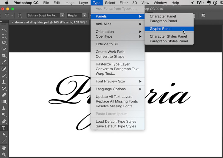
STEP TWO: To find the cool hidden stuff, go under the Type menu, under Panels, and choose Glyphs Panel (as shown here).
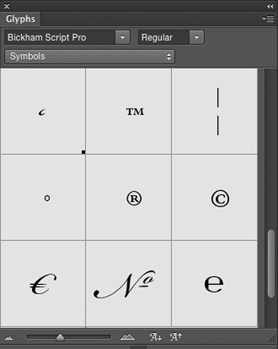
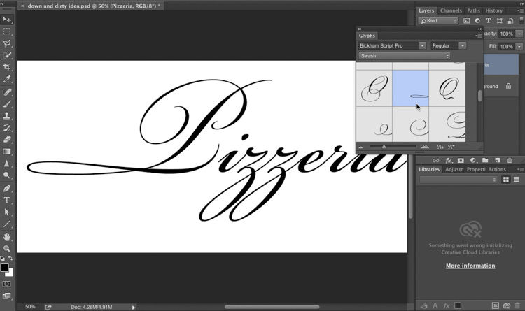
Above: Here’s what the panel looks like — it shows you all the font’s symbols, special characters, and specially-designed beautiful extra versions of your capital letters and lower case letters, and you can use these to create instant logos that really have a unique look.
Above: At the top of the panel is a list of all the different sets of characters that come with this particular font (and you can see there’s a bunch of ’em, like a whole set for Currency symbols, like the British Pound, The Euro, The Japanese Zen, etc.). But we’re going to use a special set of capital letters.
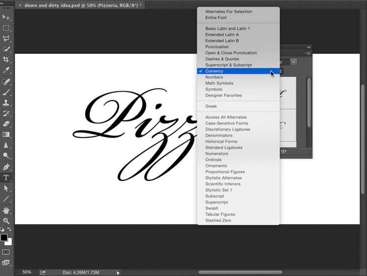
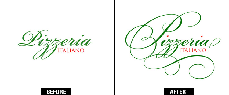
STEP THREE: Highlight the “P” in Pizzeria (as shown here) and then choose Swash from the pop-up list of characters in the Glyphs panel (as seen here). You can see a preview of the some of the beautifully-designed alternate capital letters you can use. Now, take a look at the capital “P” that is the default “P”. It’s “OK” but it could be fantastic by choosing some of these Swash version (TIP: there’s a slider at the bottom of the panel that lets you choose the size of the thumbnail previews).
STEP FOUR: Scroll down alphabetically to the letter “P” and double-click on the preview and it replaces your boring old capital P with the much fancier P you see here. Admittedly, I’m not crazy about this particular fancy “P” but luckily, it’s not are only choice.
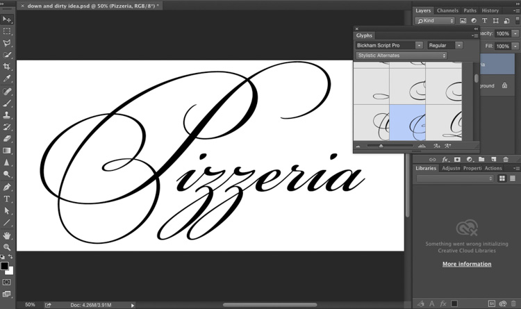
STEP FIVE: There’s another set of beautiful capital letters that take things up a notch. Highlight that capital P again; then from the pop-up menu at the top of the Glyphs panel, choose Stylistic Alternates; scroll down alphabetically to the letter “P” and double-click on the “P” there to get the gorgeous “P” you see here. How about that bad boy? Beautiful, right? Oh, but there’s more — let’s make the last letter in Pizzeria — the boring “a” into a more interesting “a.”
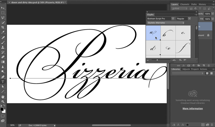
STEP SIX: Highlight that ‘a’ at the end, and then scroll up to the Stylistic Alternate “a” and double-click on it. Look at that nice a now! (stop snickering). ;-)
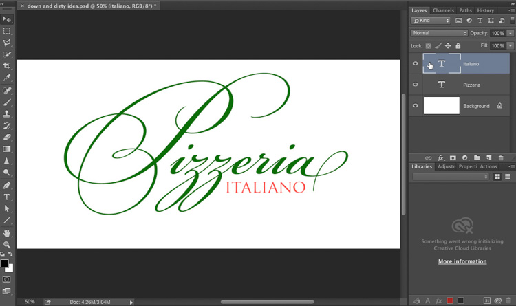
STEP SEVEN: We’re not done (still more cool stuff we haven’t uncovered), but let’s add a 2nd line of text; change your font to Trajan Pro (this font comes with Photoshop, too!) and type in the word Italiano. Change the color of Italiano to red; change the color of Pizzeria to green (highlight the text and choose the new color from the color swatch up in the Option bar at the top of the screen). OK, time for more fun stuff.
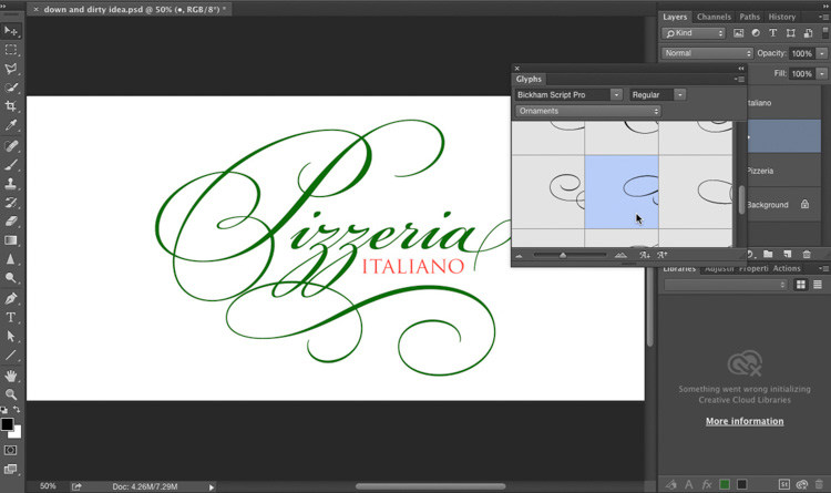
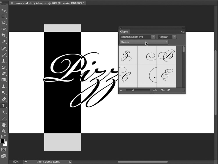
STEP EIGHT: One of my favorite features of Open Type fonts is that many of them has a set of decorative ornaments, and Bickham Script Pro is no exception — choose Ornaments from the Glyphs panel’s pop-up menu; click the Type tool somewhere away from where your other text is located; then double-click on any one of the ornaments and it appears on screen. Here I clicked on a nice ornamental “swooshy thing” and then I dragged it up under the letter “P” like you see here. I clicked on a few different ones until I came up with this one that I thought fit pretty well, but there were LOTS of choices of different styles and shapes. OK, we’re almost done.
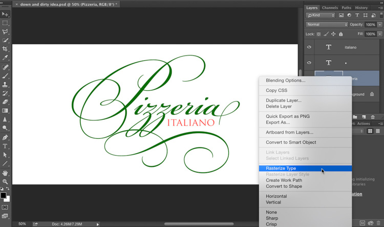
STEP NINE: You’re about to learn a very handy selection trick, but to make a selection of just part of a Type layer, you have to convert it from a Type layer to a regular ol’ pixel layer. You do that by Right-clicking on the layer in the Layers panel and from the pop-up menu that appears, choose Rasterize Type (as shown here). Now, you could grab the Eraser tool and just start erasing any part of that word Pizzeria you’d like (but don’t do that, because you’d miss the really handy selection tip I’m about to share.
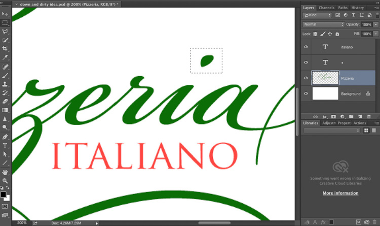
STEP 10: We’re going to make the dots in the dotted “i’s” red. Get the Rectangular Marquee tool; drag a selection around the dot over one of the eyes (as shown here).
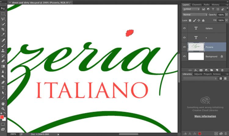
STEP 11: Switch to the Move tool; then press the Up Arrow key on your keyboard once, and then press the Down Arrow key once. This snaps the selection to the dot (as seen here). This is such a handy tip because it picks up every pixel (it does a much better job than the magic wand would have done. In fact, this technique will even pick up stuff like soft drop shadows behind layers, and basically anything and everything in that area. It works like a charm!) Now; set Red as your Foreground color then press Option-Delete (Windows: Alt-Backspace) to fill the dot with red like you see above.
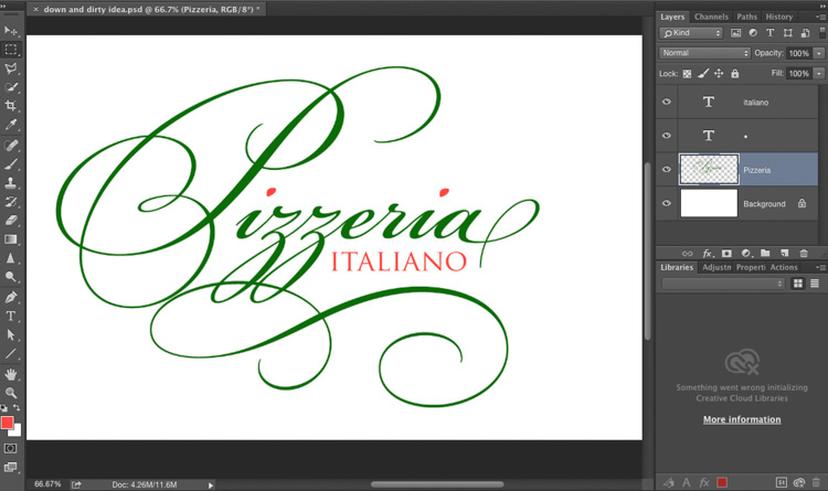
STEP 12: Here’s the finished logo with the red-dotted “i’s”
Hope you found that helpful. :)
-Scott
P.S. OK, this is a little off-topic, but if you’re into Landscape photography, make sure you check out the new online class from landscape photographer Richard Bernabe — his class on landscape composition is getting rave reviews from KelbyOne members. Here’s the trailer (it’ll make you really want to watch the class, so here’s the direct link to the class itself. You can watch it for $20, then watch all the rest of our classes for a full 30-days. Can’t beat it).
Hi Scott,
Sorry for the off-topic, but since you mention yourself Richard Bernabe’s class, any idea on when the problem with the iPad and iPhone apps will be fixed please? I watched the classes on my commute as when I spend time in front of my “real” computer it’s usually because I have work to do, so I am not enjoying all the classes that have been added recently. Thanks in advance for your answer.
They are telling me it’s going to be fixed today or tomorrow (and the fix is supposed to fix a bigger problem some users have been having, so I have my fingers crossed that it’ll fix both). So sorry for the delay, but we are “on it.” Many thanks. :)
Thanks for replying Scott
OK, it’s fixed!!!! You might have to manually quit the app and restart it (double-click the Home button then swipe up on the app to close it), but it’s working now. Whoo hoo!! (and thanks for your patience).
Scott,
I’ve seen the use of the Bickham Script Pro font mentioned in several posts accompanied by the line, “it comes with Photoshop.” As far as I can tell, that font was included in older versions of Photoshop but does not come bundled with CC. The only version I’m able to find in the Typekit fonts is a web version. Am I missing it somewhere? Thanks!
Hi Kevin. Thanks for the headsup – you’re right – the only current version is in Typekit – I just edited the post. Appreciate it. :)
Hi Kevin – you can download the font free from Fontsgeek.com (thanks commenter Sammy). :)
One constant in Photoshop is that there are almost always two ways to accomplish an task. Selecting the dot over the eye is just such an example. Here’s another route to the same destination:
1. Rasterize type
2. In the Layers panel, Command/Control the “Pizzeria” layer to create a marquée selection tight to the word.
3. Using the Marquée too (M), Option-Shift/Alt-Shift drag around the dot over the ‘i” and BINGO, you’ve isolated your selection.
That’ll work, Trev – you’re right…there’s always more than one way to skin a cat in Photoshop :)
Thanks Scott I wanted to make a new logo, now I can wait to try your new tip!
Very cool, Scott!
Many thanks, StormingZ :)
1) The glyphs panel is also available in InDesign and Illustrator
2) Not all OpenType fonts, or type families, have such an extensive availability of glyphs—though they are more likely to have more options than the TrueType or Postscript versions of the same font. Arcana GMM Manuscript (OpenType) and Poetica Chancery (Postscript) are a couple of other fonts that also have a range of type alternates that are fun to play with.
3) The formal creation of a logo should never be designed as rasterized (pixelated) artwork. This severely reduces the ability to scale (resize) the artwork for other uses. A better solution would have been to do this work in Illustrator—instead of rasterizing the type, it could be converted to outlines, allowing the artwork to retain scalability as a vector (paths), not pixels. In the example given above of “Pizzeria Italiano,” the artwork would need to be available at sizes for business cards (small scale) through menus and posters, to store signage (large scale), and possible billboards (extremely large).
4) The “italiano” art should consider using Trajan Pro Bold, instead of Trajan Pro Regular. The text gets a little lost in the plethora of swirls—thicker text would increase readability. Another suggestion would be to use Bickham Script Pro Semibold, instead of Regular. When scaling this artwork smaller, it is very likely that most of the finer lines of the artwork would become distorted or disappear at smaller sizes. Press-printed (paper) products, especially quick print, tend to have issues with lines thinner than 0.5 points. I have experienced offset press can sometimes go as low as 0.375 points, but that is really pushing the limits.
Great article – I just couldn’t see the ‘Swash’ set in the panel for any of the standard open fonts in PS CC
Me neither. Can anyone tell me what I would need to purchase to get the Fonts and the Swash set.
It just depends on the font you choose – some have created Swash characters and some haven’t. It’s more likely to find them in script fonts.
http://fontsgeek.com has the font for free, and will include the Swash set.
Scott, I have cc 2015 but the glyph panel doesn’t give me any alternates for selection, regardless of which open type font I am using. How do I get my glyph panel to reflect these?
Yes, that is correct. Not every font offers alternative glyphs.
Timely ideas . For what it’s worth , if your business want to merge are interested in merging of , my business partner saw a tool here http://goo.gl/G3c5mf.