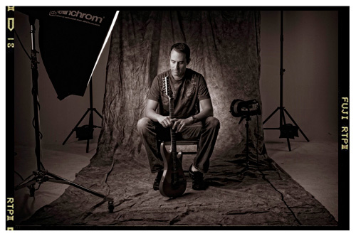
I had a number of people comment about the Duotone look I applied to my “Sessions” images” series (link), so I thought I’d share the exact settings I used (just promise me you won’t be surprised or disappointed that it’s so incredibly simple).
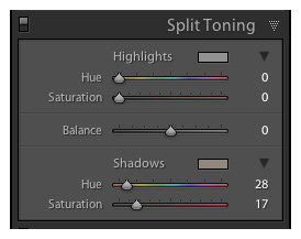
I did the conversion completely in Lightroom (though I’ll show you the camera raw equivalent in a moment). Start by pressing the letter “V” to convert the image to Black & White. Then go to the Split Toning panel—don’t touch the Highlights at all—just drag the Shadows Hue slider to 28, and the Saturation to 17.
That’s it. One letter—two sliders. :)
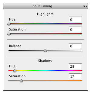
If you’re using Camera Raw instead; go to the HSL / Grayscale panel and click on “Convert to Grayscale.” (Does it bother anybody that photographers don’t use the term Grayscale for converting to black and white? That’s a graphic designer’s term, not a photographers. Don’t get me started). Anyway, then go to the Split Toning tab. Don’t touch the Highlights controls at all—just move the Shadows Hue slider to 28, and the Saturation to 17. That’s it.
Anyway, I know it doesn’t have a lot of fireworks to it, but that’s exactly how I did the conversions, and the exact settings I used.
Have a great Monday everybody!



Sometimes the simplest settings are the most effective ones.
I like how there is some sort of “memory” of color, not just the plain black and white. I”ve been experimenting a lot with duotones and B&W, and it’s amazing how you can imediately take all the color distraction of a photo.
I’ve been so exited about photography lately, thanks again Scott, for all your help.
Pedro; I definitely agree with you, the simplest settings for most design and photography pieces can be the most effective.
I absolutely love duotone and black&white photography.
Thanks Scott.
I’m still pretty new to lightroom and don’t even know what duo-tone is. Is there a tutorial or explanation somewhere?
Google or Youtube “photoshop Duo-Tone” or “Lightroom Duo-Tone” you’ll get good results.
You know, of course, that everyone is now going to load this in as the “Scott Kelby Duotone” preset. :-)
Good call! That’s exactly what I’m calling it. ;)
I agree with Pedro: sometimes we don’t need a lot of fireworks to get a nice spectacle. Thanks for sharing Scott!
Simple is the new sophisticated…
Nice and simple, you should never make it harder than it has to be. :)
So, what´s your next personal project?
Thanks for sharing. Despite your humility, this sort of “simple” setting is what most people need.
Did you get this from Matt’s presets? Just kidding, great tip! I missed the Jan 14th post somehow and broke my 3year comment string. That is not cool. Oh well, start over. :)
KT
Haha! I should have read the posts before I commented about Matt and all his LR3 presets, Ken!
Sorry about your broken comment string!…Now THAT was very cool and kick-butt! :D
–John
Hi Ken: I’ve been meaning to talk to you about that. ;-)
-Scott
Great look from a simple procedure. The hallmark of Scott Kelby tutorials! Thanks, Scott…now Matt can make another preset for us to download at killerlightroomtips.com (but he’d better give you credit! :D ).
–John
That so simple its genius! I am surprised only the shadows were toned, and not the highlights. I think I will have to have a play with the shadow toning of some of my photos now…
Thanks Scott
Thanks for sharing.
Surprised not to see some football pics. R U shooting any of the playoffs?
Wish I was in Tampa
it’s -16 right now in Toronto
Iden, I was hoping Scott made the Chicago game. I looked for him through the snow. That would have been a change from sunny FLA!
Hi Iden:
I had sideline credentials to shoot the game, but this weekend was my son’s birthday, so I skipped it. I’ll be shooting the NFC Championship Game this Sunday, though. Whoo Hoo!!! :-)
-Scott
Hey Scott,
Your response to this took my respect for you as a person to a complete new level. Happy Birthday to your son. So Bears/Packers will see the Fabulous Scott Kelby. Way to go buddy
Mike
PS thanks for the excellent & Simple settings!
I’ll be traveling to Florida but will be watching every second of the game. Looking forward to your shots. GO BEARS!!!!!!
GO PACKERS!!!!!!! Have fun
Go Bears. Looking forward to hearing how you use the shutter and gloves in the cold. Also, how you keep batteries warm with the wind chill from Lake Michigan. Finally, maybe I missed it but what is the “FUJI RTP II” on the photo of Matt K.? It looks like a film contact sheet. Is that part of the effect, camera type or film? Thanks, as always, for the good stuff and inspiration.
Hi Scott
Thanks for Sharing. It my be simple put you had to envision it in the first place, great work.
Thanks for the “recipe,” Scott! I’m going to try it out ASAP.
“Grayscale” doesn’t bother me as much as Canon refering to shutter speed as “time value”. Have you ever heard a photographer ask, “Hey, what time value are you shooting at?”
Hey Harry, I’m a Canon shooter and that is too funny! It made me burst in laughter!! Thanks, I needed a boost … it’s kind of gloomy back here.
take care
rui
Ah, the KISS method. Keep It Simple, Scott.
Hey Scott,
This is fabulously simple or what ever you can call it. Certain things are so simple and effective but yet we break our head to sit in front of system to get the different look.
Landed on this one with pointer from Glyn Dewis regarding a similar toning stuff that i was looking for.
Great stuff this one. Would def do a preset and would call this “Scott Kelby Duotone” :P
Cheers,
Shiv
Thanks for sharing that. It does look nice. ;-)
Can somebody translate this to Aperture?
Love ,love, love the Doorhof video placed today in Kelby Training. He has packed that thing with so much info! I also love the mention of Dean Collins!
One question, right off the bat, He never mentioned why he removed the front from the octi. Is it for a more contrasty look on the model?
Thx
Debbi
I haven´t seen that yet, but i´m gonna.
I guess you mean the octabank, if you remove the inner and outer baffle then you get a much crispier light which will give you a more contrasty/harder/crispier type of light on the model.
Its´s all a matter of taste and what you wanna achieve.
I´ve tried it myself and it´s kinda cool.
Thanks Patrick!
Scott why can’t you create a place on Kelby Training for questions and answers for the individual classes we see there?
Debbi
An excellent technique that’s probably the most simple I’ve ever used. I’ve gotten used to doing most of editing in ACR anyhow. The tools are really effective. Especially the “Gray Scale” section. If you use it, don’t forget to use the individual color sliders. You’ll get the most out of your B&Ws.
Thanks for sharing
p.s; pls check your email
I echo what Pedro says in that sometimes the simplest settings are the most effective.
As I said in the original post Scott, I absolutely love this series!
Great work; thanks for sharing.
Glyn
Could I trouble anyone to give me these steps in Photoshop as I do not use either Light Room or Camera Raw.
Thanks in advance.
I love this! I just uploaded an example to my flickr.
http://www.flickr.com/photos/spencerkoch/5369145436/