

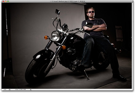
The original image is shown above—that’s Photoshop User Managing Editor Issac Stolzenbach, on his classic Honda Shadow Sabre (click for a larger view).
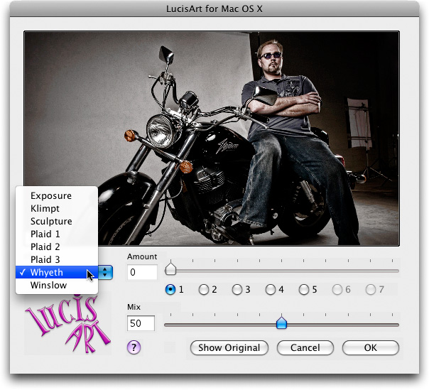
The Lucis Art plug-in interface (Click for a larger view).

The grittier, hyper-sharpened, high-contrast image after applying the Lucis Art plug-in (click for a larger view).
YOU’VE GOT THE LOOK
Photography, like fashion itself, seems to go though periods of time where there is a certain “look” that everybody wants to have, and right now the hot look for portraits is what you might call the “Dave Hill look” (I blogged about Dave’s photography last month—here’s the link). His trademark look is gritty, sharp, yet at the same time I’ve heard it described as almost “painterly” in nature. Whatever you want to call it; every big celebrity and rock band wants him to shoot them, and even big business magazines are calling on him to shoot their covers. He’s the “it” photographer.
Now, after researching the living daylights out of this topic, I can tell you this: I don’t believe Dave Hill’s look comes from a plug-in, or just a Photoshop technique, or just a special way of lighting. It’s a combination of all three:
- Lighting. His lighting is a key ingredient and without the right lighting look; what you do after the fact in Photoshop won’t get you there. He uses a lighting set-up that creates lots of contrast (he uses anywhere from four to six lights on average). He often uses two bare bulb kicker flash units (with reflectors) behind his subjects to really rim out the sides of his subjects, which helps add that bright highlight contrasty look. He also usually uses a Main Light up front (sometimes a Ring Flash), and a Fill flash as well (You can see this in the “behind the scenes” video on Dave’s site—I’ve watched every single one).
- Photoshop Techniques. He mentioned in a recent interview that he does a lot of dodging and burning (I believe he makes his highlights much brighter and his shadows much darker to create maximum contrast before he adds special effects), I think he does some Shadow/Highlight moves, along with some High Pass sharpening, or a series of Unsharp Mask or Smart Sharpen applications. He said recently that he doesn’t use HDR for his images (and I agree), but I do believe he “double-processes” his raw images (exposing the same image twice in Camera Raw; once for the foreground, one for the background, and then he combines the two). He could also be doing a lot of this right within Camera Raw, but then again–I could be totally wrong. (Matt showed a Lightroom technique on Photoshop User TV for achieving this type of look in Lightroom’s Develop Module or Camera Raw).
- Composition. It doesn’t matter how much Photoshop and lighting you throw at a scene, if it isn’t composed well and exposed properly; it’s not going to work. The fact is; Dave is a very, very good photographer, with great technique, and he’s very creative and clever in his compositions. You could nail his lighting, and his Photoshop techniques, and still not get a Dave Hill final image. There’s no substitute for talent and creativity.
A ONE-CLICK LOOK?
Dave has given some “hints” in forums and interviews about how he gets his look, but he’s somewhat guarded about his “Secret Sauce,” and I don’t blame him. Everybody wants the look he has created—it’s what makes him stand out and get all those high profile gigs, and if he shows us all exactly how he gets it, his trademark look (the one you can currently only get from him) will be franchised, and I totally understand and respect him for protecting it.
So, although I can’t show you how to get Dave’s exact look, there is a plug-in called “Lucis Art” (pron. “Lou-sis” Art) that gives you that dirty, grungy feel, and it’s gaining it’s own underground cult status because although it won’t turn you into a Dave Hill, the look it gives is in the ballpark enough that I’ve seen people arguing back and forth in forums that his whole look is either based on this plug-in (he says he doesn’t use it, and I believe him), and/or HDR (as I mentioned earlier; he says he doesn’t use HDR either; I believe that as well).
The existence of the Lucis Art plug-in is almost as shrouded in secrecy as David’s techniques, but once you’ve found it, you’ll be amazed at what it can do. It is somewhat of a one-trick pony; with three basic controls:
- Which type of effect you want to apply. It’s just got one pop-up menu, and the one I find myself using most often is the Whyeth effect.
- An “Amount” set of radio buttons, which controls the intensity of the Effect. It’s really the amount of noise, brightening and sharpening. A setting of “1” is the basic setting, and every button you click higher just turns up the sharpening and noise effect. I stick to the “1” setting myself.
- The Mix, which is really like an opacity setting which lets you choose how much of the original image stays in tact, and how much of the effect you see. I usually stay between 40 and 50%. I also usually apply the filter on a duplicate of the Background layer, so I can lower the layer opacity after the fact if I get carried away.
THE PROS
I like the gritty, dirty look, Lucis Art provides and if you’re looking to add this type of look to your bag of tricks; this is about the easiest way to get you there.
Another “Pro” is that you can download a free 30-day Demo version from their web site (here’s the link).
THE CONS
There are some issues on both the Mac and Windows platforms. The big Mac issue is that to run Lucis Art on an Intel-based Mac (and by the way; all Macs for past year or so are Intel-based), you have to run Photoshop in the slower “Rosetta” mode (you do this by simply turning on the “Open Using Rosetta” checkbox in the Get Info box, before you launch Photoshop). That’s not a big problem (other than the fact that Photoshop runs slower), but the big problem is (at least for me), I forget to turn Rosetta back off when I’m done.
The other Con is that the Mac and Windows interfaces are different. The Mac interface (shown up top) is much more simple and refined looking than the Windows interface, which is somewhat clunky–but at least you don’t have to run it in Rosetta mode.
THE BOTTOM LINE
If it weren’t for the whole Rosetta and PC Interface issue, this plug-in would have gotten my “Scott Thinks It’s Hot!” Award. I really like what it does, how easy it works, and the simplicity of it’s operation. The plug-in isn’t cheap at $169, but if you’re a working pro (and according to the developer, Image Content Technology; 90% of the people who buy the plug-in are pros) and your clients are clamoring for this look, you’ll get that $169 back on the first job. Also, the company that developed the plug-in said this summer they will be replacing Lucis Art with a “Pro Version” with many new features and a greatly enhanced interface, but also a greatly increased price; $595 (which may be why so many people are snatching up the $169 version before it’s too late). Here’s the link to their site for more info, examples, and to download a demo version. Oh, and NAPP members should check the members discounts because Lucis Art is listed there. One last thing:
THE DAVE HILL DEBATE
Dave’s “Look” has created incredibly long debates in a dozen or so different online forums, with people arguing back and forth endlessly about what they think he does/doesn’t use to get this look (or what Dave has or has not said in forums and interviews about how he gets his look). I’ve seen their comments often get pretty nasty, as things generally tend to do in forums. I really didn’t want to start yet another debate here on my blog, and the comments I made above about how he gets his look are simply just my own guesses–I haven’t talked with Dave or even been able to replicate his look myself. So, in short, I could be totally wrong about how I think he does it.
Also, I want to make it clear that I am absolutely NOT saying that the Lucis Art plug-in will give you Dave Hill’s look; what I am saying is that the plug-in gives you a gritty, dirty look that I personally like, and while it does somewhat remind me of Dave’s look; it’s just a plug-in and Dave’s work is MUCH more than that. Lastly, if you look through Dave’s portfolio, he doesn’t apply the same look to every photo. Some are very gritty; others are not nearly as gritty, and so on. For some things in life, there’s just not a one-click-fix.