

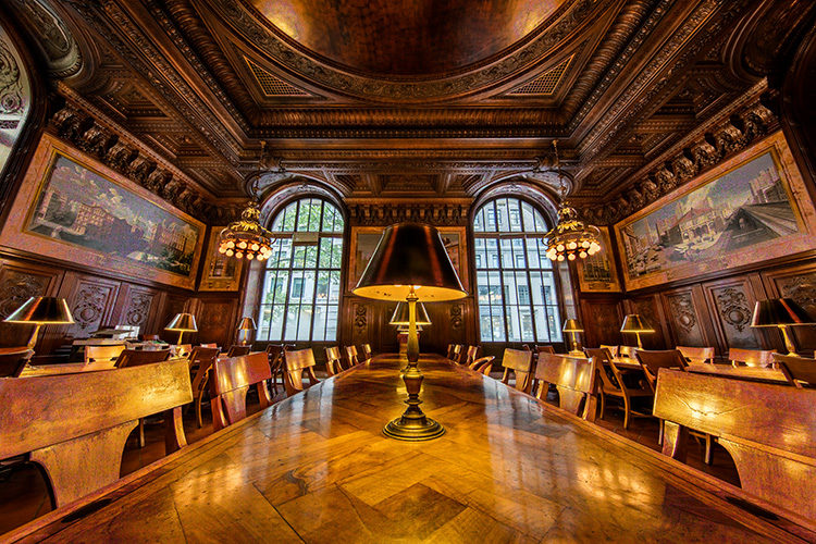
Above: The Dewitt Wallace Periodicals Room at the New York Public Library on 5th Ave. in Manhattan, taken with a Canon 11-14mm super wide-angle lens on a Canon EOS 5Ds.
Hi gang, and happy Monday. I shared the image you see above on Instagram this past weekend, and as expected, one of the photographers that follows me there wrote:
“Lightroom can easily straighten the verticals with just a few clicks, hint hint.”
Of course! I know that: I’ve written about it in my books, talked about it in my online classes, etc., but it was nice of him to let me know, anyway. ;-)
Here’s the thing…
I like it just the way it is, or I would have fixed it before I posted it on Instagram.
Even though the verticals are not “technically correct” (meaning the walls are leaning inward) I love the look a super wide angle gives. I know the verticals aren’t straight, but I love that look. It’s breaking the rules on purpose.
It’s just like breaking the “rules of composition” — if you don’t know what you’re doing and you break the rules, you’re a “goober.” If you know what the rules are, but you break them intentionally because you like the way it looks, then you’re an artist.
If I wanted the straight verticals look, I would either have used a tilt-shift lens when I shot it, or I would have fixed it in Lightroom, but I left the verticals untouched (and I generally do), in all my super wide angle images unless (and this is a biggie) it looks bad to me. That’s the “art” part of it, and a decision the photographer taking the image makes. In this case, I don’t believe the “technically correct” shot looks better. You might feel differently. See below.
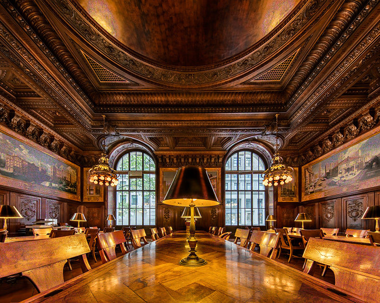
Above: Here’s what the same shot looks like when you fix the verticals in Lightroom. This is a more “technically correct” shot, but I don’t like it nearly as well.
Yes, the walls are now straight and not leaning inward. But, to me, the shot lost some of it’s “epicness.” It’s now cropped almost into a square, and I had to use Content Aware Fill and some Cloning to fill the edges. It’s really not a super wide-angle shot any longer. I don’t like what it did to the ceiling, and I just don’t like it in general. I miss my bendy walls. :)
Now, all that being said…
…it’s very possible that you prefer the second shot (the shot with corrected verticals) better and I’m OK with that. That lens distortion in the first shot (the walls leaning in) doesn’t agree with everybody — though one guy on Instagram wrote:
“…the distortion really draws me into the photo.”
I dig that guy. Plus, I agree, and I think that is part of the power of not correcting — it kind of draws you in. Anyway, when you take images really wide like this, this is a call (to correct or not correct) you’ll get to make, and I’m sure a lot of people will choose to fix the verticals. I’m cool with that too.
My style is to not fix the verticals (scroll through the images on my Instagram page and you’ll see this look again and again, along with the occasional corrected shot, too, but for me, that’s rarely the call I make). That’s the awesome thing about creating art. Everybody gets to do their “own thing.” If we all saw art the same way, what a boring world this would be.
Technically Correct vs. Artistically Correct?
Does your photo look better to you a stop under-exposed? How about 2-stops over-exposed? There’s a difference between a mistake, and an artistic decision. At the end of the day, this is a call only you can make, and as long as you’re making the call intentionally, then go make your art. :-)
A Quick Shout Out….
…to the super friendly folks in Little Rock, Arkansas who came out to catch my keynote presentation at Photo Expo 2016 last Friday night. I met so many wonderful photographers, and enjoyed the Little Rock hospitality (and the entire audience “calling the Hogs”) very much indeed. Also, a big thanks to Canon for inviting me to be there in the first place.
Have a great Monday everybody, and I hope I have given you something to think about today. :)
Best,
-Scott
P.S. A TON of new cities around the world just posted photo walks this weekend as part of my “9th Annual Worldwide Photo Walk” (sponsored by Canon). If you looked last week and your city didn’t have a walk organized yet, I’ll bet it does now! Here’s the link to check.
P.S.S. I’m in Indianapolis on Thursday with my seminar. Hope you can join me.
I noticed the distortion as well. But since I’ve followed you for years, I figured that you knew what you were doing. Due to the criticism you received, I now know why. Thanks.
Graphic design guru Robin Williams said many years ago that there are hard and fast rules for graphic composition. She then went on to note that some of the most captivating designs broke those rules. Her claim was that the designers of these masterpieces knew the rules and knowingly decided which ones to break to create their art. Your post reminds me of the technically imperfect music of Rock ‘n’ Roll icon Little Richard. Many of his early hits were distorted because he was screaming into the microphone. My guess is that if he had the recording equipment of today that would limit that distortion, the raw essence of Little Richard would not have come through and we may never have heard of him or his music. Loved your “technically imperfect” photo on Instagram.
The whole point of having that (or any) lens is the “look” it gives you. By straightening the verticals, you take away the point of the lens, as well as loose part of the frame. These sorts of images are precisely why I love and use these kind of lenses. It’s art, it’s not just documenting a space as it exists and besides, “technically correct” is usually boring anyway… Keep rockin’ Scott!
I like both versions, like you said it’s the art part that either appeals to some folks or not. What a beautiful room though, that’s all I see. Great work Scott.
ditto.
the richness of all the details etc…
I like the corrected image the best. The leading lines draw me into the image not the distortion. Both work. So many opinions on the web that at times it becomes toxic. My pet peeve is when someone offers an opinion or a suggestion to make an image better( in their mind) and the creator doesn’t like it. The answer is always it’s Art or its my style.
That’s the thing – you shouldn’t offer an opinion or suggestion on how to make it better, unless the person that posted the shot asked for one on how to make it better. The button says “Share” – Not “Submit for critique.” :-)
In a perfect world that would maybe be the case. We are all human and I think if you post an image expect a response.
A lot of people believe that if you have the right to share your image they have a right to share their opinion. We can’t really grow on just ” thata boys”. I do know what you mean though.?
I don’t really have a preference on one or the other. The corrected version looks “right” because it isn’t skewed. However, the uncorrected has a different feel to it. It makes me feel more like I’m actually sitting at the end of the table and feeling very small. I just imagine all those chairs occupied by older, very serious people all looking at me with stern and unhappy expressions.
I love the look of super-wide lenses also. My taste in distortion and volume deformation in any photo is somewhere between “technically-correct” and “straight-out-of-the-camera”.
I can go either way with it. When I want my verticals “fixed” I just use my tilt-shift lens :)
Distortion wins the day for me. I love the original shot, and while the “corrected” version is fine, I lose all sense of scale for the room when I look at it. But I can’t help feeling you’re “feeding the trolls” with this post, though……
Btw, how is your “Great Interiors” book coming along? A copy would look good on my coffee table (signed by the author, of course)! ?
–John
Here’s the bigger deal with stuff like this – no one knows whether or not you know the rules and broke them on purpose for artistic intent or if you’re a goober who doesn’t know any better. The bottom line with this is whether or not the image communicates to you and appeals to you. And that’s the deal with art – some will like it and some won’t. We have to be OK with that!!
While there are “rules” in photography, they are in reality more guidelines than actual rules.
Personally I prefer the original skewed version. It draws me in, and makes me want to be there.
The “fixed” version is the sort of thing I’d expect to see in a real estate ad as its likely more “accurate”. However, unless I am greatly mistaken, Scott is not going for journalistic purity, but doing it for the art. Art is meant to evoke an impact in the viewer, and the original does that for me. The perspective really draws me into the scene and makes me want to be there. There is a great deal of interest and freedom in distortion, that lacks when the scene is perfectly straight.
For me personaly, the best approach is the one that my university profesor taught me: “If it should be straight, straighten it, if it should be skewed, leave it skewed.”
I love this quote: It’s just like breaking the “rules of composition” — if you don’t know what you’re doing and you break the rules, you’re a “goober.” If you know what the rules are, but you break them intentionally because you like the way it looks, then you’re an artist.
Good stuff as always, Scott.
Gotta agree with you on this one. Much more dynamic that way.
Couldn’t agree with you more. There are plenty of times when it just makes sense to break traditional rules – and if it looks better uncorrected (which I think it does) just leave it the way it is…
Sometimes it’s actually the very things that shouldn’t work or are technically incorrect that make an image. I’ve also noticed that what the camera thinks is over exposed Lightroom or photoshop will think is bang on or even underexposed. Sometimes you just have to break the rules to get the look you want :-)