I’ve been wanting to update my online portfolio for a long time now for a number of reasons, but mostly so it could be a somewhat consistent experience no matter where you see it (on a computer, iPad, iPhone, etc.). Besides that, I also wanted to update my images, but since my portfolio was Flash-based, and I’m no Flash wizard, it was kind of a pain (read as: I needed outside help) to update even just one image in my port, so it stayed pretty much woefully out-of-date.
RC to the Rescue!
Luckily, this turned out to be an easier, and much faster process than I figured it would be, because when you want to get your images on the Web, where do you go? That’s right—-you go to RC Concepcion (the guy who literally wrote the book on the subject). RC got my previous Flash-based portfolio online for me, and I absolutely loved the way it worked—-as long as I was looking at it on my computer. As soon as I looked at it on a mobile device, it….well….it stunk (it swapped the Flash version out for a lame HTML stand-in).
I went to RC and told him the four things I wanted this port to do:
(1) It had to work on iPads and iPhones (so it couldn’t be Flash-based).
(2) I wanted the images to be as large as possible, while still allowing room for links to multiple galleries.
(3) I wanted a portfolio layout where wide images and tall images would get the same amount of attention (if you look at a lot of portfolios you see online, the wide images fill the screen, but then a tall image comes up, and it feels tiny by comparison, and it’s centered on the screen and surrounded by either gray or black.
(4) It had to load faster than my old Flash portfolio, which made you wait while each image loaded one-by-one (it even had its own status bar), which was another big downside of the old one.
I went with a horizontally scrolling layout, with no thumbnails
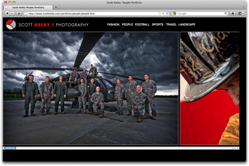
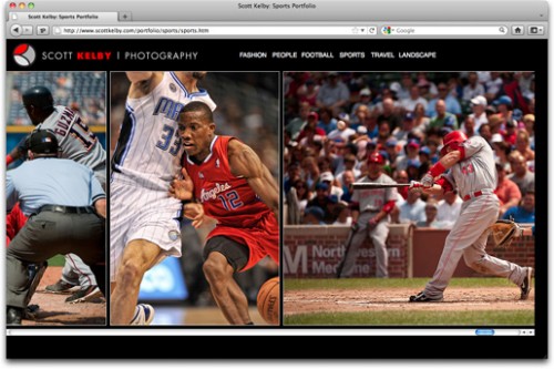
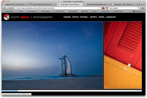
You can see in the layout below how vertical and horizontal images are side-by-side at the same height, so the tall images don’t wind up all alone, centered on a page and looking really small.
But there’s another big benefit to this horizontally scrolling layout (as you’ll see below).
Panos rock with this layout
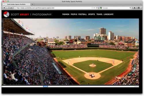
I shoot a decent amount of panos, and I use my Cinematic Style Cropping technique on images, and these look really great in this horizontally scrolling style (because usually these wind up so small on screen), but if you look at the image above, it’s actually even wider than what you’re seeing, but you just scroll right on over. This I really dig (there’s an image of a Hawaiian Fire Dancer in my People port where this works beautifully to show the entire image at a nice big size). Also, another nice feature is that although you do click and drag the scrollbar to see the images on your computer, on an iPad or iPhone, you just swipe your way through it, which I love.
More Categories
I wanted to separate my Football shots from my other Sports images, so now I have two separate categories (sports and football), but RC also suggested, after seeing the first run-through of my people port, that I should separate People and Fashion into two separate categories, and after looking at it, I agreed, so now they’re separate (although the fashion category technically should be titled “Beauty & Fashion” I’m going to let it go as just Fashion, and it’s the default portfolio that appears when you click the Portfolio link here on the page (or this link right here).
RC’s Design Hits All My Points!
This new port, which RC designed from scratch in Adobe Dreamweaver, does everything I want it to (with one small exception). It’s HTML-based, so it can be seen on any mobile device; it loads much, much faster than my old port, I like the horizontally scrolling layout so tall and wide images both look good, and I like that the image sizes themselves are very large. However, that’s the one area that doesn’t well as well when you view the port on an iPhone. You actually have to “pinch in” to get the port to fit on the tiny screen. Outside of that, I’m very happy with it, and it’s very easy to update with any HTML editor (I just upload the file and change the file name—that’s it. Not a bunch of coding and stuff, which is great for me).
Another benefit is that this new port lets me email a direct link to an individual portfolio, so if I wanted to send someone directly to my Football portfolio, I could send them to http://www.scottkelby.com/portfolio/football/football.htm (whereas in the old portfolio, I could only send them to the main portfolio, and then ask them to click on the Sports link).
This Would Make a Great Online Course
When RC was done (he put the first version together in literally just an afternoon or so), he said, “Do you think showing how to build a vertically-scrolling online portfolio just like this this would made a good class for Kelby Training Online? I told him, “Are you kidding!!!! Absolutely!” so RC’s going to take what he did for me, and show anybody how to quickly and easily create the same type of port for anybody who digs this type of layout, and multi-device compatibility.
Thanks RC!
My thanks to RC for all his help in getting this up (Dude, you so rock!). The bulk of his time was spent rearranging images for me to this morning’s launch. Once he’s done (today) he’s handing the reigns over to me to do my own updating from here on out, and honestly, that’s the way I want it. I don’t want to bother someone each time I want to add, move, and update my port, and being able to instantly do it myself, will almost ensure it gets updated much more often.
You can see the final port yourself by clicking on word “Portfolio” (top left side of my blog here, right under “About Me”), or you can just click this link.


That RC….he’s worth his weight in gold! Great job with the portfolio. I agree that this would make a great class on Kelby Training. Hope we don’t have to wait as long as the Jay Maisel Part 2, though! ;)
–John
John, are you whining?!? #1rule! ;-)
Ken, any implied whining was immediately cancelled out when I put in the “winking smile” emoticon. I’m well aware of Scott’s #1 rule, and I’ve seen the Wrath of Kelby when someone on his blog breaks it! :D
–John
Hi John: Luckily, RCs class won’t have three cameras rolling, and 18 hours of video to log and edit, so I imagine it will go up in a fraction of the time of Jay’s. That’s one of the downsides of creating those documentary-style classes—they take forever to edit (even though, when they’re finally done, they’re worth it).
All in good fun, Scott. You know we all appreciate what Kelby Media does for us, no matter how long it takes.
Seriously, though, how much sleep do you get at night? Looks like about 3 hours judging by your responses to these comments! :P
–John
I don’t know if it would be possible, but could you enable it to scale to different resolutions? I use a 1600×900 monitor, and the images don’t fill up the browser.
Yes, it’s a pity that the pano crops aren’t full screen on my 1920x1080px monitor :-(
Just send RC an email. We’re working on it. :)
-Scott
Scott….this is just GREAT!! Can’t wait to watch the class….I want a site like this too!! After RC does the class, however, you might end up with thousands of “Scott Kelby Clones” out there…So, RC…be sure to let us know how to make our new sites unique…
I dont mean this to be snarky at all.. but the best way to make the sites unique is to use your images. I think that as a whole people expect to see a general consistency with browser UI (navigation on top, a logo on the upper left, etc)
To that.. your content is whats going to make it unique
Speaking of consistency… I don’t know that I like it so much. I think that it looks best centered but several pages jump from center to the left. And I don’t know that I like the scroll bars at the bottom.
Although I don’t know how to let people know to scroll to the side rather than down.
Just my 2 cents.
Just like to agree with Ken. If things are to be consistent then we need a slightly better way to move from one image to another with Left and right arrows. I know it was the first thing I looked for ! Other than that I also want my Portfolio like this.
Hey Scott! Very nice, very nice! I like the layout alot, it gets me thinking if I should change my site (again).
I was looking at your site on the iPad and the only thing that I did’t like too much is that you have to scroll all the way back to get to the menu. But other then that very nice!
Looking forward to a class on this.
Hi Mark: I agree about scrolling back to the beginning. RC had talked about adding an arrow at the end that you tap (or click) to return to the beginning, and we should probably add that. :)
How about fixing the navigation so it doesn’t scroll with the rest of the page?
You (or RC) might want to look up “Responsive Design” on alistapart. I think it might help for dishing up different sized images for different view port sizes. The images fit great on an iPad when held in landscape, but there’s a big gap in portrait. Just saying…
C.
The portfolio looks amazing on an iPad (blessed to even have one, my wife brought it back after her recent trip to the States, we live in Russia)…really amazing!! Well done.
If there is a fix to the navigation always showing on the iPad, great, but if not, I did not mind at all looking at the shots pass me by again as I flipped to the beginning!!
Well done!
Yup. Looks great but it would be an improvement for the menu to remain fixed. I soooooo need to get my act together and create an online portfolio. RC’s WordPress course really inspired me, and then Scott gives us this!!!
Amazing. That’s the word. What superb content. The layout is really good. The scroll works perfect and looks good as well.
Great work.
Nice stuff, even though i think that this kind of portfolio works best on a iPad/iPhone because of the swipe thing. It´s not the same thing on the computer and scrolling sideways with your mouse or keyboard.
I agree!
Scott, looks great and yes, it would be a great training class. I’m so glad to have the app now so I have something to do when lying around waiting to be the first post! I actually had a Coroner call about 11:00 so I missed being first but I see John Swarce filled in for me. 8-)
I’m always there for you, Ken. Just save a seat for me at the Flounder if I ever visit.
Hello Scott, there is no page title on a landscape page, there is written “untitled document”.
Scott, nice job.
RC did a nice job, the portfolio works really well!
The only small thing I see that got overlooked was your last “Landscape” link, the page indicator says it’s a “untitled Document” when the Landscape pictures come up.
Congratulations!
Great job of SK and RC as usual.
I like the screen shots in this post. I personally like to see it 100% width on widescreen monitors or full screen preview. I think it’s designed to 1400px width.
I have noticed, there is a white border around the logo in IE8, not in other browsers. Page title of the landscape page is Untitled Document. (Don’t scream at RC)
Keep up good works and see you in Las Vegas.
Very good! I’m up for that course. It would make the perfect site for me. Just need to improve the photography then …
Very slick and certainly faster than the flash. Also good to see some new pics, some great ones in there Scott.
Looks Good!
Possible enhancements –
1. Center the web page (portfolio) for those users who have a large monitor
2. Do you want to have a link back to your blog (just personal preference)?
3. Place a vertical bar in between your portfolio categories for easier reading
It is nice to see another way to set up a portfolio. RC has done a beautiful job.
Hi Burk:
I agree with all three. I wouldn’t be surprised if you saw those happen this morning (RC is like a rapid response team, even though at this point he’s probably sound asleep). :)
-Scott
Love it! (but most of the suggestions made above would make it even better, especially if it can automatically scale to larger monitors). I love the newer photos that you just added to the portfolio, and RC did an awesome job as always. I’m very much looking forward to his class on this.
very nice!, one of the best design portfolio sites with amazing photographs. Good job RC,
The photographs are amazing!. nice shooting,and nice editing.
Good luck!
Yea it looks prity great.
It’s a shame tough that it is so small on my 24″ monitor. I noticed that the page is pinned in the top left corner of the browserwindow. It looks somehow like a scared animal cornered by a terrible beast. ;-)
I think it could help to put it in the center or add a small margin or something like that.
But all in all I realy like it. Great pics as allways!
Looks fantastic Scott! Just checking it out now at 9.15am here in Ireland, it’s my morning ritual. Just a small thing (sorry!) the title on the page tab on landscape is showing as ‘untitled document’…. I know RC is a perfectionist so I won’t tell anybody ha ha!
But seriously this looks great and I’m loving those classes on Kelby Training…I only took up photography (thanks to your books and blog) a couple of years ago at the tender age of 36 and now I’m making a decent living shooting weddings and journalistic commercial….so a big thanks to all you guys at the Kelby madhouse!
Why didn’t you take a picture of Borj-al-Khalifa the highest tower in the world while you were in Dubai?
It wasn’t nearly complete when I was there a few years ago. :)
Scott, I love your photography, but I really have a problem with your advocating a Dreamweaver-maintained web portfolio – it’s so 1990s!
I’ve been a web developer and photographer for over 15 years, and online photography portfolios are my speciality. Web designers don’t want to spend their time re-arranging images, and photographers shouldn’t have to spend their time editing files in Dreamweaver.
There are myriad portfolio themes for WordPress (the easiest/most-popular) CMS, countless web app businesses providing photographers with online tools to create and manage their portfolio (heck, I even launched one myself – GallerEasy) that make it SO easy to add new images, arrange them in portfolio albums, edit pages/sections, and keep everything SEO-friendly (no “untitled documents” to be found). You’ll find enough choice in design/layout, as well options for adding dynamic slideshow viewers – so no real need to get a bespoke design made for you.
Compared to hand-crafting HTML, and even using Dreamweaver, a CMS-driven portfolio site is a pure dream to maintain.
Here are some helpful links:
Google: wordpress photography themes
Web-app businesses: zenfolio, foliopic, smugmug, photographyblogsites
Claude, as a fellow web developer of 15 years, I wholeheartedly agree with you on every point you’ve made here. A horizontally scrolling site might work well on an iPad, but *only* on an iPad. It’s not a natural way for users to navigate a site on a computer and doesn’t tend to be well received in most usability tests. Even back in 2002, this type of layout was considered by most web developers as something *not* to do:
http://www.useit.com/alertbox/20021223.html
Not to be a downer here, but today’s photographers would be smart to opt for WordPress sites as Claude recommends. We haven’t been asked to create a static HTML site in over 2 years. All of our clients are now opting for WordPress, once they understand the many advantages, most especially the ease of updating it themselves. This is particularly true when the client will be regularly uploading images to gallery albums.
Although I’m encouraged to see photographers starting to finally nix their flash sites, I don’t want to see them trade one set of problems for another.
Scott,
Mark Imhof is right, you need to move the menu buttons into their own non scrolling frame so that on an iPad the menu stays put on screen instead of moving off screen when going through your portfolio. Other than that, oustanding work, very clean and simple html coding, I am curious as to how you get to update the galleries yourself, what RC made you for that!
Wow Scott! Fantastic work! Kudos to you and RC!
While you (and this new format) rule, it’s the reins (not reigns) that RC is handing over to you! ;-)
Pretty sweet Scott and RC. 2 things I noticed though in my quick scroll through, both of which would be quick fixes. There’s no title tag for the landscape page. And it would be nice if the current category link was highlighted in some way.
Abhsolutely great job Scott and RC. I checked it on both my desktop and Ipad and it works flawlessly. I wish I had an RC close by!!
Wes
Scott,
Loved the look. It’s quite impressive and would even be better with one tweak.
When scrolling horizontally on an iPad, you have to scroll back to the beginning in order to access the other categories..
It would be quite helpful if the menus repeated itself along the top, or remained frozen along the top as you scrolled through.
All the best,
John
Your work is breathtaking for sure. And as a fellow web / print designer I’m sure RC is LOVING the “2 cents” but at the risk of being a cad, I would add my own. Simply this: its quite easy for you to build a flash site for users viewing traditional web browser, and toss in a few snippets of code that would detect being viewed on iPad or iPhone, and switching back to this site. Then you have the best of both worlds and the comments can go back to the wonderful photos instead of the vehicle for their viewing.
Looking good!!! The only other suggestion I’d make that hasn’t been mentioned is to provide a better looking scrollbar other than the browser default. A itty bit of javascript can make that happen easily.
Hey Scott
Great collection of images! Wondering if you might offer some advice on how to choose images for a portfolio like this. It’s always a struggle to whittle things down.
Hi Jay:
I’m still struggling with it myself, because I want to keep each category to no more than 24 images, and I have a few under (which is good), but a few are over, so I still need to do more cutting. If you get stuck, do what I do; ask a number of other people to chose the three weakest images from your port. If a few people agree on any of them, then cut those first. :)
Hi Scott,
Just running through your portfolio again (I like it!). When looking at your Sports section I noticed one of the basketball shots(http://www.scottkelby.com/portfolio/sports/images/sports-0018.jpg) the picture looks like it was shot at a very high ISO, it just kind of stands out from the others as it seems kind of pixilated. Was this intentional the way it was shot or something else? Thought I would ask…
Scott, as always, great photos… Love the new portfolio and layout!
I have bought RC’s book, but haven’t had much of a chance to work through it. I really need to update my stuff too. (And then keep up with it when it’s updated)
I feel I am getting pretty darn good with Photoshop. The rest of the Adobe suite, not at all. However, something has come up that I need to have a good grasp on Illustrator, InDesign, Dreamweaver, and Flash by the fall semester. I will be on Kelby Training much, much more after my Alaska Cruise next week.
See ya in September Buddy,
Mike
Admit it! You liked my website and sent RC the direct link to it!
:))
(mine has no limit to the right side so the panos look even better on large screens)
Great site, Vlad!!
Thank you!
I re-worked my website a few months ago giving it a more personal touch. (panos and graphic design oriented)
Awesome. Forget the class, RC: just sell me the template.
I wish I understood all this. I have a G Slate with 3.0 Honeycomb and 1GB of RAM and it works like my laptop, only faster. I was so surprised how fast the pages change, etc.
My laptop is circa 2009 and Vista so maybe I shouldn’t be so surprised.
Andrew
Have you thought about letting the image gallery (when you clock of for example Fashion) to open in a new window without the navigation bar? That way the images can be bigger as they can fill the full screen.
Hey Scott!
Slick setup for the portfolio! And I’m tickled that you aren’t using Flash anymore!
Seems fairly straight forward. Looked at the source code:
– Uses the HTML5 tag to insert one HTML page inside another
– The inner page is simply a bunch of tags stacked right next to each other, inside of a tag that is specified in the CSS sheet
I would like to see how RC solves some of the issues that have been raised thus far (iPhone small screen size, etc). I suppose a JavaScript/redirect setup for ‘mobile devices’ could be used, but then again, an iPad (and other ‘tablet’ devices) are also considered ‘mobile devices.’
One other item to have RC take care of:
– ‘Untitled Document’ is still listed on both the main and pages (Only noticed this on the landscape page(s), as that is what I’m most interested in and only looked at on your portfolio.)
Again, congrats on the new setup, and props to RC for such simplicity!
Hey Scott –
Love the shots, and the portfolio looks good but it suffers from the one gripe I have with 99% of horizontal portfolios out there: navigation on a computer
What makes vertical portfolios so effective is you can PAGE DOWN and PAGE UP through them. As there are no horizontal paging keys, you are forced to use the teeny scroll bar at the bottom of the window.
Some portfolios address this with a simple js hack that lets you use your ARROW LEFT and ARROW RIGHT keys to flip from image to image (not unlike how The Big Picture lets you cycle through photos with J and K keys.
I would highly suggest asking RC to implement that tiny little hack that will make your portfolio infinitely more user-friendly. It’ll make all the difference in the world.
Nice, but when viewing the football page, I get vertical scrollbars..
http://emberapp.com/afulki/images/scott-kelby-football-portfolio
I uploaded a screenshot if you want to see what I mean, I had Safari at full screen so there is plenty of space.
Hi Gang:
Good news: RC is working on a lot of different things you guys have proposed, over on his development site, and once he’s got it all working there, he’ll move it over here, but he’s getting very close on some of the most requested tweaks (including having the navigation stay in place while you scroll through the port, and letting the gallery scale in width for larger monitors). More to come so stay tuned (and thanks RC!!!!). :)
-Scott
Hey Scott this is a different way of looking at it and I agree about how the tall images end up looking so small in the old layout but there is just something about this new one where your looking at one image and off to the side you can see part of the next one, it seems to draw me aways from the one on the screen and possibly make me zip thru it faster then I would like. Also would be nice to be able to move fromimage to image with the arrow keys in both directions or the sliding with the mouse.
As always your shots are great and would look good in any layout. Rc did good.
Hi Aaron:
We’re working on that “Page through” with the Arrow keys thingy. :)
-Scott
Scott is really communicative today))
Anyway i do not understand why apple do not support flash…
In the words of Steve Jobs “it’s a big bag of hurt”
Scott,
This is truly CAKB! I just ordered RC’s Web book, and am waiting (not-so-patiently now) for it to arrive. Can’t wait to learn some new skills.
Curious there were no Aaron Rodgers pics in the football gallery……. ;)
Isn’t that Aaron Rodgers in the 2nd photo throwing the ball? Or are you not that familiar with the Packers. ;-)
-Scott
P.S. That guy still owes me money! ;-)
Hmmmmm, I don’t remember that pic earlier. I must’ve been pretty sleepy to miss that. I know that jersey pretty well. :)
That IS a very cool shot, Scott!
Thanks for this post, Scott! I’m trying to update my portfolio as well (have a Flash-based site, transitioning to WordPress), so this is really timely and helpful. I’ve been particularly struggling with deciding which images to include/scrap, so your suggestion of polling for the weakest images (rather than the best) is appreciated.
I also was curious how you decided on the categories for your portfolio? In my heart of hearts, I am a freelancer… it’s why I love this job, it’s never boring and I enjoy the challenge of photographing new situations and figuring them out… but I find it kinda hard to organize my portfolio.
Thanks again for sharing your knowledge and experiences here and in your classes!
Love the new website. Sign me up the RC’s Kelby Training. It’s what we’ve been waiting for and Dreamweaver is our design tool.
Yo Scott, The new portfolio site is SICK!!!! I can’t wait until the class gets put together. looking forward to doing my own.
Geez RC does it again! Cracking way to show a portfolio of both Landscape and Portrait orientated photos Scott and yeah, would make a killer class on Kelby Training.
Great job!
It reminds me of Jeremy Cowart’s portfolio in term of simplicity, ease of use (except he went the vertical way – http://www.jeremycowart.com/).
What would make this perfect … if RC could design this so the images could be updated via the Lr Publish function … without having to re-code the portfolio each time you would add or delete images from a given portfolio … I’ve been playing around with some JQuery/PHP options that pull images from a directory without direct coding of the image file names … but I haven’t come up with exactly what I want yet … though this design looks like a great solution …
OK…I give….I will renew when RC’s class is up…. I have been meaning to but dang, jsut so busy I dont have time to stop long enough to watch….but summers coming and I do want to redo my pitful site and this will be my motivation!
Nicely done. Love the photos and the layout.
Kudos to RC
i like it! reminds me of the Sidewinder theme for WordPress by Graph Paper Press, which I used for my site. (hat tip to RC’s book for the assistance!)
Great transition to HTML. Please set the navigation to be “always visible” or place a link back to start of page. Kind of like other port sites that annoys users without a quick way to get to main navigation. Should be a quick fix. Use static footer also for links to other things that may be important to you. The only element that needs to move are the images. These are just suggestions, I know it can be annoying for others to tell you how to run your stuff.
Thank,
Dave.
I see one big problem with this new portfolio.
When I look at particular image, I see also one,two or even three fragments of other photos.
Different colors,styles,geometry,mood…
It is big no-no. It is simply distraction, which not let me concentrate on central image.
I can not believe,that Scott could overlooked this thing.I am talking about image perception,that depends also on surrounding.
This is most important reasons why we do not see museum paintings placed next to each other, frame to frame.
I prefer to see black or gray empty space,than something from another planet :)
Let’s look,for example,at sport screen-shot above.What we have there ?
We have on right side baseball photo,on the middle basketball one and on the left big a…
Or other screen shot – how You can contemplate beautiful,moody image with blues and dream ambiance, from Dubai,when Your eyes are hurt with red and yellow “abstract form” on the right side.
Sorry,but I can not…
>>>>>>>>>>>>>>>>>>>>>>
Greetings from Your honest admirer
I agree 100%. I found it very hard to focus on one picture at a time.
I can agree even if I said it was looking great below which I still think it does. But it could be improved. I’ve seen sites like this but where the pic on the sides where dimmed out. But I guess it might be hard to do here due to the setup of the portfolio.
Pssst….the 4th image from the end (with the boat) in the Landscape gallery could need a horizontal adjustment. ;-) As I can see it falls to the left…
Besides that, great site with even greater pictures!
/Anders
Very happy to see that no less than two images in the travel portfolio was shot in Sweden (the Roadmaster and the Turning Torso).
Unfortunately I have to say that there is some technical issues with the portfolios.
When viewed on “low-res” display (1024x768px) , you get a s*it load of scrollbars.
Just a few pixels smaller layout would do the trick.
Lucky you. I don’t have RC. :( I can’t even set the flash portfolio up. Mine looks horrible it’s just a Slideshow that I made with a plugin. Yes I needed a plugin to do that.
Mister picky pants says “I think you mean “REINS” as on a horse…. not REIGNS” like the king of cool… ( Me )
Absolutely Love It!!!!
I love it too :)
With regards to the model photo,I meant the right of the photo, the models’ left arm.