

Hi! My name is Regina Pagles and I am a portrait photographer residing in the rural community of Springdale, Utah (Pop. 450), just outside of Zion National Park. I have a small studio where I have been taking portraits of friends and family since I discovered studio lighting in 2010.
I have combined the techniques learned from my biggest inspirations, Peter Hurley (expression), Sue Bryce (posing), Don Giannatti (lighting) and Scott Kelby (post processing) to develop and hone my own style. In the spirit of â˜paying it forward,' I would like to share with you what I have learned and the techniques I use, in honor of those that have inspired me and who have offered their knowledge so graciously.
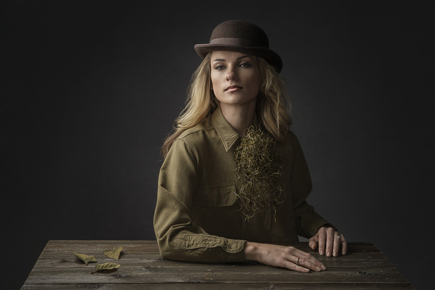
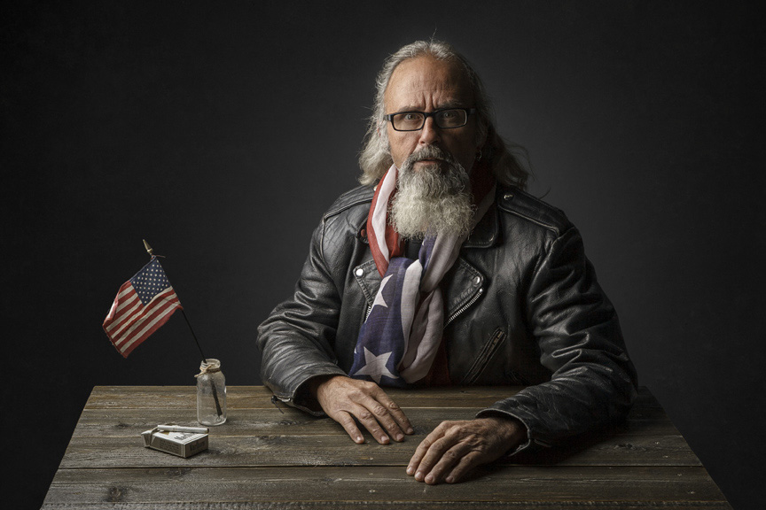
I will take you through my post processing workflow, using a recent image of one of my favorite subjects, model Yolanda Damon Harris.
Straight out of the camera, you can see the image doesn’t look too good…
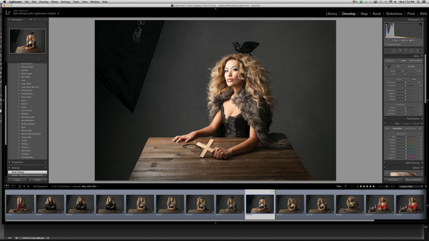
I begin by making initial adjustments in Lightroom and the image starts to improve.
The first Lightroom adjustments are correcting White Balance, Exposure, Highlights, Shadows and Blacks.
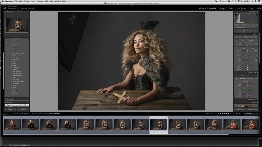
Next in LR:
- Add a little Sharpening. Amount = 60, Radius = 0.6
- Correct the table perspective. Under Lens Corrections, I adjust the Horizontal slider to +11. This distorts the entire image a little, but I'm ok with that.

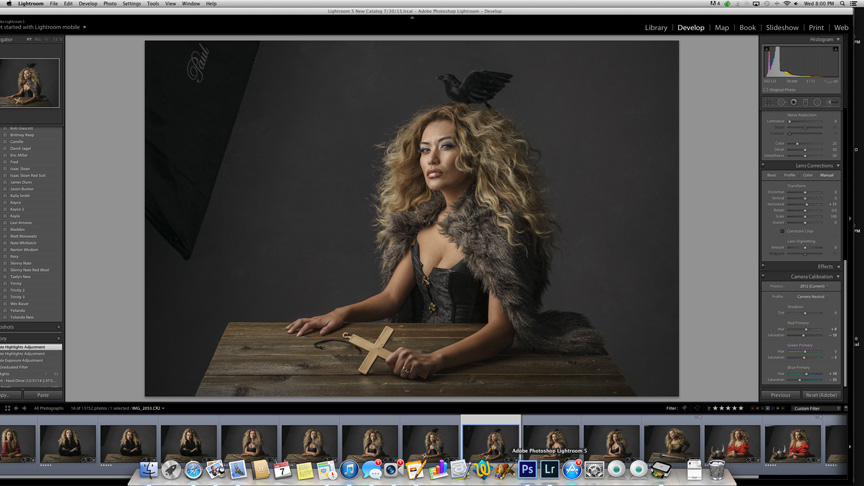
Under Camera Calibration, I make these adjustments:
- Change Profile to Camera Neutral
- Under Red Primary, Hue = +8, Saturation = -10
- Under Green Primary, Hue = 0, Saturation = -5
- Under Blue Primary, Hue = +10, Saturation = -35
The red, green and blue primary adjustments are image specific, but generally very close to these settings for the majority of my images.
All finished in Lightroom, now onto Photoshop.
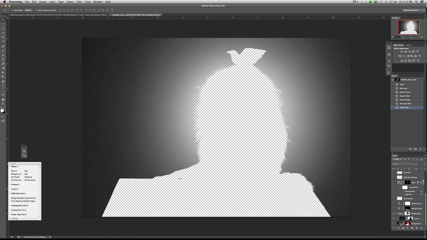
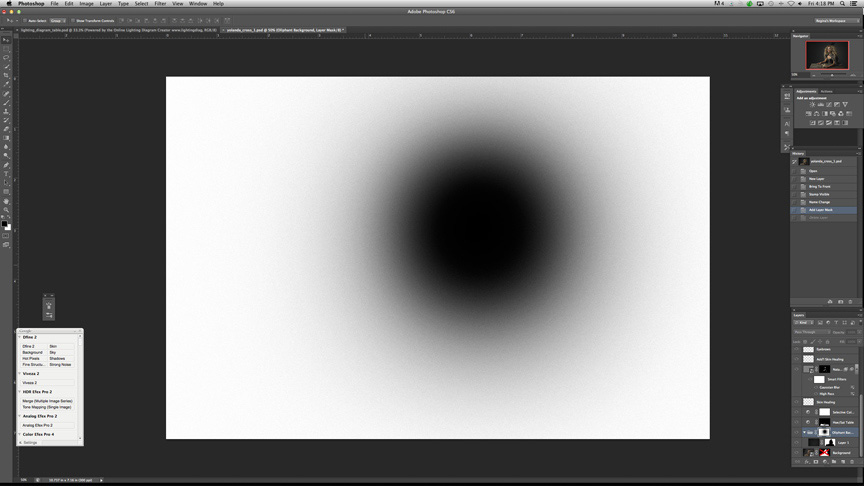
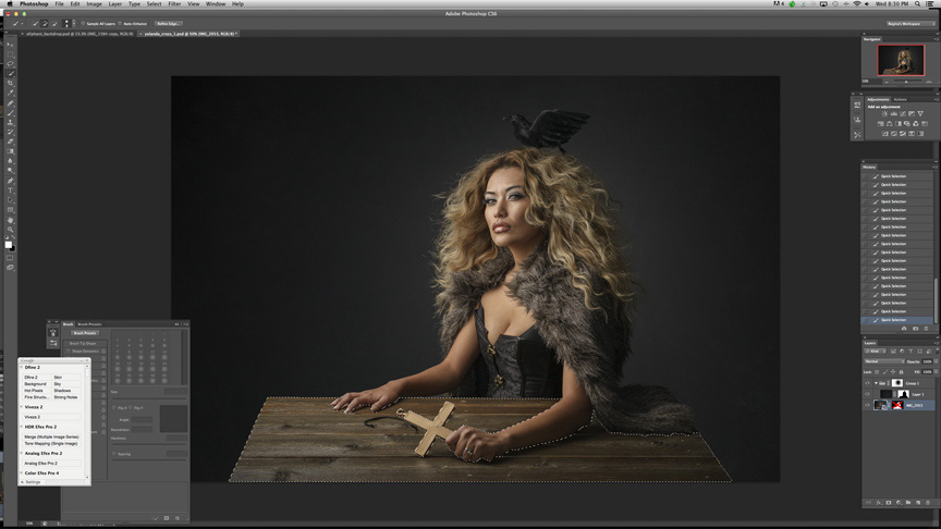
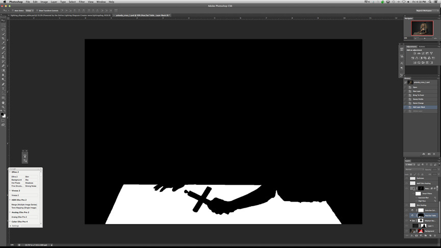
First thing I do is mask the subject.
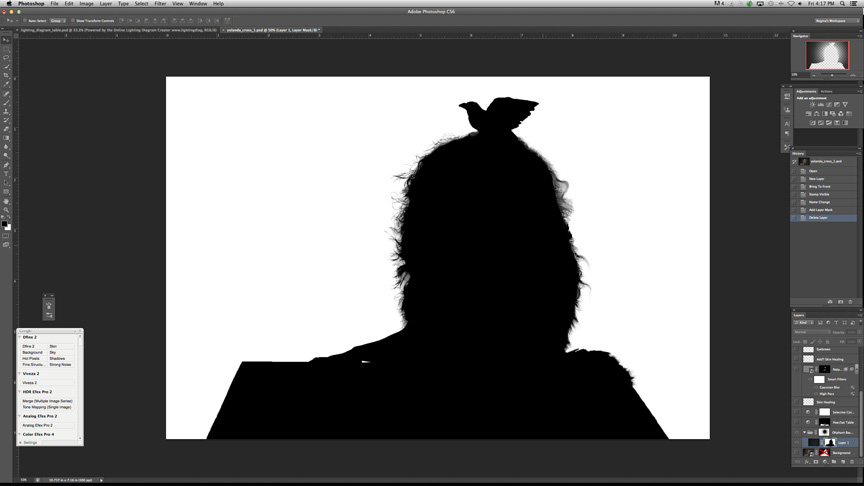
Next, I add the â˜Oliphant' layer.
Explanation:
I photographed just the Oliphant backdrop at a darker exposure and place it in the document as a separate layer. I then mask the subject. The original texture of the Oliphant background is retained, but just darker. I made a large 5000 px soft feathered brush and added noise to it. Then, I put the Oliphant backdrop layer in it's own group and add a white mask to the group. I paint with black, using the large brush I made, right over the subject. Now I have a vignette, no banding and the hair blends seamlessly in to the background. Plus, the background is the darker shade I prefer and the texture is the original. Yay!
Next, I mask the table and correct the saturation in the yellow and reds.
Now on to the subjectâ¦
- Add a Selective Color Adjustment layer for the skin, Red = +12.
- Use Healing Brush to fix skin blemishes.
- Apply a skin retouching technique learned from Calvin Hollywood, who learned it from retoucher Natalia Taffarel. I have it set up as an action, and I don't remember exactly what the steps are… sorry! Calvin explains the technique in his ‘Calvinize’ DVD. Not a deal breaker if you don't use this technique, especially if the face is so small in the image, like they are in mine.
- Double check for any skin inconsistencies and add add'l healing, if necessary.
- Even out the eyebrows and eyelashes, (only on females) using a 1 or 2px hard brush.
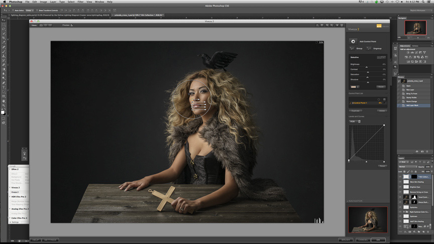
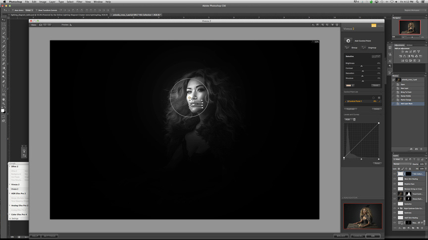
- Use Viveza plugin by Nik to subtly darken the highlights of the face, if necessary.
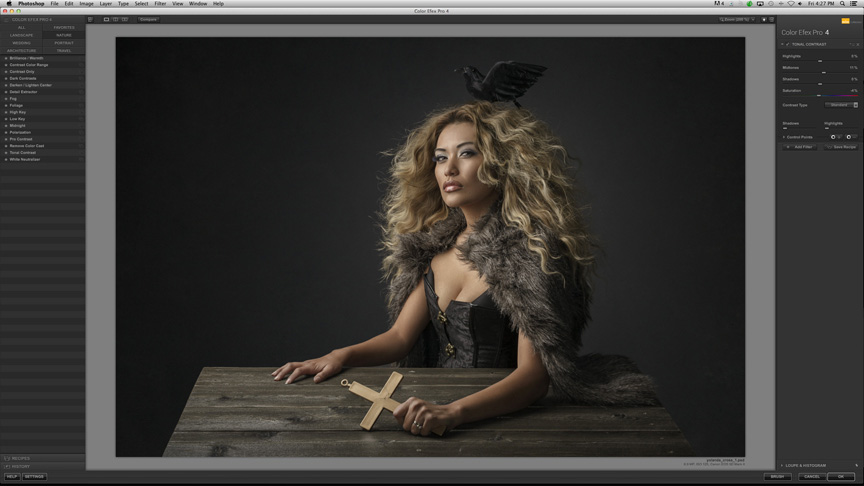
- Add very subtle contrast, only to the subject, with Nik's Color Efex Pro v.4 â˜Tonal Contrast' filter.*
- Brighten eyes using Dodge & Burn.
I then make some image specific adjustments, such as removing the string on the cross in this image.
A few more minor tweaks to skin healing and I'm done.
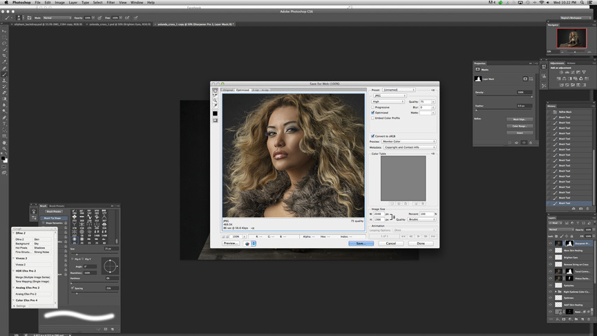
Now, I just save and duplicate the image, then resize the copy to 2048px wide, which I read is best for Facebook.
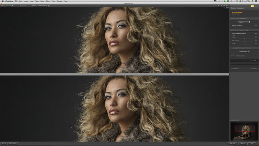
Last of the adjustments, I will use Nik's Sharpener Pro v.3 and apply only to the subject, avoiding the edges.
I convert the profile to sRGB and use Save for Web, 75 quality.
*I am SO disappointed with the Version 4 of Nik's Tonal Contrast filter. I used to LOVE v.2, but v.4 is just awful. I use it still, out of habit and denial that such a wonderful filter could turn so bad.
Older behind the scenes shot (pre Oliphant backdrop and reversed main light position).
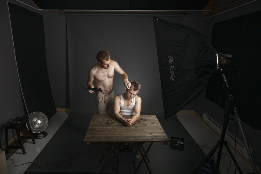
Black foamcore on left is not in use, it's just resting against the only available wall space.
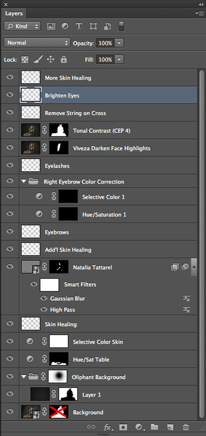
Here are the Photoshop layers:
Lighting diagram:

I hope that this information will provide some insight into how I post process and light my images. Granted, posing plays a huge role, but I will have to save that topic for another post! Thank you for reading and I'll see you next time :)
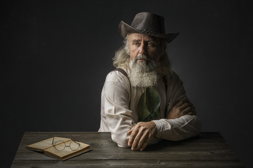
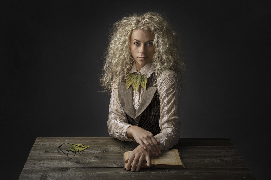
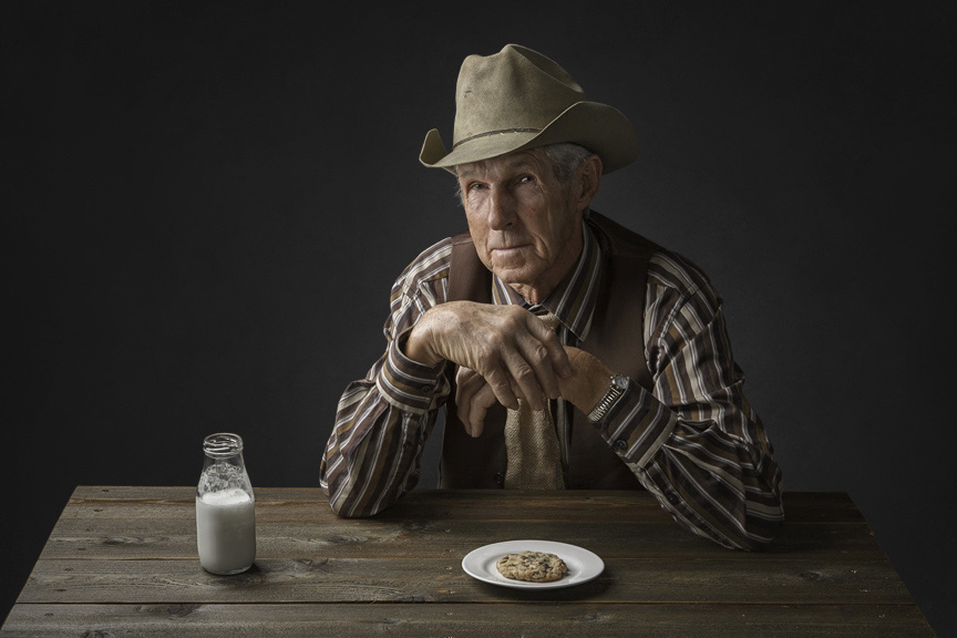
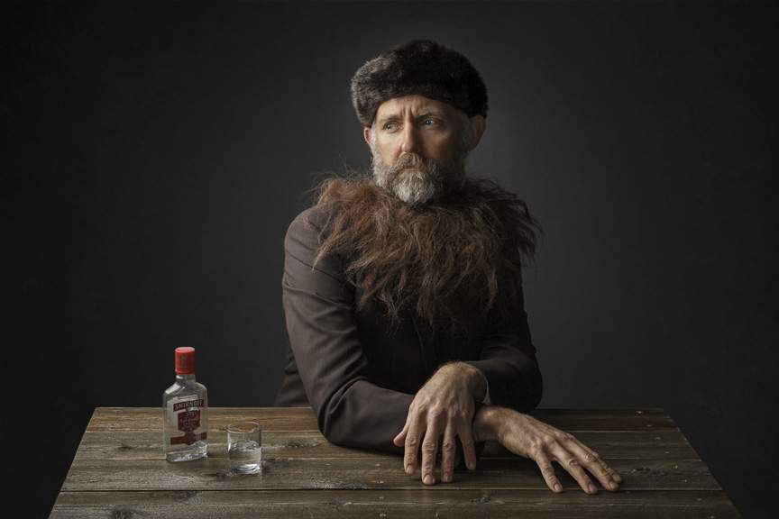
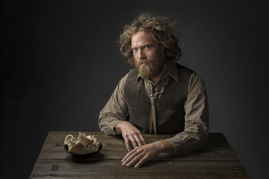
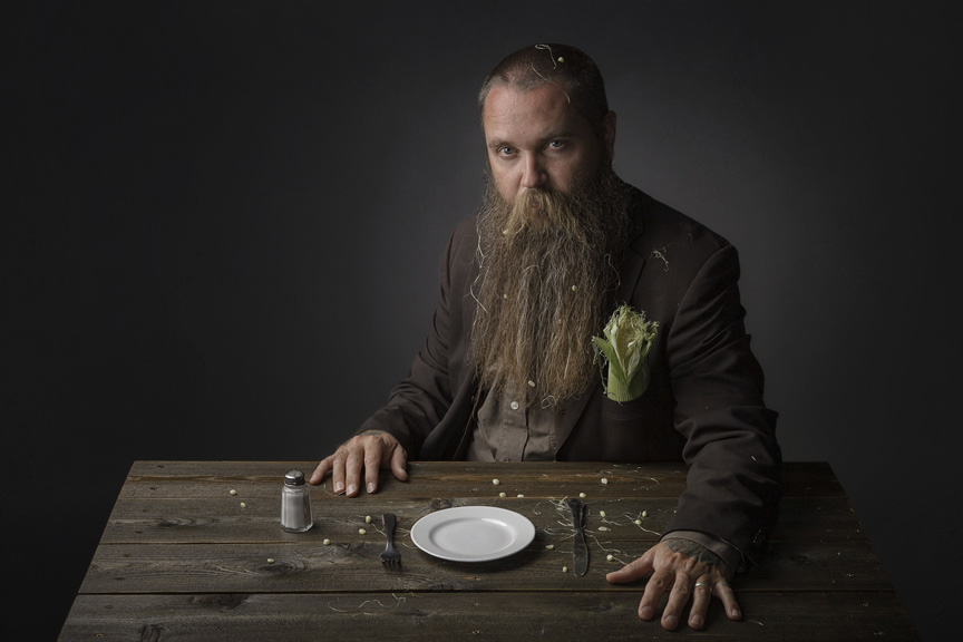
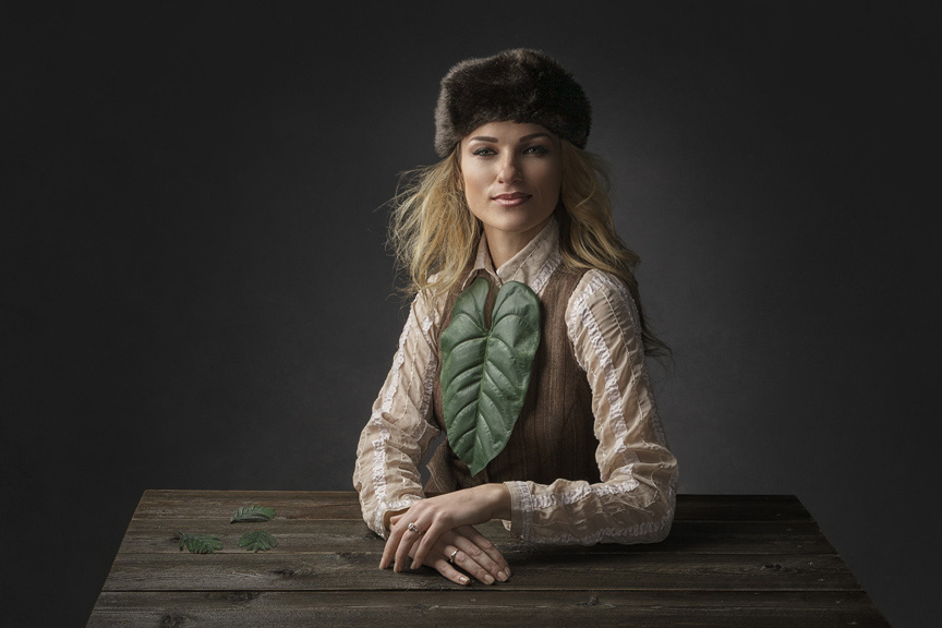
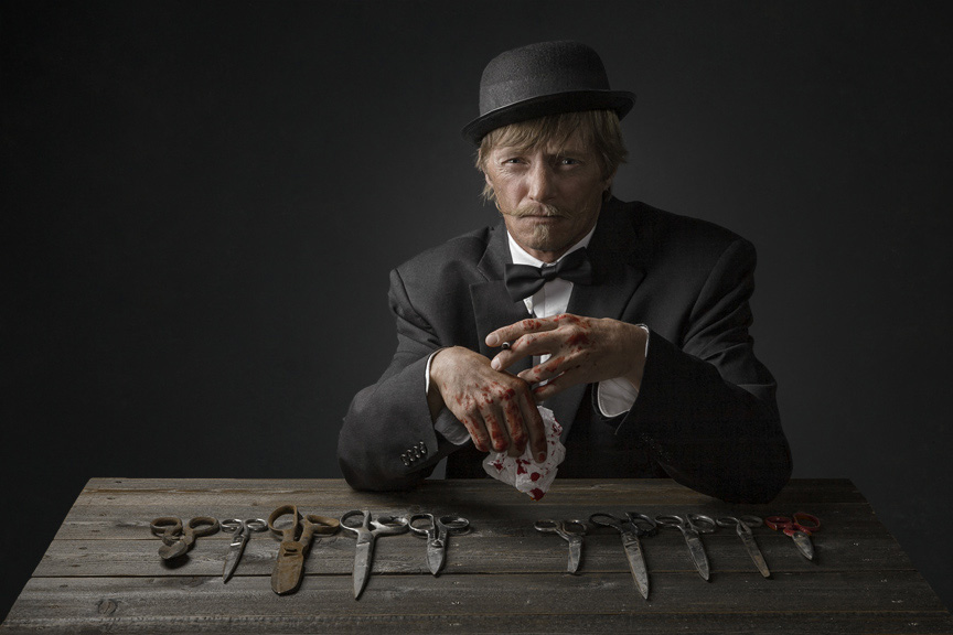
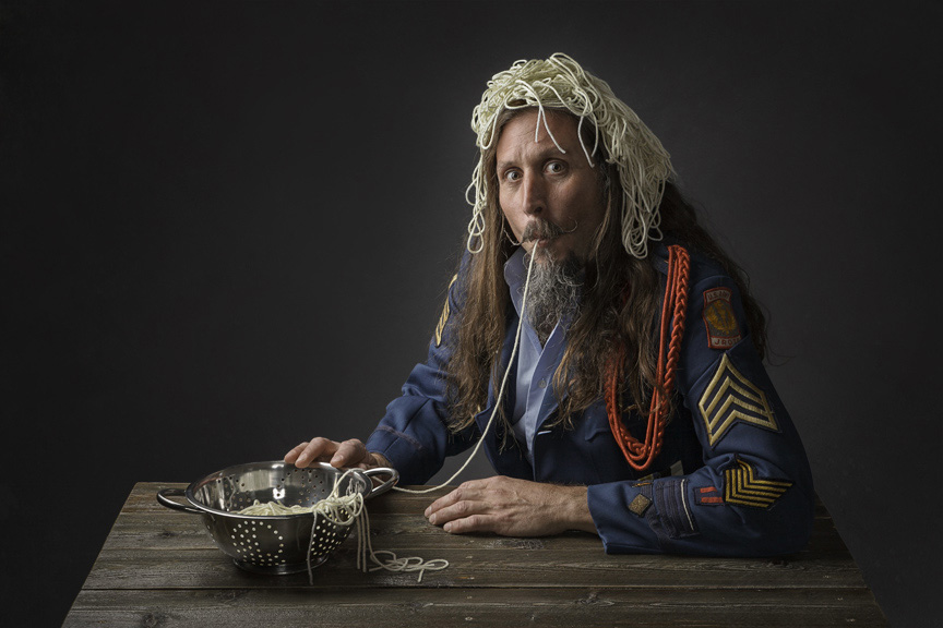
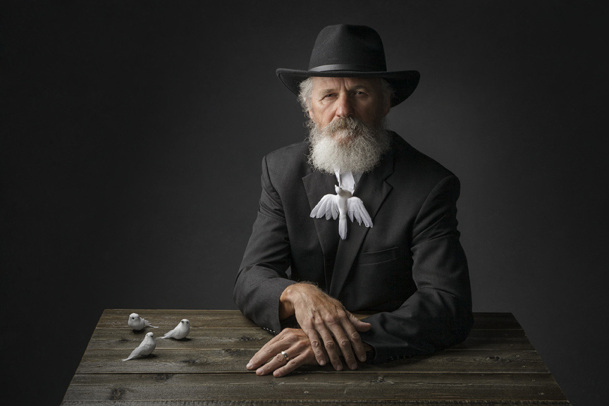
Image samples:


You can see more of Regina’s work at ReginaPaglesPhotography.com, and follow her on Flickr, Facebook, and Instagram.
Love your stuff, Regina. Thanks!
THANK YOU, Wolfgang!
I’m a big fan of your work Regina.
Much appreciated, Larry :)
I’m wondering how many viewers of the blog post noticed that Paul C. Buff Alien Bees lighting was being used. Good on you, Regina, for creating quality work without having to use the industry “standards” to light your subjects. And, good on the Kelby team for finally showing what can be done with products that aren’t sponsors of Kelby Media.
Thank you for your comment, KC… Love my AlienBees!
Yes…and sadly we lost Mr. Buff this year. The products will live on. Great post and awesome work Regina. Enjoy seeing you on the grid chat weekly and following your work.
Such quality work… I can see these techniques being applied in a lot of different ways to make visually impactul images. I think I have some tinkering to do in the lab to get to this level!
Thank you so much, Eloy! Took me years to simplify my postprocessing…
These images are just fabulous Regina. I just love the look of them. Every one of them makes you want to know their story.
I have a large bedroom converted to a small studio with Paul C. Buff gear like yours. I’ve been messing with product photography, but this article really makes me want to try some portraiture. I have one question though. How high is the fill light soft box? You say it is directly behind you. Are you standing right in front of it and letting the light wrap around you? Thanks for sharing.
Hi Bill… Thank you so much for your comment!
I am standing on a small step stool directly in front of the fill light. My head comes to about the center of the fill light. I hope this helps :)
My best to you!
Yes, that helps, thank you. I suspect you are standing on a small step stool in order to get a bit more height and camera angle to better capture the table texture and props. Your head/body is also blocking the brightest part of the fill light which most likely helps the overall exposure too.
Yes, I found that by standing just a slight bit off the ground gave me a better perspective.
Hope you enjoy portraiture, Bill!
Thank you so much. The images are great! We use this in our studio. I will be teaching this at my studio workshop at the end of may. Thanks so much. I have been following you since you started with chair. We may explore the table top now. Much appreciation.
Such a pleasure to have helped in any way, big or small. Thank you for the kind comment, Ralph!
Excellent write-up and detail in explanation. I am a fellow Utahn and really love your style you have created. Such great expression on the subjects. Thanks for sharing your talents!
A pleasure to share, so happy you like it :)
Regina,
What wonderful images. Should prove very helpful to my own process. I only hope Imcan someday obtain such fine results. Thank you
You will, A… Just stick with it! Never imagined myself writing a Guest Post for Scott Kelby. So glad my dad taught me to persevere :)
Regina,
Your photos are exquisite. I have often seen them in the past and immediately recognized them as yours with the deep texture, vibrance and tones. I always wondered how you achieved those results and greatly appreciate your willingness to share your process in such great detail and contribute to the community. I am betting there will be a flood of flickr photos that will be appearing tagged with ‘Regina Pagles’ as everyone now has a chance to try your technique.
P.S. *love* the Oliphant background and I have often contemplated getting one, and your pictures/results have certainly pushed me to the edge of buying one :) :)
Thank you so much Lance! By the way… You will not regret the purchase of an Oliphant backdrop!
Hi Regina, Fantastic post, and I love your work! Thanks for sharing, I’m impressed with how much care and attention you put into everything, including post processing to get everything just right. You’re an inspiration! PS – I love my Alien Bees to!
Never imagined myself being an inspiration to others, but happy about it, nonetheless! Thank you :)
If you don’t mind, where (and how) do you find so many interesting subjects? And, how do you get them to sit for you?
The majority of my subjects are locals from the small rural town that I live in. I would post the images of them on FB and their friends would ask me to photograph them. I also started asking interesting looking customers of our bike shop if I could photograph them. Our small town gets 3 million visitors a year, so there is no shortage. It helps that my studio is only a block away from the shop, so it’s very convenient. Then, there is always my husband :)
My husband, Fred
Thank you for sharing! I finally got a lighting setup – Paul C. Buff set up that someone tried and never used. Perfect time to use your diagram and try some portraits!
Yay Virginia! Looking forward to the results 😃
I really do love your portrait style and appreciate that you took the time to share your methods for photographing and processing the pictures. The portraits are so creative and at the same time, the people look very natural. You are very talented and give me something to think about in my photography.
Thank you very much for the kind words… so appreciated!
That is very nice work you are showing on your website! I like the iterating theme and all the different wardrobes and props. It reminds me to get off my a.. and do some project work myself again…
Please, could you get a bit more specific about the Tonal Contrast filter, why -in your opinion- it got worse? I chose to buy the onOne suite a long time ago, but barely use it anymore. I wanted to take a look at Nik Software and your opinion could help me to be more careful about testing Tonal Contrast.
Both Moose Peterson and Vincent Versace use Tonal Contrast in Nik’s Color Efex Pro quite frequently (based on their books and blogs that I read/follow). Be careful to not “throw the baby out with the bath water.” What does not work for one photographer’s work and/or style may be perfectly suited to another.
Personally, I love the entire Nik suite. I, too, have the onOne suite and don’t use it very often—mainly for the Perfect Resize (Genuine Factals) application. I find the suite to be more of an attempt at a Photoshop replacement, instead of a Photoshop enhancement.
Hi Mika,
The only filter in the entire Nik collection that I use is the Tonal Contrast filter. The only thing I can say is the new version of it is not as good as the old version, for my application. I cannot provide details, because I don’t know why it’s different, it just is. I am not a very technical person, I just know when I like something and when I don’t. Sorry I am not more help!
Thank you, Regina! As far as I can see, your preferred version was still under the brand Nik and now only the “googled” version is available. So I won’t be able to compare anyway…
Trust me… if I could get my hands on the old version, I would, too!
Wonderful. Thank you thank you Regina. Can’t wait to see what’s next from you!
Thank you so much, Mike :)
An awesome post and thanks for sharing. I noticed that you apply sharpening in Lightroom. Is there any reason that you apply it in Lightroom and not in Photoshop?
Thank you, Arnab! I apply sharpening in both Lightroom and Photoshop.
Thank you – been following your photography since I saw you submit your pics to the Grid. Brilliant work
So kind of you… Thank you :)
Superb information from this blog and I have to tell you, your article giving the best and information. And I would like to thanks for this information that I had been looking. Regards Wall Painters in Dubai