

Yes, it’s me again! Dave Williams, the #TravelTuesday blogger here at Scott Kelby’s Photoshop Insider, and freshly appointed editor at LayersMagazine.com. I’ve kicked off a new series of #MondayMotivation posts over there and I’d love for you to go check out the first one by Gilmar Smith!
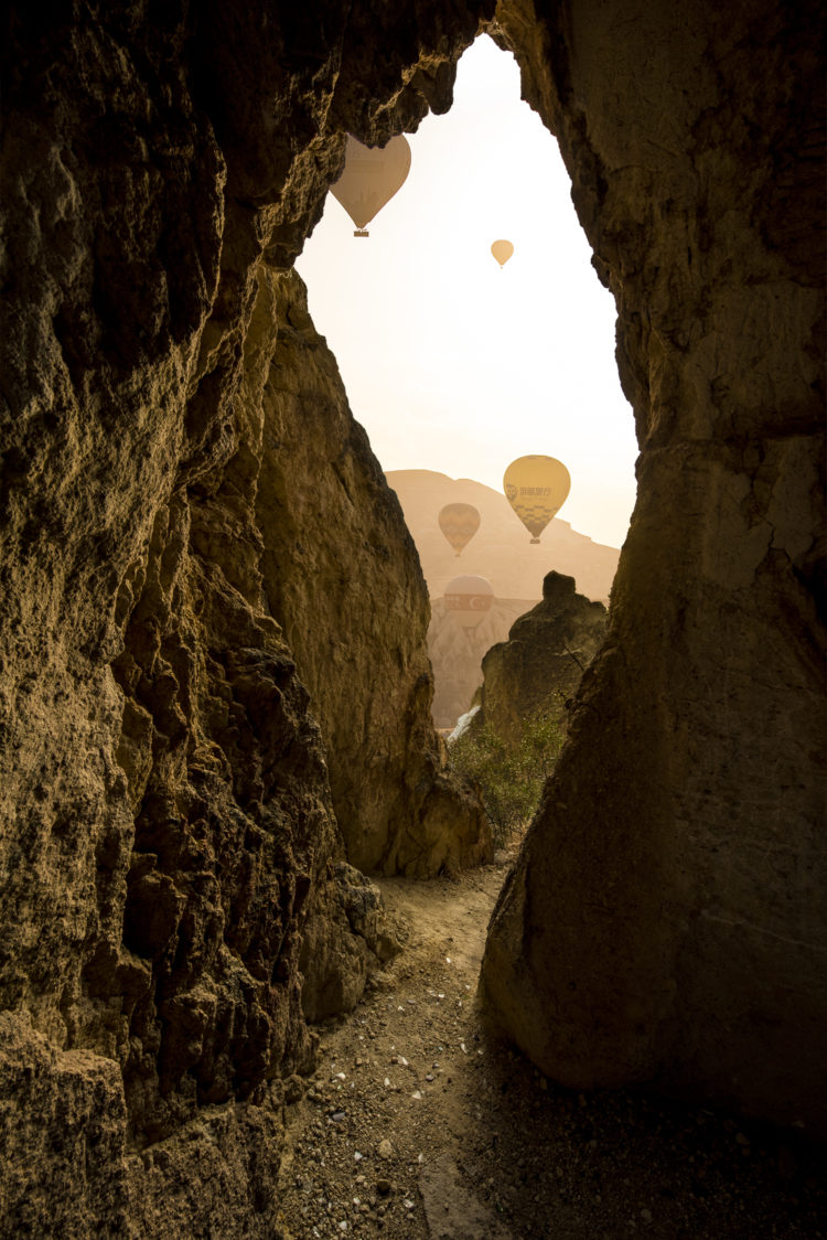
I’m fresh back from a mission to Turkey where I predominantly shot the hot air balloons over Göreme in Kapadokya. It’s home to the densest hot air balloon airspace in the world, with the dawn skies filled with them.
The town is unique in that the buildings are carved and tunnelled into the rocky landscape. I’ll share more about it over on my blog, capturewithdave.com, another day, but today, right here, is all about this shot from the trip: –
Here’s the caveat, and it’s very important you aren’t disappointed by this: So, you know how this blog is entitled, “Scott Kelby’s Photoshop Insider,” right? The clue’s in the name.
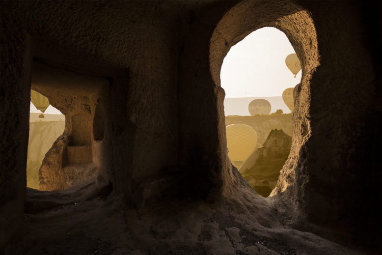
This is a composite of two images: one of the cave interior and one of the balloons in the sky. Now, I’ll say at this point, anticipating any comments about how I shouldn’t be faking this, that actually it is a view that is attainable at this location. I just wasn’t in the caves at the right time of day to see it! I was limited by time and didn’t know my way around to find the right spots in the dark before dawn. Anyway, here’s the tip: –
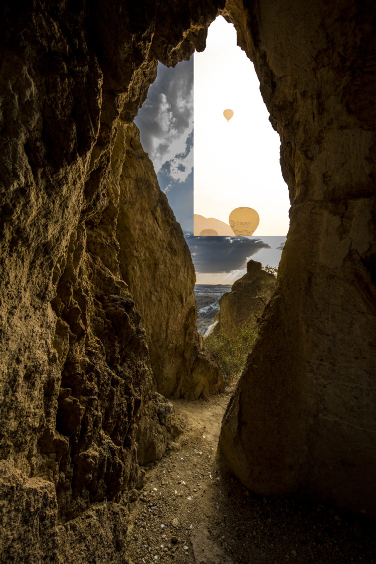
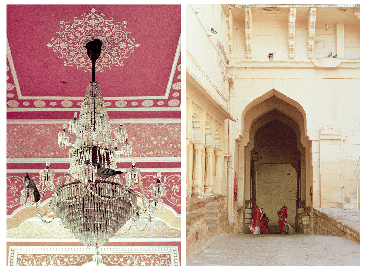
We’ll use a different pair of images, which you can download the PSD file here to try it yourself.
When compositing images, it’s obviously very important to make the result look convincing! As well as good cut-outs and realistic placement of elements, matching the tone is very important. What I’m going to show you is a very quick, very easy, and very good way to match those tones.
First off, get everything cut out and in position.
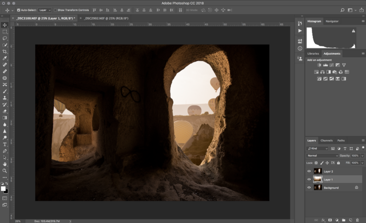
The layers are set out in no fancy way for this technique; they’re simply stacked in order. On top, create a new layer and fill it with 50% gray.
Now, change that new layer’s blend mode to Luminosity. The colours will change, revealing the differences going on in your image. To see them more clearly, add a Saturation layer to this and boost the saturation right up. What we’ve done here is create a representation of the colour in the image.
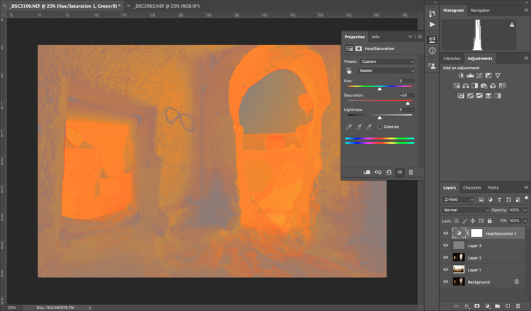
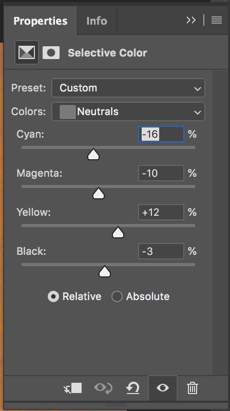
From here, add a Selective Colour adjustment mask. When faced with the Properties panel, select the Neutrals from the Colours option, which actually contains most of the colour information. Adjust the sliders to balance out your image and match the colours – it’s hard to explain it because it varies wildly on an image-by-image basis, however when you do it and see it yourself it’ll make sense, I promise!
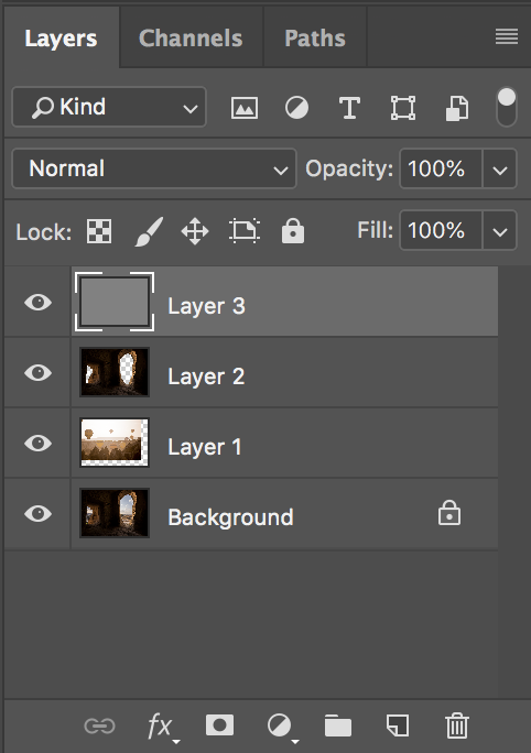
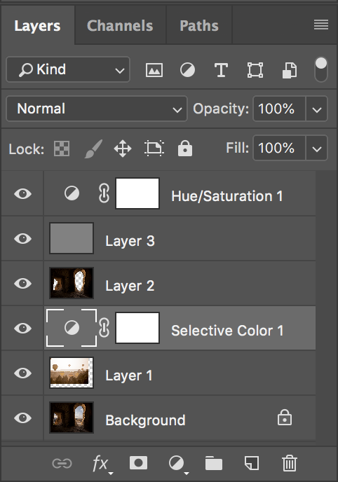
The Layers panel should look something like this one below. And, to finish off the image, we just need to remove the Hue/Saturation layer and the gray layer.
This leaves us with an image which has balanced tones, leaving it looking realistic.
It’s a simple and fast way to balance tones in a composite, and I’d love to see how it works for you!
Now, this experience is called a “once in a lifetime” thing, and that played on my mind when I was out in Turkey. I wrote a little piece about that, which I’d love for you to read over on my blog.
So, for now,
Much love
Dave
Hi. Maybe I missed something but can you tell me where the link is to download the aforementioned .psd file? Thanks!
You can find the link to download the PSD beneath the second image. :-)