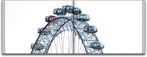
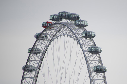
Well, it just happened to me. When I ran a blog post about my trip to London, buried on those pages was my personal favorite shot from the trip (well, if you don’t count my silly vacation-type photos of us all goofing off), was a photo I took of the London Eye (shown above—click on it for a much larger view).
What caught my eye about the shot was the fact that there was one red capsule (the whole “a pattern is good, but a pattern interrupted is better” which I believe originally came from Jay Maisel). Also, I love how you can see the forms of individual people in the capsules when you crop in tight (or show the image at a large size). Anyway, it still wasn’t my favorite shot until something happened by accident in post processing.
When I took the shot (above), the sky behind it was kinda light gray and non-descript, and a little under-exposed as well (which didn’t help) so I started to brighten the Exposure in Lightroom to see if the red car stood out more (and if the shot was even worth keeping), and when I did the sky turned almost white. I knew right then I was onto something.
Over to Photoshop for Finishing
Once I got it in Photoshop, I added some contrast to the cars to help them stand out more, then I duplicated the layer and changed the Layer Blend mode to Screen to make the sky even whiter. Of course, this made the capsules light again, too, so I added a layer mask to this layer, then painted over the cars in black again to mask away the brighter version from this Screen layer. I did this a few times (making the sky whiter, and the masking away the cars) until it looks like what you see at the top (though I did add more contrast to the cars, and an strong Unsharp Mask, too).
I showed my buddy Dave Moser (BTW: Happy Birthday Dave) the image, full screen size, and he absolutely loved it (and he’s a tough critic when it comes to photos), so I was a bit relieved that I wasn’t the only one who liked it. Although it was the red capsule that brought me to the photo, I think what makes it unique is that you rarely see the London Eye on solid white like this (well, at least I hadn’t anyway).
I’m Not Sure It Deserved Its Own Blog Post, But….
I wanted to show it here today, since it kind of got lost in my London photo book, and although I know the post production on it won’t be for everybody, at least I got to show it larger, and show how it the post was done.


Scott:
I admit, I am one who missed this photo last week. Very cool and thanks for telling about the processing of it. Is there only one red capsule on the whole ride?
–John
P.S. Hey, it’s my birthday today, too! But I won’t hear you singing “Happy Birthday” to me, though….. right, Ken? :D
Here’s a question: for you – at what point does it stop being a photograph and it become a photo illustration. You know what I mean? That line between editorial or documentary and art or interpretation?
You should check out the Grid. Matt and Scott spent a good 45 minutes on this topic a few weeks ago.
Its Episode 9. I went to watch it and it wont play. Every other episode works but Episode 9 is broken. It shows the ads then nothing else.
A common situation among photographers, I guess…
for what it’s worth i immediately was impressed by this shot, i think because of the white background and of course the red cab. have a good one bub!
Cool postprocessing Scott! Thanks for sharing.
I must admit I missed it as well. I guess one of the reasons could be the page divider spoils it a bit. Could be.
The post really got the spark in it.
Nice so see such articles from you, always learning.
Coincidence Maybe I got a similar pic….But I think I have the Red Capsule highlighted well in one of my pics, with nothing but just Lightroom… http://www.flickr.com/photos/vsk_suresh/5779884881/in/photostream/lightbox/ Hope u like it…(I used many Presets from Matt’s blog & OnOne, and just love it….).
Yep,
for me it’s definitely the grey page divider that breaks up the image. I remembered the image from the previous post thinking “such a shame the grey pole runs through it, or it would be a great image”.
Is it worse to have one of your favorite photos go unnoticed, or your entire photography portfolio?
Thanks for the info on processing, I am always trying to figure out how people get cool effects. This is the sort of thing I like but don’t know how to achieve. Love this.
It is a beautiful pic though, but you needed to exhibit all your shots for that trip for them to pic the best. Photographers sometimes have weird tastes…what seems good to you may not to the other
Id hang that on my wall, so at least it makes that cut?
Newbie PS question: How did you mask away the wires and just the cars to paint them back with black or to add contrast? Great photo!
Hi Matt: I really didn’t have to mask out the wires (thankfully) because the sky behind them got so white it really wasn’t a problem. When I added overall contrast (making the highlights whiter and the shadows darker) it took care of the wires for me. There’s a word to describe when this happens: luck. :)
I caught you, Scott :-)
I remember you said once that it’s some kind of wedding technic (I mean focusing on the particular color) and you are tired a little bit with it.
Anyway, very nice shot and great description: “A pattern is good, but a pattern interrupted is better”
Nice photo. Pushing background to white looks nice a lot of the time. Unfortunately, you went a ruined the image in your photo book by spreading it over two pages having each half not line up. Looks dorky now. You would have been better off putting it on one page to keep it intact plus add in all of that white space on either side and you have a really nice wasted image.
Hi John. I disagree. :)
I’m afraid of heights..I was too afraid to look. :)
Soctt, great shot but I too have to admit that I glanced over it but I’m putting that down to it being amongst other images.
Great shot & great post and works so well as a double page spread; nice one!
Cheers,
Glyn
Scott, great shot! I’m one of the ones who missed it as well. And thanks for sharing your post-processing tips!
Hi Scott,
Nice shot… and I know how you feel – I took a shot of the Eye over a year ago; at that time one capsule was missing… I named the shot ‘Eye see it!’, but no one else did… :-]
http://jackbakker.com/2011/05/15/eye-see-it/
Cheers,
J.
I think your pic is really cool! it could be a red bus the pod is so close to the road ;)
Love this type of thing, I posted a similar article a few weeks ago and its great that AWESOMENESSES like yourself have the same thing ;) – http://www.michaelhreed.com/2011/05/runt-of-the-image-litter